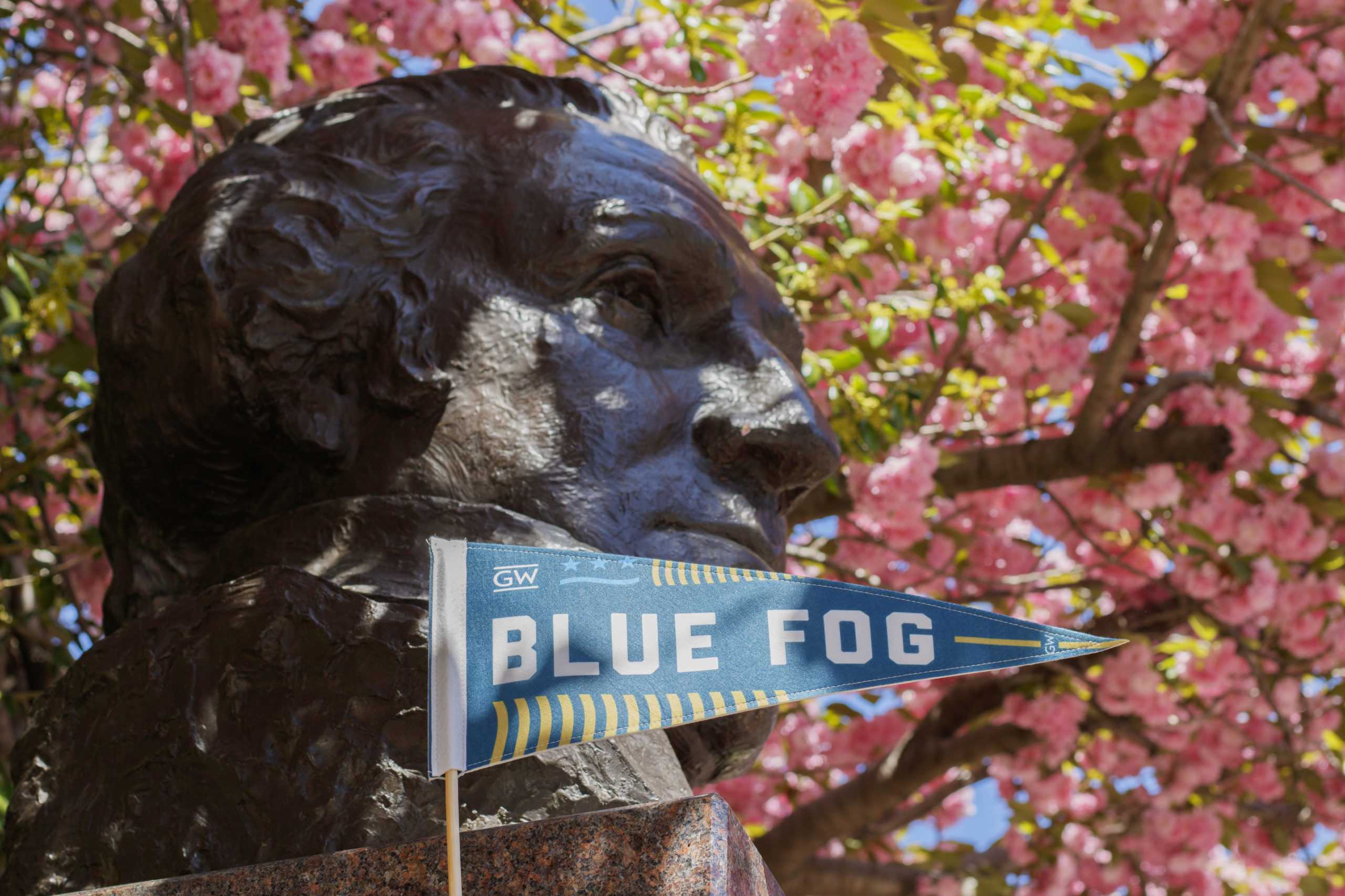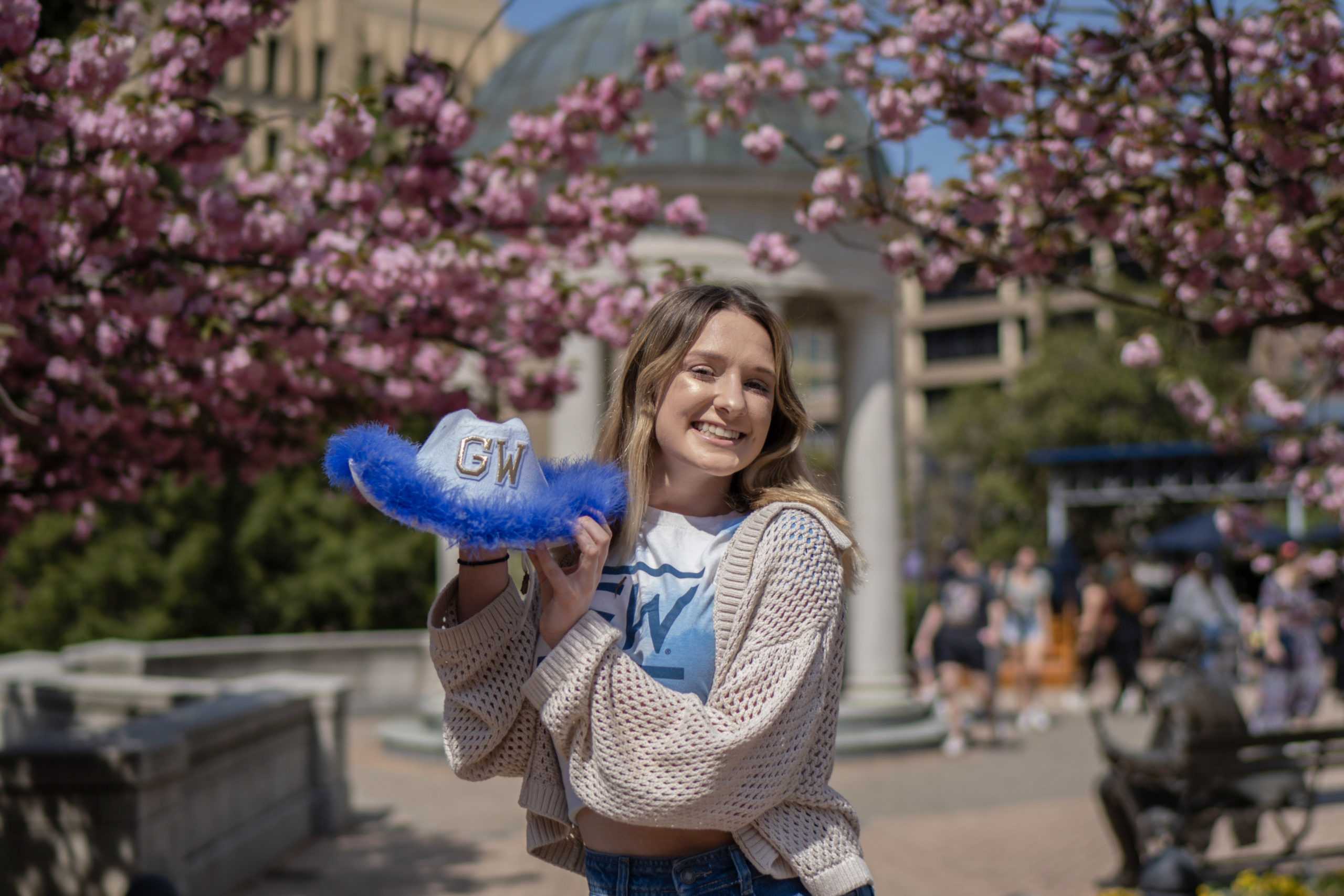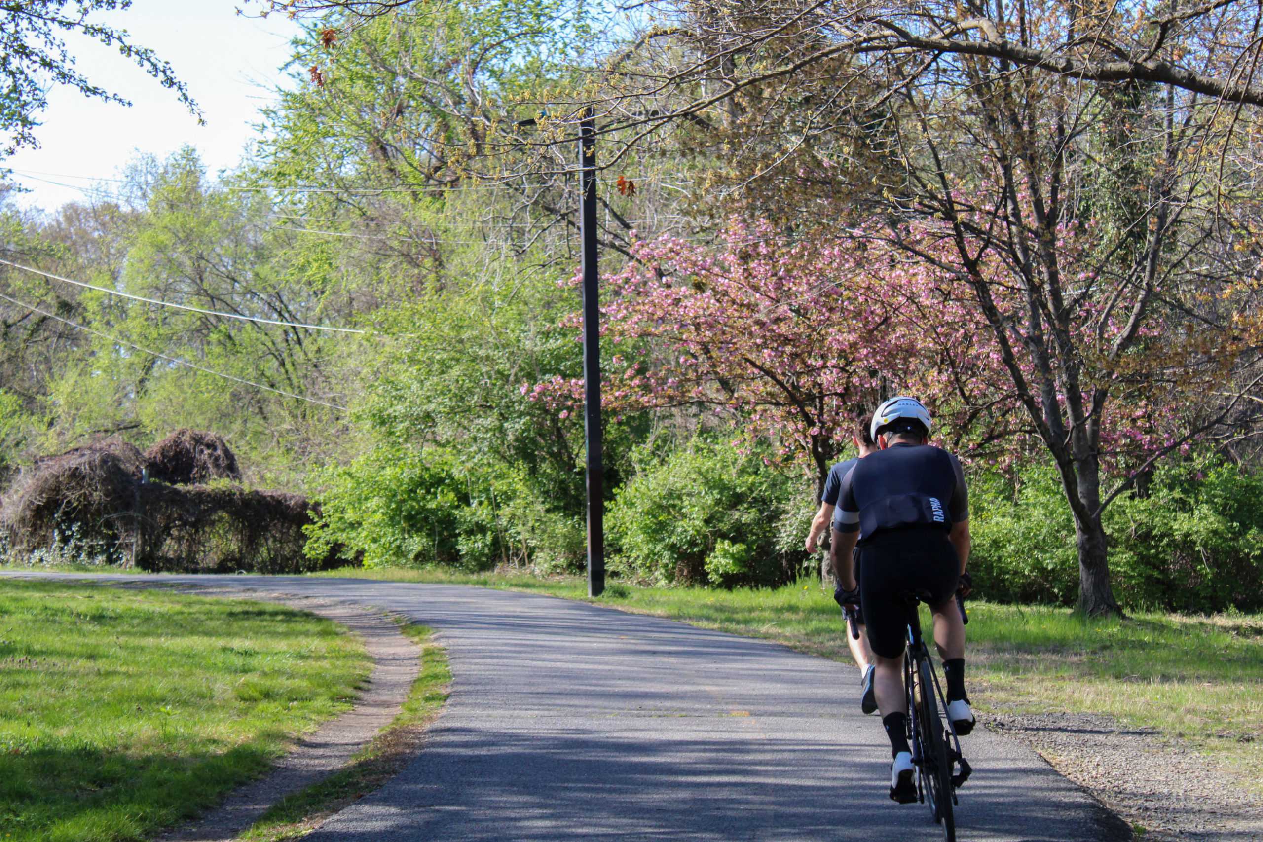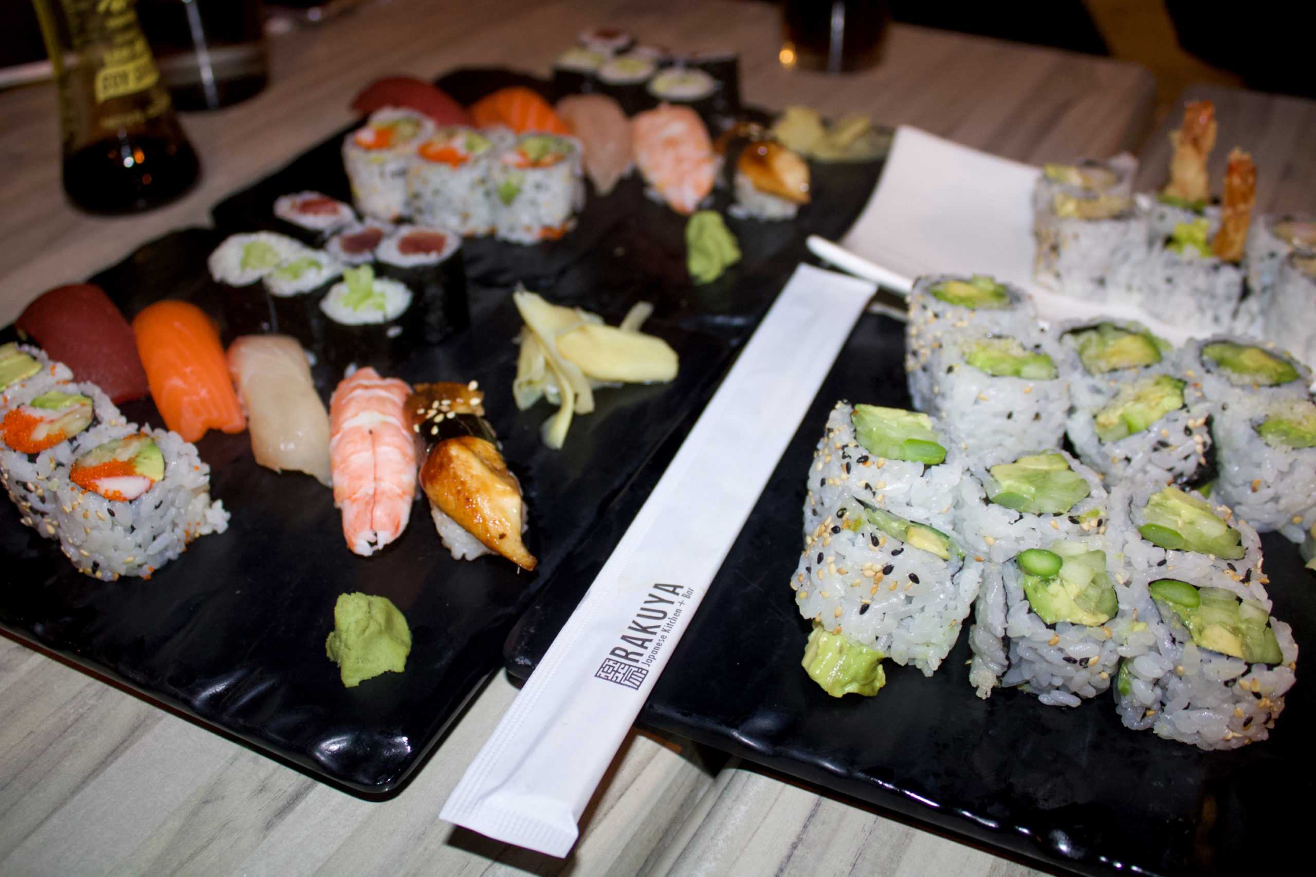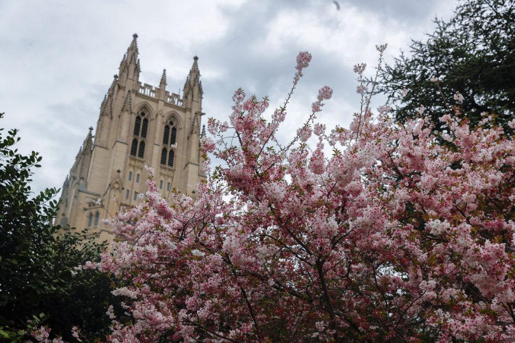
Sage Russell | Staff Photographer
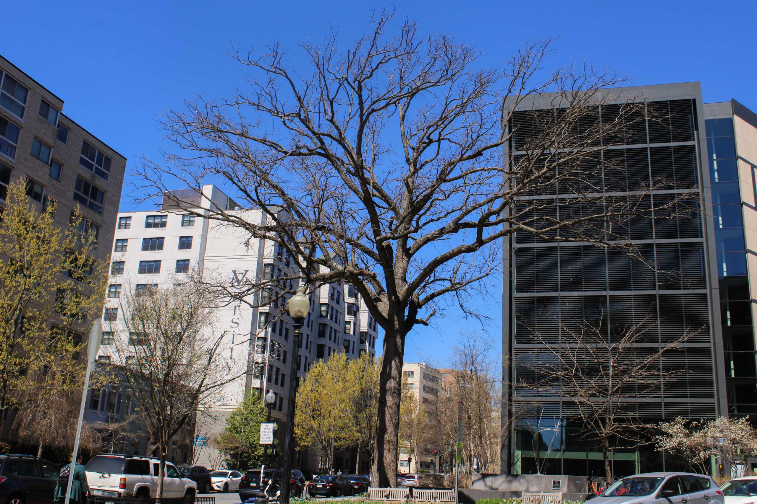
Although the trees were few and far between, visitors could not drop their gaze from their expansive pink-and-white encrusted branches.
{“@context”:”http:\/\/schema.org”,”@type”:”WebSite”,”url”:”https:\/\/www.gwhatchet.com”,”name”:”The GW Hatchet”}
@media only screen and (min-width: 650px) {
blockquote.right {
width: 40%;
margin-top: 0px;
margin-bottom: 10px;
margin-left: 30px;
margin-right: 0px;
}
}
@media only screen and (max-width: 650px) {
blockquote.right {
margin-top: -10px;
margin-bottom: 10px;
margin-left: 15px;
}
}
blockquote.right {
border-left: 4px solid #043c5b;
color: #043c5b;
font-family: ‘Sansita’, sans-serif;
font-weight: bold;
padding-left: 15px;
float: right;
font-style: italic;
}
blockquote > p {
padding: 0;
margin: 0;
}
@media only screen and (min-width: 650px) {
blockquote.left {
width: 40%;
margin-top: 5px;
margin-bottom: 10px;
margin-left: 15px;
margin-right: 30px;
}
}
@media only screen and (max-width: 650px) {
blockquote.left {
margin-top: -5px;
margin-bottom: 15px;
margin-left: 15px;
margin-right: 30px;
}
}
blockquote.left {
border-left: 4px solid #043c5b;
color: #043c5b;
font-family: ‘Sansita’, sans-serif;
font-weight: bold;
padding-left: 15px;
float: left;
font-style: italic;
}
blockquote > p {
padding: 0;
margin: 0;
}
aside {
background-color: rgb(3, 60, 90);
top: 0px;
float: right;
padding: 10px 15px 0px 15px;
width: 100%;
margin: 0px 0px 15px 0px;
color: #043c5b;
font-family: ‘Sansita’, sans-serif;
border-top: 4px solid #043c5b;
font-size: 20px;
line-height: 1em;
font-weight: bold;
}
.related:before {
content: “Related: “;
color: rgb(99, 113, 122);
font-family: ‘Sansita’, sans-serif;
}
.aside {
font-family: ‘Sansita’, sans-serif;
font-size: 16px;
color: rgb(99, 113, 122);
line-height: 1.2em;
font-weight: 100;
}
.aside2 {
font-family: ‘Sansita’, sans-serif;
font-size: 16px;
color: #043c5b;
font-weight: 100;
}
aside > p {
margin: 0px 0px 10px 0px;
}
@import url(‘https://fonts.googleapis.com/css2?family=Patrick+Hand+SC&display=swap’);
@import url(‘https://fonts.googleapis.com/css2?family=Tillana&display=swap’);
@import url(‘https://fonts.googleapis.com/css2?family=Fuzzy+Bubbles&display=swap’);
html, body {
background-color: rgb(191, 87, 66);
background-image: url(‘https://www.gwhatchet.com/wp-content/uploads/2023/04/cherryblossoms.gif’);
background-repeat: repeat;
background-position: center center;
background-size: 400px;
}
@media screen and (max-width: 1100px) {
.guide-header {
display: none;
}
.mobile-cover {
display: block;
}
}
body.ios header {
display: none
}
.cover-header {
display: block;
}
::-webkit-scrollbar {
width: 0px; /* Remove scrollbar space */
background: transparent; /* Optional: just make scrollbar invisible */
}
logo-slider {
–image-height: 250px;
–image-width: 350px;
border: none;
padding: 20px;
overflow: hidden;
max-width: 100%;
width: 100%;
margin-top: 100px;
position: relative;
display: flex;
}
logo-slider div {
display: flex;
position: relative;
animation: marquee 25s linear infinite;
justify-content: space-around;
}
logo-slider img {
display: block;
min-width: var(–image-width);
height: var(–image-height);
margin: 0 1vw;
border-radius: 8px;
overflow: hidden;
}
logo-slider:after {
content: “”;
position: absolute;
width: 100%;
height: 100%;
left: 0;
top: 0;
background: rgb(219,209,251);
background: linear-gradient(0deg, rgba(219,209,251,1) 0%, rgba(94,21,255,1) 100%);
background: transparent;
}
@media (max-width: 900px) {
logo-slider {
–image-size: 50px;
–image-size: min(max(50px, 10vw), 100px);
}
}
@keyframes marquee {
0% {
transform: translateX(0%);
}
100% {
transform: translateX(-100%);
}
}
body {
background-color: rgba(237,114,159,0.2);
}
.pres-he {
object-position: 10% 10%;
}
.pres-cw {
object-position: 15% 10%;
}
.pres-ca {
object-position: 0% 10%;
}
.pres-bh {
object-position: 15% 10%;
}
.pres-kc {
}
.issue-link {
width: fit-content;
margin-left: auto;
margin-right: auto;
}
@media only screen and (max-width: 450px) {
.pres-he {
object-position: 25% 10%;
}
.pres-cw {
object-position: 30% 10%;
}
.pres-ca {
object-position: 15% 10%;
}
.pres-bh {
object-position: 25% 10%;
}
.pres-kc {
object-position: 35% 10%;
}
}
@import url(“https://fonts.googleapis.com/css?family=Source+Sans+Pro:400,700”);
.bonw-guide-23-container {
max-width: 1100px;
text-align: left;
margin: 1rem auto
}
.bonw-guide-23-container h1 {
font-size: 2rem;
font-family: ‘Patrick Hand SC’, cursive;
text-transform: uppercase;
background-color: #0F703C;
color: white;
}
body.ios header {
display: none
}
body.ios .bonw-guide-23-container header {
display: block
}
html {
height: 100%;
overflow: hidden;
}
body {
color: white;
margin: 0;
padding: 0;
-webkit-perspective: 1px;
perspective: 1px;
-webkit-transform-style: preserve-3d;
transform-style: preserve-3d;
height: 100%;
overflow-y: scroll;
overflow-x: hidden;
}
figure {
box-sizing: border-box;
min-height: 40vw;
padding: 30vw 0 5vw;
margin-left: -0.0em;
position: relative;
-webkit-transform-style: inherit;
transform-style: inherit;
width: 100vw;
background-blend-mode: darken;
transition: 3s;
}
figure,
figure:before {
background: 50% 50% / cover;
}
figure::before {
bottom: 0;
content: “”;
left: 0;
position: absolute;
right: 0;
top: 0;
display: block;
background-color: white;
/*./ArmellTransfer_OA-2000×1340.gif*/
/*https://www.gwhatchet.com/wp-content/uploads/2018/11/LandingPage_GS-2000×1340.jpg*/
background-image: url(https://www.gwhatchet.com/wp-content/uploads/2019/11/2019-fall-basketball-preview-image-1.jpg);
background-size: cover;
background-repeat: no-repeat;
background-origin: center;
background-clip: center;
background-attachment: fixed;
background-blend-mode: darken;
transition: 3s;
/*-webkit-transform-origin: center center 0;
-webkit-transform: translateZ(-1px) scale(2);
transform-origin: center center 0;
transform: translateZ(-1px) scale(2);*/
z-index: -1;
min-height: 50vh;
}
@media screen and (max-width: 600px) {
figure::before {
background-attachment: scroll;
}
}
figure * {
text-align: center;
margin: 0;
padding: 0.1em 0;
font-family: “Source Serif Pro”, “Georgia”, “Cambria”, “Times New Roman”, serif;
}
figure h2 {
font-size: 3rem;
margin: 0.75rem 0 0.75rem 0;
font-family: “Source Sans Pro”, “Segoe UI”, “Helvetica Neue”, “Helvetica”, sans-serif;
text-transform: uppercase;
line-height: 3rem;
color: #0F703C;
}
figure .big-subheadline {
font-family: “Source Sans Pro”, “Segoe UI”, “Helvetica Neue”, “Helvetica”, sans-serif;
}
main {
background-color: hsl(60, 10%, 10%);
line-height: 1.7;
max-width: 32em;
padding: 5% calc(50% – 16em) 35%;
position: relative;
z-index: 2;
}
.header-title-container {
margin-left: auto;
margin-right: auto;
width: 50%;
padding: 1em;
padding-left: 2em;
padding-right: 2em;
text-align: center;
}
.header-subtitle-text {
color: #000;
font-size: 20pt;
font-weight: 1000;
margin-top: 0.5em;
}
.header-title-text {
color: #000;
font-size: 45pt;
font-family: grafolita-script, sans-serif;
font-weight: 700;
font-style: normal;
}
.header-paragraph {
font-family: “Source Sans Pro”, “Segoe UI”, “Helvetica Neue”, “Helvetica”, sans-serif;
font-size: 16pt;
margin-top: 0.5em;
color: black;
}
.section-header-title {
color: #FFF;
font-size: 25pt;
text-transform: none;
text-align: center;
margin-top: 2em;
box-shadow: 10px 10px 0px #92C99D;
background-color: #0F703C;
padding: 1em;
font-family: “Source Sans Pro”, “Segoe UI”, “Helvetica Neue”, “Helvetica”, sans-serif;
}
.guide-section-first {
margin-top: calc(100vh + 6em);
}
.guide-header-image-container {
width: 100%;
height: 700px;
}
.guide-header-image {
width: auto;
height: inherit;
margin-left: auto;
margin-right: auto;
}
@media only screen and (max-width: 1200px) {
.header-title-container {
width: 80%;
}
}
.borders {
border: 5px solid #e69651;
position: relative;
border-radius: 20px;
margin-bottom: 10em;
}
.borders:after {
content: ”;
position: absolute;
top: -15px;
left: -15px;
right: -15px;
bottom: -15px;
background: white;
border: 5px solid #861d44;
z-index: -1;
border-radius: 30px;
}
.bonw-guide-23-container section.guide-section {
margin-bottom: 2rem
}
.bonw-guide-23-container section.guide-section section.row {
display: flex;
flex-direction: row;
flex-wrap: wrap
}
.mobile-cover {
display: none;
}
@media screen and (max-width: 1100px) {
.guide-header {
display: none;
}
.mobile-cover {
display: block;
}
}
body.ios header {
display: none
}
body.ios .bonw-guide-23-container header {
display: block
}
body.ios article.post {
padding-left: 0;
padding-right: 0
}
.guide-section {
width: 800px;
padding-top: 0em;
margin-left: auto;
margin-right: auto;
}
@media screen and (max-width: 700px) {
.guide-section {
width: 95%;
}
}
.guide-section-header {
text-align: left;
}
.guide-section-header-title {
font-family: ‘CircularStd’;
font-size: 25pt;
font-weight: 900;
margin: 0;
padding-bottom: 0.1em;
}
.guide-section-header-subtitle {
font-family: ‘CircularStd’;
font-size: 16pt;
font-weight: 300;
margin: 0;
padding-bottom: 0.5em;
margin-bottom: 0.5em;
}
@media only screen and (max-width: 450px) {
.guide-section-header-title {
font-size: 20pt;
}
.guide-section-header-subtitle {
font-size: 10pt;
}
}
.guide-section-header-divider {
height: 10px;
background-color: black;
width: 100%;
margin-bottom: 1em;
box-shadow: 0 4px 8px 0 rgba(0, 0, 0, 0.2), 0 6px 20px 0 rgba(0, 0, 0, 0.19);
}
.guide-news-card {
width: 100%;
height: 200px;
margin-bottom: 1em;
background-color: #861d44;
border-radius: 25px;
}
.guide-news-content {
text-align: left;
margin-right: 1em;
height: 200px;
}
.guide-news-image {
width: 200px;
height: 200px;
object-fit: cover;
float: left;
margin-right: 1em;
background-color: black;
}
@media only screen and (max-width: 800px) {
.guide-news-image {
float: none;
width: 100%;
margin-top: 1em;
margin-bottom: 0.5em;
}
.guide-news-card {
height: auto;
}
}
.guide-news-card-header {
width: 100%;
margin-bottom: 1em;
color: white;
font-size: 20pt;
font-weight: 900;
text-align: left;
padding-top: 0.25em;
padding-bottom: 0.25em;
}
.guide-news-card-title {
font-family: ‘Fuzzy Bubbles’, cursive;
font-size: 25pt;
font-weight: 900;
margin: 0;
padding-top: .3em;
padding-bottom: 0.1em;
color: #e69651;
}
@media only screen and (max-width: 800px) {
.guide-news-card-title {
font-size: 20pt;
}
.guide-news-content {
height: auto;
}
}
@media only screen and (max-width: 450px) {
.guide-news-card-title {
font-size: 16pt;
}
}
.guide-news-card-subtitle {
font-family: ‘Patrick Hand SC’, cursive;
font-size: 16pt;
font-weight: 300;
margin-bottom: 3em;
color: #e69651;
width: auto;
display: inline-block;
margin-left: 0.5em;
}
.guide-news-card-subtitle-block {
font-family: ‘Patrick Hand SC’, cursive;
font-size: 16pt;
font-weight: 300;
margin-bottom: 3em;
background-color: #e08dac;
padding: 3px;
color: white;
display: inline-block;
width: auto;
}
.guide-news-card-body {
font-family: ‘Tillana’, cursive;
font-size: 12pt;
font-weight: 100;
margin-top: .5em;
margin-bottom: 0em;
padding-bottom: 0.5em;
}