Dozens of drawings, adages and advice engulfed in manic, stress-ridden energy sit between bookshelves, scribbled into the desks of Gelman Library.
Graffiti from the minds of sleep-deprived students from various class years line the desks, walls and chairs, ranging from overtly sexual drawings to partisan political messaging all the way up to the “S” the cool kids drew in elementary school. The growing collection is a collaborative experience – graffitiers engage in conversations with each other, adding new responses to prior scribblings or expanding on drawings with new features, accessories and appendages.
The Hatchet set out across the library’s eight floors to explore and record these bits of art and knowledge. Here are some of our Gelman graffiti favorites:
“Stop Being Mentally Ill” – Batman
Fourth floor – Undergraduate Student Reading Room
As a bastion for overly toxic masculinity, it makes sense that Batman would lean into mental health denialism with a simple solution – “stop being mentally ill.” I’m not sure if this is a hateful piece, but in the library, where I am at my lowest, I like the funny, absurd messaging.
[gwh_image id=”1178159″ credit=”Lily Speredelozzi | Assistant Photo Editor” align=”none” size=”embedded-img”][/gwh_image]
The graffiti gets even better with the additional context of the small, large-schnozed head drawn beside it, who offers a simple and sweet “no” in response. Small heads like these spattered around the desk alongside the Batman art were most likely added on by a different artist. The cute and haunting look of the small head refusing to make the 180-degree change to neurotypical is an especially silly, and just as absurd, addition.
The piece is a heartwarming interaction that shows not only the understated humor you’ll find between the stacks of Gelman, but also how the art styles interact with each other to make a story on the library desk.
Person kneeling on a rainbow
Fourth-floor stacks
This melancholic work of a person kneeling on a rainbow should be applauded – not just for its large size, nearly eight inches in height – but also for its complexity. The art, which is scribbled into a corner of a desk in the back corner of the fourth floor, shows tons of layers of color from dark blue, green, orange, yellow and purple pens.
A person with a green jacket and bun attached to a parachute is kneeling on the top layer of color while sunken into the rainbow. It’s hard to tell if the person is surrendering, praying or meditating – they could honestly be doing a combination of the three. Or they could just be getting back from the Call of Duty Warzone Gulag.
[gwh_image id=”1178160″ credit=”Lily Speredelozzi | Assistant Photo Editor” align=”none” size=”embedded-img”][/gwh_image]
The work is arguably the most layered, colorful and intricate in the entire library. The scale and detail in the drawing make it one of the few that displays a clear theme.
I LIKE TURTLES
Fourth-floor stacks
Simple, concise and accurate. Just three written words smushed together. Who doesn’t need the imagery of a turtle cheering them up on their desk as they stress out over exams and papers? Environmental addition.
[gwh_image id=”1178163″ credit=”Lily Speredelozzi | Assistant Photo Editor” size=”post-thumbnail” align=”none” /]
Rectangle Pyramid
Fourth-floor stacks
This one has to be the most precise piece of graffiti in the entire library. The illustration couldn’t be bigger than a thumb, but the pen work is so detailed and well-executed that it will instantly catch your attention when you sit down. I’m not sure what this artist used to make such straight lines – perhaps the edge of a textbook they managed to crack open only a few times that semester or a graphing calculator they’ve spent more time with during finals season than their significant other. I would love to know which assignment they were avoiding to decide that drawing these tiny, intricate 3D pyramid layers would be more worthwhile.
[gwh_image id=”1178164″ credit=”Lily Speredelozzi | Assistant Photo Editor” size=”post-thumbnail” align=”none” /]
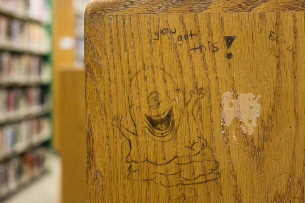
“you got this!” – Bob
Fifth-floor stacks
I can almost word-for-word quote the movie Monsters vs. Aliens – which should be in Letterboxd’s top 250 narrative films list – so I was elated to discover a drawing of the character Bob, a gelatinous blob of goo famous for his optimistic attitude and literal lack of a brain. Seth Rogen voices the comical blue monster, so I imagine if students are feeling down in the dumps in the library, reading the “you got this” writing in the instantly recognizable Rogen voice will help brighten their spirits.
Spiky skull and mermaid
Fifth-floor desks
This drawing is probably the most similar to the type of graffiti I would expect to see on the street. It’s a hodge-podge of scribbles underlying the naked body of a shrugging mermaid and a single-eyed skull with knives jutting out in four directions. Historically, the best graffiti is rebellious and layered, with artists publicly interacting with each other through the canvas, possibly never even meeting in person. The hemorrhaged-together body parts of the mermaid with the adjacent skull are goth-esque and reminiscent of Y2K grunge culture. The only way for this piece to improve is if more people drew on their own takes to expand the desk’s graffiti.
[gwh_image id=”1178162″ credit=”Lily Speredelozzi | Assistant Photo Editor” size=”post-thumbnail” align=”none” /]
Dancing parrot
Fourth floor – Undergraduate Student Reading Room
The dancing parrot offers another notable example of Gelman’s stress-induced goofiness and the fruitful result when new artists layer their creations on top of old drawings. Originally, it appears there was a pencil dinosaur drawing, which was later colored over with pen to turn into a beaked parrot. A potential third person later used a pencil to add small, stick arms with tiny circles for hands, transforming the illustration into a dancing parrot. The parrot is a magnificent encapsulation of art built upon by multiple artists, all of whom provide different visions for what the piece should be.
[gwh_image id=”1178158″ credit=”Lily Speredelozzi | Assistant Photo Editor” align=”none” size=”embedded-img”][/gwh_image]


