Krishna Rajpara | Assistant Photo Editor
This spring’s Commencement will follow the same COVID-19 safety protocols as the in-person ceremony last fall.
@import url(“https://fonts.googleapis.com/css?family=Oswald:600|Source+Serif+Pro”);
.background-image-top {
background-image: url(https://www.gwhatchet.com/wp-content/uploads/2022/03/032722_KR_cherryblossomfestival-scaled.jpg);
background-position: center center;
background-size: cover;
position: absolute;
top: 0;
left: 0;
width: 100%;
height: 110vh;
opacity: 1.0;
}
.title-text h1 {
color: #012657;
font-family: Oswald, sans-serif;
font-size: 100px;
text-align: left;
margin-left: 45px;
margin-top: 100px;
line-height: 0.9;
}
.title-text p {
color: black;
font-family: ‘Source Serif Pro’, serif;
font-size: 16px;
font-weight: 600;
text-align: left;
margin-left: 45px;
margin-top: -50px;
background-color: #80AEB2;
padding: 0.7em;
width: fit-content;
}
.sub-ban h1 {
font-family: Oswald, sans-serif;
text-align: center;
color: #033B59;
}
.landing-page a
{
color: white;
}
.landing-page
{
margin-top: 100px;
margin-bottom: 50px;
justify-content: center;
text-align: center;
}
.landing-page .grid-container-1 > p
{
font-family: ‘Oswald’, sans-serif;
font-weight: 600;
font-size: 48px;
text-align: center;
color: white;
padding: 10px;
background-color: none;
display: inline-block;
line-height: 60px;
}
.landing-page img
{
max-width: auto;
max-height: 100%;
}
.landing-page .grid-container .grid-container-1 /*grid container*/
{
margin: auto;
margin-top: 110vh;
width: 100%;
display: grid;
grid-template-columns: auto;
grid-column-gap: 30px;
grid-row-gap: 30px;
justify-content: center;
grid-template-areas:
“story1”
“story2”;
}
.landing-page .grid-container-2 /*grid container*/
{
margin: auto;
margin-top: 0;
width: 100%;
display: grid;
grid-template-columns: auto;
grid-column-gap: 30px;
grid-row-gap: 30px;
justify-content: center;
grid-template-areas:
“story3”
“story4”
“story5”
“story6”;
}
.landing-page .grid-container-3 /*grid container*/
{
margin: auto;
margin-top: 0;
width: 100%;
display: grid;
grid-template-columns: auto;
grid-column-gap: 30px;
grid-row-gap: 30px;
justify-content: center;
grid-template-areas:
“story7”
“story8”
“story9”
“story10”;
}
/*Changing title for different devices*/
/*685 px*/
@media screen and (max-width: 685px){
.title-text h1 {
font-size: 100px;
margin-left: 45px;
margin-top: 100px;
font-size: 70px;
}
}
/*414px iPhone+*/
@media screen and (max-width: 414px){
.title-text h1 {
font-size: 100px;
margin-left: 45px;
margin-top: 100px;
font-size: 47px;
}
}
/*For Laptop*/
@media screen and (min-width: 900px)
{
.background-image-top {
background-image: url(https://www.gwhatchet.com/wp-content/uploads/2022/03/032722_KR_cherryblossomfestival-scaled.jpg);
background-position: center center;
background-size: cover;
position: absolute;
top: 0;
left: 0;
right: 0;
max-width: 100%;
height: 100vh;
opacity: 0.7;
}
.title-text h1 {
font-size: 100px;
margin-left: 45px;
margin-top: 170px;
}
.sub-ban h1 {
font-family: Oswald, sans-serif;
text-align: center;
color: #033B59;
}
.landing-page .grid-container .grid-container-1 /*grid container*/
{
margin: auto;
margin-top: 100vh;
width: 75%;
display: grid;
grid-template-columns: auto auto auto;
grid-column-gap: 30px;
grid-row-gap: 30px;
justify-content: center;
grid-template-areas:
“story1 story2”;
}
.landing-page .grid-container .grid-container-2 /*grid container*/
{
margin: auto;
margin-top: 10px;
width: 75%;
display: grid;
grid-template-columns: auto auto auto;
grid-column-gap: 30px;
grid-row-gap: 30px;
justify-content: center;
grid-template-areas:
“story3 story4 story5 story6”;
}
.landing-page .grid-container .grid-container-3 /*grid container*/
{
margin: auto;
margin-top: 0;
width: 75%;
display: grid;
grid-template-columns: auto auto auto;
grid-column-gap: 30px;
grid-row-gap: 30px;
justify-content: center;
grid-template-areas:
“story7 story8 story9 story10”;
}
}
.landing-page .grid-container .grid-container-1 > div /*story boxes*/ {
font-size: 12px;
text-align: left;
width: 80vw;
height: 80vw;
position: relative;
text-align: center;
color: black;
overflow: hidden;
box-shadow: 10px 10px 0px #CBA7A7;
}
.landing-page .grid-container .grid-container-2 > div /*story boxes*/ {
font-size: 30px;
text-align: center;
width: 80vw;
height: 80vw;
position: relative;
text-align: center;
color: black;
overflow: hidden;
box-shadow: 10px 10px 0px #CBA7A7;
}
.landing-page .grid-container .grid-container-3 > div /*story boxes*/ {
font-size: 30px;
text-align: center;
width: 80vw;
height: 80vw;
position: relative;
text-align: center;
color: black;
overflow: hidden;
box-shadow: 10px 10px 0px #CBA7A7;
}
@media screen and (min-width: 900px)
{
.landing-page .grid-container .grid-container-1 > div /*story boxes*/ {
font-size: 30px;
text-align: center;
width: 20vw;
height: 20vw;
position: relative;
text-align: center;
color: black;
overflow: hidden;
}
.landing-page .grid-container .grid-container-2 > div /*story boxes*/ {
font-size: 30px;
text-align: center;
width: 20vw;
height: 20vw;
position: relative;
text-align: center;
color: black;
overflow: hidden;
}
.landing-page .grid-container .grid-container-3 > div /*story boxes*/ {
font-size: 30px;
text-align: center;
width: 20vw;
height: 20vw;
position: relative;
text-align: center;
color: black;
overflow: hidden;
}
}
.landing-page .grid-container .headline /*headline*/ {
position: absolute;
font-size: 24px;
bottom: 8px;
left: 16px;
font-family: ‘Source Serif Pro’, serif;
transition: .5s ease;
opacity: 1;
text-align: left;
background-color: #80AEB2;
padding: 5px;
}
@media screen and (min-width: 900px)
{
.landing-page .grid-container .headline /*headline*/ {
position: absolute;
font-size: 18px;
bottom: 8px;
left: 16px;
font-family: ‘Source Serif Pro’, serif;
transition: .5s ease;
opacity: 1;
text-align: left;
background-color: #80AEB2;
}
}
.landing-page .grid-container .overlay
{
position: absolute;
top: 0;
bottom: 0;
left: 0;
right: 0;
height: 100%;
width: 100%;
opacity: 0;
transition: .5s ease;
background-color: #80AEB2;
text-align: left;
}
.landing-page .grid-container .overlay-text /*excerpts*/
{
font-family: ‘Source Serif Pro’, serif;
color: black;
font-size: 25px;
position: absolute;
top: 50%;
left: 35%;
margin:0;
transform: translate(-50%, -50%);
-ms-transform: translate(-50%, -50%);
transition: .5s ease;
opacity: 0;
}
@media screen and (min-width: 900px)
{
.landing-page .grid-container .overlay-text /*excerpts*/
{
font-family: ‘Source Serif Pro’, serif;
color: white;
font-size: 18px;
position: absolute;
top: 50%;
left: 35%;
margin:0;
transform: translate(-50%, -50%);
-ms-transform: translate(-50%, -50%);
transition: .5s ease;
opacity: 0;
}
}
.landing-page .grid-item1{grid-area: story1}
.landing-page .grid-item2{grid-area: story2}
.landing-page .grid-item3{grid-area: story3}
.landing-page .grid-item4{grid-area: story4}
.landing-page .grid-item5{grid-area: story5}
.landing-page .grid-item6{grid-area: story6}
.landing-page .grid-item7{grid-area: story7}
.landing-page .grid-item8{grid-area: story8}
.landing-page .grid-item9{grid-area: story9}
.landing-page .grid-item10{grid-area: story10}
.landing-page .grid-container .grid-container-1 > div:hover .overlay
{
opacity: .95;
}
.landing-page .grid-container .grid-container-1 > div:hover .overlay-text
{
opacity: 1;
}
.landing-page .grid-container .grid-container-1 > div:hover .headline
{
opacity: 0;
}
.landing-page .grid-container .grid-container-2 > div:hover .overlay
{
opacity: .95;
}
.landing-page .grid-container .grid-container-2 > div:hover .overlay-text
{
opacity: 1;
}
.landing-page .grid-container .grid-container-2 > div:hover .headline
{
opacity: 0;
}
.landing-page .grid-container .grid-container-3 > div:hover .overlay
{
opacity: .95;
}
.landing-page .grid-container .grid-container-3 > div:hover .overlay-text
{
opacity: 1;
}
.landing-page .grid-container .grid-container-3 > div:hover .headline
{
opacity: 0;
}
}
/* This helps the page look right in the app */
body.ios header {
display: none;
}
body.ios article.post {
padding-left: 0;
padding-right: 0;
}
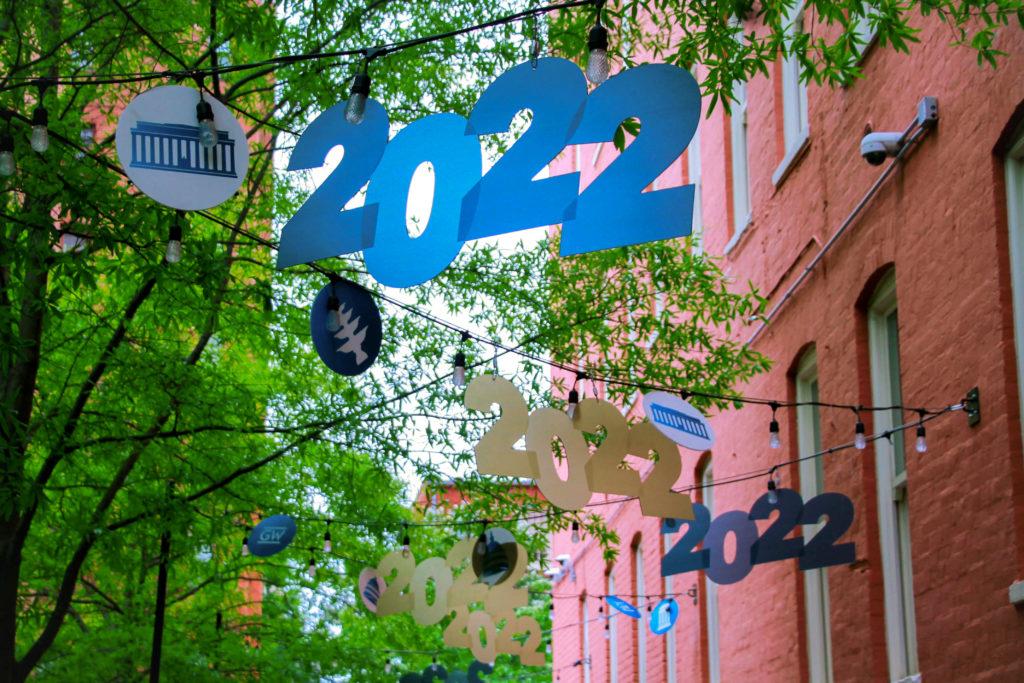
2022Commencement Guide
For the first time in three years, GW will host its traditional spring Commencement on the National Mall Sunday.Read Cover Story
Looking Ahead
The Class of 2022 shares parting advice for new students

Seniors discuss post-graduation plans
Activities & Gifts
COVID-safe destinations to take your family when they visit
Take your family to these smaller, hidden-gem museums during Commencement weekend

Support these alumni-owned businesses for graduation gifts
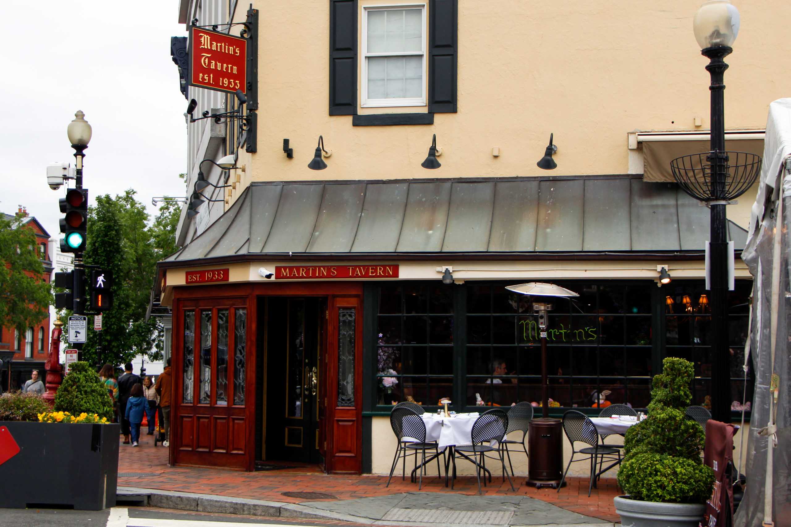
Visit these historic restaurants that will leave your family with a taste of D.C. history
Senior Reflections
Seniors share ways they incorporated their home culture into GW during their last four years
Look back on these #OnlyAtGW Moments over the past four years
“You just have to move forward:” Reflecting on seniors’ COVID college careers
This or That: Throwback pop culture trends that defined the Class of 2022’s childhood
var confettiSettings = {
“target”:”canvas”,
“max”:”180″,
“animate”:true,
“props”:[“square”,”triangle”,”line”],
“colors”:[[203,167,167],[128,174,178]],
“clock”:”10″
};
var confetti = new ConfettiGenerator(confettiSettings);
confetti.render();