
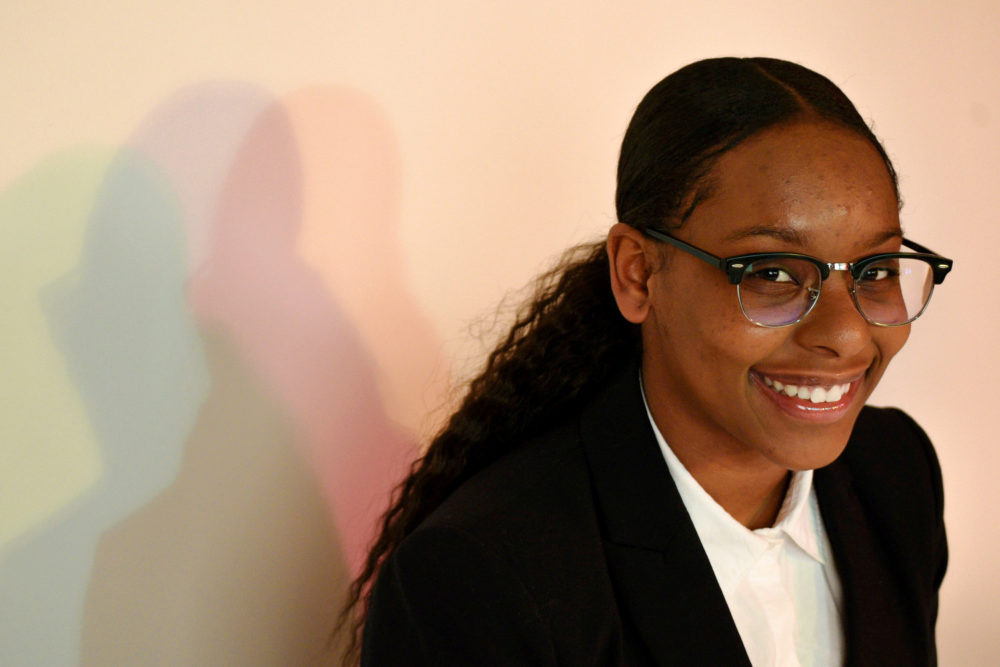
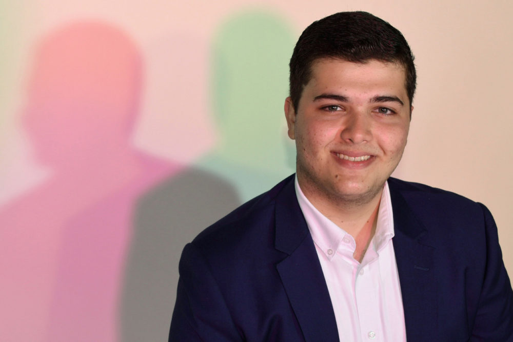
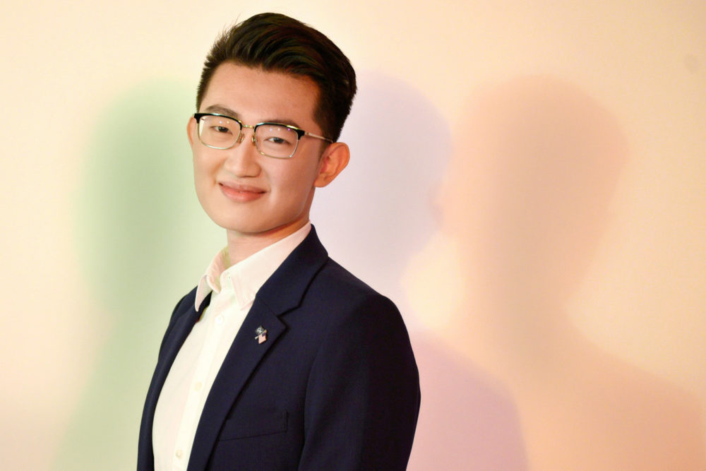
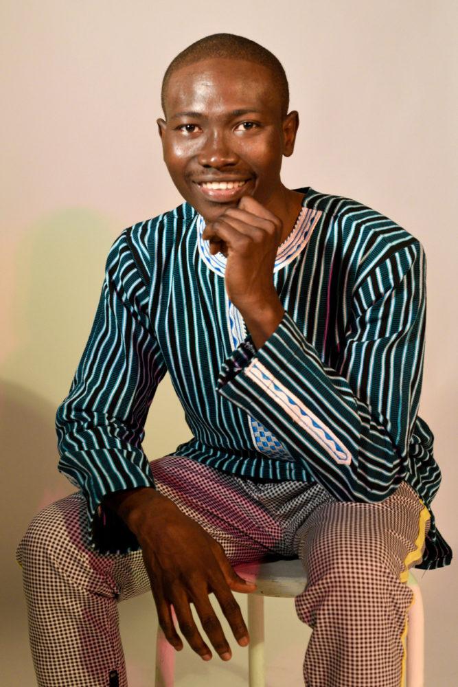
Danielle Towers | Assistant Photo Editor
This year’s Student Association races mark the first in-person elections since the pandemic, but some of the normal campaign traditions haven’t quite bounced back.
{“@context”:”http:\/\/schema.org”,”@type”:”WebSite”,”url”:”https:\/\/www.gwhatchet.com”,”name”:”The GW Hatchet”}
@import url(“https://use.typekit.net/kco7duy.css”);
@media only screen and (min-width: 650px) {
blockquote.right {
width: 40%;
margin-top: 0px;
margin-bottom: 10px;
margin-left: 30px;
margin-right: 0px;
}
}
@media only screen and (max-width: 650px) {
blockquote.right {
margin-top: -10px;
margin-bottom: 10px;
margin-left: 15px;
}
}
blockquote.right {
border-left: 4px solid #043c5b;
color: #043c5b;
font-family: bureau-grot, sans-serif;
font-weight: bold;
padding-left: 15px;
float: right;
font-style: italic;
}
blockquote > p {
padding: 0;
margin: 0;
}
@media only screen and (min-width: 650px) {
blockquote.left {
width: 40%;
margin-top: 5px;
margin-bottom: 10px;
margin-left: 15px;
margin-right: 30px;
}
}
@media only screen and (max-width: 650px) {
blockquote.left {
margin-top: -5px;
margin-bottom: 15px;
margin-left: 15px;
margin-right: 30px;
}
}
blockquote.left {
border-left: 4px solid #043c5b;
color: #043c5b;
font-family: bureau-grot, sans-serif;
font-weight: bold;
padding-left: 15px;
float: left;
font-style: italic;
}
blockquote > p {
padding: 0;
margin: 0;
}
aside {
background-color: rgb(227, 227, 227);
top: 0px;
float: right;
padding: 10px 15px 0px 15px;
width: 100%;
margin: 0px 0px 15px 0px;
color: #043c5b;
font-family: bureau-grot, Georgia, Cambria, Times New Roman, serif;
border-top: 4px solid #043c5b;
font-size: 20px;
line-height: 1em;
font-weight: bold;
}
.related:before {
content: “Related: “;
color: rgb(99, 113, 122);
font-family: bureau-grot, Georgia, Cambria, Times New Roman, serif;
}
.aside {
font-family: sans-serif;
font-size: 16px;
color: rgb(99, 113, 122);
line-height: 1.2em;
font-weight: 100;
}
.aside2 {
font-family: bureau-grot, Georgia, Cambria, Times New Roman, serif;
font-size: 16px;
color: #043c5b;
font-weight: 100;
}
aside > p {
margin: 0px 0px 10px 0px;
}
@font-face {
font-family: “CircularStd”;
src: url(“https://github.com/AaronKovacs/Hatchet-2021-SA/blob/master/fonts/LEMONMILK-Bold.otf?raw=true”) format(“opentype”);
font-weight: 900;
font-style: normal;
}
@font-face {
font-family: “CircularStd”;
src: url(“https://github.com/AaronKovacs/Hatchet-2021-SA/blob/master/fonts/LEMONMILK-Bold.otf?raw=true”) format(“opentype”);
font-weight: bold;
font-style: normal;
}
@font-face {
font-family: “CircularStd”;
src: url(“https://github.com/AaronKovacs/Hatchet-2021-SA/blob/master/fonts/CircularStd-Book.otf?raw=true”) format(“opentype”);
font-weight: 100;
font-style: normal;
}
@font-face {
font-family: “CircularStd”;
src: url(“https://github.com/AaronKovacs/Hatchet-2021-SA/blob/master/fonts/LEMONMILK-Medium.otf?raw=true”) format(“opentype”);
font-weight: 400;
font-style: normal;
}
html, body {
background-color: transparent;
}
@import url(“https://fonts.googleapis.com/css?family=Source+Sans+Pro:400,700”);
.basketball-guide-2017-container {
max-width: 1200px;
text-align: center;
font-family: “bureau-grot”, “Cambria”, “Georgia”, serif;
margin: 1rem auto
}
.basketball-guide-2017-container * {
box-sizing: border-box
}
.basketball-guide-2017-container a:link {
text-decoration: none
}
.basketball-guide-2017-container h1 {
font-size: 2rem;
font-family: “bureau-grot”, “Segoe UI”, “Helvetica Neue”, “Helvetica”, sans-serif;
text-transform: uppercase;
background-color: #eb6123;
color: white;
padding: 0.5rem 0;
margin: 0.5rem 0
}
h2 {
font-size: 2rem;
font-family: “bureau-grot”, “Segoe UI”, “Helvetica Neue”, “Helvetica”, sans-serif;
text-transform: uppercase;
color: black;
padding: 0.5rem 0;
margin: 0.5rem 0
}
.basketball-guide-2017-container header.guide-header img {
width: 99%;
max-height: 450px;
object-fit: cover;
object-position: center top;
}
.basketball-guide-2017-container header.guide-header .cover-story {
max-width: 900px;
margin: 0 auto;
color: black
}
.basketball-guide-2017-container header.guide-header .cover-story h2.big-headline {
font-size: 24pt;
margin: 0.1rem 0 0.1rem 0;
font-family: “bureau-grot”, “Segoe UI”, “Helvetica Neue”, “Helvetica”, sans-serif;
text-transform: uppercase;
color: #eb6123
}
.basketball-guide-2017-container header.guide-header .cover-story p.big-subheadline {
font-size: 18pt;
margin: -0.25rem 0 0rem 0;
font-family: “bureau-grot”, “Segoe UI”, “Helvetica Neue”, “Helvetica”, sans-serif;
color: #FFF;
}
.basketball-guide-2017-container header.guide-header .cover-story p.big-excerpt {
margin-top: 0.0rem;
font-size: 14pt;
color: #FFF;
}
@media screen and (max-width: 500px) {
.basketball-guide-2017-container header.guide-header .cover-story h2.big-headline {
font-size: 2rem;
line-height: 2rem
}
.basketball-guide-2017-container header.guide-header .cover-story p.big-subheadline {
font-size: 1.5rem
}
.basketball-guide-2017-container header.guide-header .cover-story p.big-excerpt,
.basketball-guide-2017-container header.guide-header .cover-story p.read-button span {
font-size: 1rem
}
}
.basketball-guide-2017-container section.guide-section {
margin-bottom: 2rem
}
.basketball-guide-2017-container section.guide-section header h3 {
font-size: 2rem;
font-family: “bureau-grot”, “Segoe UI”, “Helvetica Neue”, “Helvetica”, sans-serif;
text-transform: uppercase;
background-color: #eb6123;
color: white;
padding: 0.5rem 0;
margin: 0.5rem 0.5rem;
}
.basketball-guide-2017-container section.guide-section section.row {
display: flex;
flex-direction: row;
flex-wrap: wrap
}
.basketball-guide-2017-container .story-box {
flex-grow: 1;
height: 400px;
display: block;
overflow: hidden;
position: relative;
flex-shrink: 0;
flex-basis: 0;
min-width: 300px
}
@media screen and (max-width: 500px) {
.basketball-guide-2017-container .story-box {
min-width: calc(100% – 1rem)
}
}
.basketball-guide-2017-container .story-box img {
width: 100%;
height: 100%;
object-fit: cover;
object-position: center bottom;
}
.mobile-cover {
display: none;
}
@media screen and (max-width: 1100px) {
.guide-header {
display: none;
}
.mobile-cover {
display: block;
}
}
div.caption h4 {
width: 100%;
position: absolute;
bottom: 0;
color: white;
background-color: #eb6123;
padding: 0.25rem 0.5rem;
font-size: 1.5rem;
text-align: right;
max-width: 75%;
position: absolute;
right: 0;
bottom: 0;
text-align: left;
display: none;
bottom: 0;
}
.basketball-guide-2017-container .story-box div.blurb {
width: 100%;
position: absolute;
bottom: 0;
color: white
}
.basketball-guide-2017-container .story-box div.blurb h4,
.basketball-guide-2017-container .story-box div.blurb p.description {
background-color: #1b3d25;
padding: 0.25rem 0.5rem
}
.basketball-guide-2017-container .story-box div.blurb h4 {
font-size: 1.5rem;
margin: 2rem 0;
text-align: right;
max-width: 75%;
position: absolute;
right: 0;
bottom: 0
}
.basketball-guide-2017-container .story-box div.blurb p.description {
text-align: left;
display: none;
max-width: 75%
}
.basketball-guide-2017-container p.read-button span {
background-color: #eb6123;
color: white;
text-transform: uppercase;
display: inline-block;
padding: 0.5rem 1rem;
font-family: “bureau-grot”, “Segoe UI”, “Helvetica Neue”, “Helvetica”, sans-serif;
font-weight: bold;
font-size: 1.25rem
}
body.ios header {
display: none
}
body.ios .basketball-guide-2017-container header {
display: block
}
body.ios article.post {
padding-left: 0;
padding-right: 0
}
@font-face {
font-family: ‘FEAFS’;
src: url(‘https://aaronkovacs.github.io/Hatchet-2019-Halloween-Landing-Page/FEASFBRG.TTF’) format(‘truetype’);
}
.modal {
width: 30%;
height: 80%;
margin-top: 4%;
margin-right: 32px;
background-color: #000;
text-align: center;
float: right;
padding: 16px 16px 32px 16px;
}
.overlay {
position: absolute;
bottom: 0;
background: rgb(0, 0, 0);
background: rgba(0, 0, 0, 0.5); /* Black see-through */
color: #f1f1f1;
width: 100%;
/*height: 100%;*/
transition: .5s ease;
opacity:0;
color: white;
font-size: 20px;
text-align: center;
}
.blurb {
transition: .5s ease;
}
.story-box:hover .overlay {
opacity: 1;
}
.story-box:hover .blurb:not(:hover) {
opacity: 0;
}
.cover-header {
display: block;
}
.header-title {
text-transform: uppercase;
color: white;
padding: 0.5rem 0;
margin: 0;
font-size: 30pt;
font-weight: bold;
font-family: “bureau-grot”, “Cambria”, “Georgia”, serif;
margin-top: -0.4em;
color: #000;
}
.header-subtitle {
text-transform: uppercase;
color: white;
padding: 0.5rem 0;
padding-top: 0.5em;
margin: 0;
font-size: 15pt;
font-weight: 600;
font-family: “bureau-grot”, “Cambria”, “Georgia”, serif;
color: #000;
}
.red-bar {
background: #1b3d25;
height: 8px;
max-width: 600px;
margin-left: auto;
margin-right: auto;
}
.story-box {
margin: 0.0rem 0.0rem;
border-style: solid;
border-width: 5px;
border-color: black;
}
.guide-section {
width: 800px;
margin-left: auto;
margin-right: auto;
}
@media screen and (max-width: 700px) {
.guide-section {
width: 95%;
}
.red-bar {
width: 95%;
}
}
.item-container {
width: 100%;
overflow: hidden;
background-color: #5EB59A;
padding-bottom: 1em;
margin-bottom: 2em;
border-radius: 16px;
}
.item-left {
width: 100%;
height: 100%;
}
.item-right {
width: 100%;
}
.item-image {
width: auto;
height: 100%;
object-fit: cover;
overflow: hidden;
}
.item-quote {
color: black;
margin-top: 1.5em;
padding-left: 16px;
padding-right: 16px;
font-size: 12pt;
}
.guide-header-title {
font-family: ‘CircularStd’;
font-size: 30pt;
font-weight: 900;
margin: 0;
}
.guide-header-subtitle {
font-family: ‘CircularStd’;
font-size: 25pt;
font-weight: 900;
margin: 0;
}
.guide-header-body {
font-family: ‘CircularStd’;
font-size: 16pt;
font-weight: 100;
margin: 0;
margin-top: 0.5em;
}
@media only screen and (max-width: 800px) {
.guide-header-title {
font-size: 30pt;
}
.guide-header-subtitle {
font-size: 25pt;
}
.guide-header-body {
font-size: 14pt;
}
}
.guide-header-read-more {
font-family: ‘CircularStd’;
font-size: 16pt;
font-weight: 300;
margin: 0;
padding-bottom: 0.1em;
background-color: #1D6951;
padding-left: 15px;
padding-right: 15px;
padding-top: 10px;
padding-bottom: 10px;
color: white;
display: inline-block;
width: auto;
margin-top: 1em;
border-radius: 8px;
transition-property: opacity;
transition-duration: 0.5s;
transition-timing-function: linear;
transition-delay: 0s;
}
.guide-header-read-more:hover {
opacity: 0.5;
}
.guide-section-header {
text-align: left;
}
.guide-section-header-title {
font-family: ‘CircularStd’;
font-size: 25pt;
font-weight: 900;
margin: 0;
padding-bottom: 0.1em;
}
.guide-section-header-subtitle {
font-family: ‘CircularStd’;
font-size: 16pt;
font-weight: 300;
margin: 0;
padding-bottom: 0.5em;
margin-bottom: 0.5em;
}
@media only screen and (max-width: 450px) {
.guide-section-header-title {
font-size: 20pt;
}
.guide-section-header-subtitle {
font-size: 10pt;
}
}
.guide-section-header-divider {
height: 10px;
background-color: black;
width: 100%;
margin-bottom: 1em;
box-shadow: 0 4px 8px 0 rgba(0, 0, 0, 0.2), 0 6px 20px 0 rgba(0, 0, 0, 0.19);
}
.carousel-container {
width: 100vw;
padding-left: calc((100% – 800px) / 2);
left: 0;
position: absolute;
padding-top: 1em;
padding-bottom: 1em;
margin-bottom: 1em;
overflow-x: scroll;
display: flex;
-ms-overflow-style: none; /* Internet Explorer 10+ */
scrollbar-width: none;
}
.carousel-card {
margin-right: 1.5em;
margin-bottom: 2em;
display: inline-block;
width: 100%;
height: 300px;
border-radius: 16px;
overflow: hidden;
background-color: #5EB59A;
box-shadow: 0 4px 8px 0 rgba(82, 142, 255, 0.2), 0 6px 20px 0 rgba(82, 142, 255, 0.19);
}
.carousel-content {
text-align: left;
margin-right: 1em;
}
.carousel-image {
width: 300px;
height: 100%;
object-fit: cover;
float: left;
margin-right: 1em;
object-position: 0% 0%;
}
.carousel-card-header {
background-color: #1D6951;
width: 100%;
margin-bottom: 1.5em;
color: white;
font-family: ‘CircularStd’;
font-size: 20pt;
font-weight: 900;
text-align: left;
padding-top: 0.25em;
padding-bottom: 0.25em;
}
.carousel-card-title {
font-family: ‘CircularStd’;
font-size: 25pt;
font-weight: 900;
margin: 0;
padding-bottom: 0.1em;
}
.carousel-card-title-smaller {
font-size: 22pt;
}
.carousel-card-subtitle {
font-family: ‘CircularStd’;
font-size: 12pt;
font-weight: 300;
margin: 0;
padding-bottom: 0.1em;
border-radius: 4px;
background-color: #1D6951;
padding: 5px;
color: white;
display: inline-block;
width: auto;
margin-bottom: 1em;
}
.carousel-card-body {
font-family: ‘CircularStd’;
font-size: 12pt;
font-weight: 100;
margin: 0;
padding-bottom: 0.5em;
}
.carousel-card-body-smaller {
font-size: 10pt;
}
.carousel-card-link {
font-family: ‘CircularStd’;
font-size: 12pt;
font-weight: 400;
margin: 0;
margin-top: auto;
color: #1D6951;
}
.carousel-width-spacer {
display: inline-block;
min-width: 600px;
}
.carousel-height-spacer {
margin-bottom: 750px;
}
.carousel-vp-spacer {
margin-top: 350px;
}
@media only screen and (max-width: 800px) {
.carousel-card-header {
font-size: 18pt;
}
.carousel-container {
padding-left: 0.75em;
}
.carousel-card {
min-width: 400px;
}
.carousel-card-title {
font-size: 18pt;
}
.carousel-card-title-smaller {
font-size: 18pt;
}
.carousel-card-subtitle {
font-size: 10pt;
}
.carousel-card-body {
font-size: 10pt;
}
.carousel-card-body-smaller {
font-size: 10pt;
}
.carousel-card-link {
font-size: 10pt;
}
.carousel-width-spacer {
min-width: 100px;
}
}
@media only screen and (max-width: 450px) {
.carousel-card-header {
margin-bottom: 0.5em;
}
.carousel-image {
width: 150px;
}
.carousel-card {
min-width: 350px;
height: 250px;
}
.carousel-height-spacer {
margin-bottom: 610px;
}
.carousel-vp-spacer {
margin-top: 280px;
}
}
@media only screen and (max-width: 380px) {
.carousel-card-header {
font-size: 14pt;
}
.carousel-card-title {
font-size: 14pt;
}
.carousel-card-title-smaller {
font-size: 14pt;
}
.carousel-card-header {
margin-bottom: 0.5em;
}
.carousel-image {
width: 130px;
}
.carousel-card {
min-width: 315px;
height: 220px;
}
.carousel-height-spacer {
margin-bottom: 550px;
}
.carousel-vp-spacer {
margin-top: 250px;
}
}
@media only screen and (max-width: 325px) {
.carousel-card-header {
font-size: 12pt;
}
.carousel-card-title {
font-size: 12pt;
}
.carousel-card-title-smaller {
font-size: 12pt;
}
.carousel-card-subtitle {
font-size: 8pt;
}
.carousel-card-body {
font-size: 7pt;
}
.carousel-card-body-smaller {
font-size: 7pt;
}
.carousel-card-link {
font-size: 7pt;
}
.carousel-card-header {
margin-bottom: 0.5em;
}
.carousel-image {
width: 120px;
}
.carousel-card {
min-width: 270px;
height: 200px;
}
.carousel-height-spacer {
margin-bottom: 490px;
}
.carousel-vp-spacer {
margin-top: 220px;
}
}
.guide-news-card {
width: 100%;
height: 200px;
margin-bottom: 1em;
}
.guide-news-content {
text-align: left;
margin-right: 1em;
height: 200px;
}
.guide-news-image {
width: 200px;
height: 100%;
object-fit: cover;
float: left;
margin-right: 1em;
background-color: black;
}
@media only screen and (max-width: 800px) {
.guide-news-image {
float: none;
width: 100%;
margin-top: 1em;
margin-bottom: 0.5em;
}
.guide-news-card {
height: auto;
}
}
.guide-news-card-header {
background-color: black;
width: 100%;
margin-bottom: 1em;
color: white;
font-family: ‘CircularStd’;
font-size: 20pt;
font-weight: 900;
text-align: left;
padding-top: 0.25em;
padding-bottom: 0.25em;
}
.guide-news-card-title {
font-family: ‘CircularStd’;
font-size: 20pt;
font-weight: 900;
margin: 0;
padding-bottom: 0.1em;
}
@media only screen and (max-width: 800px) {
.guide-news-card-title {
font-size: 20pt;
}
.guide-news-content {
height: auto;
}
}
@media only screen and (max-width: 450px) {
.guide-news-card-title {
font-size: 16pt;
}
}
.guide-news-card-subtitle {
font-family: ‘CircularStd’;
font-size: 12pt;
font-weight: 300;
margin: 0;
padding-bottom: 0.1em;
color: black;
width: auto;
margin-bottom: 1em;
display: inline-block;
margin-left: 0.5em;
}
.guide-news-card-subtitle-block {
font-family: ‘CircularStd’;
font-size: 12pt;
font-weight: 300;
margin: 0;
background-color: #1D6951;
border-radius: 4px;
padding: 5px;
color: white;
display: inline-block;
width: auto;
}
.guide-news-card-body {
font-family: ‘CircularStd’;
font-size: 12pt;
font-weight: 100;
margin: 0;
padding-bottom: 0.5em;
}
.endorsements-container {
background-color: #5EB59A;
border-radius: 16px;
width: 100%;
margin-bottom: 1em;
padding-top: 0.25em;
padding-bottom: 0.25em;
box-shadow: 0 4px 8px 0 rgba(95, 158, 255, 0.2), 0 6px 20px 0 rgba(95, 158, 255, 0.19);
}
.endorsements-card-left {
margin-top: 2em;
margin-bottom: 2em;
margin-left: 2em;
margin-right: 1em;
width: calc(100% / 2 – 3em);
border-radius: 16px;
overflow: hidden;
background-color: white;
display: inline-block;
}
.endorsements-card-right {
float: right;
margin-top: 2em;
border-radius: 16px;
overflow: hidden;
margin-bottom: 2em;
margin-left: 1em;
margin-right: 2em;
width: calc(100% / 2 – 3em);
background-color: white;
}
.endorsements-guide-op-card {
background-color: white;
padding: 1em;
margin: 2em;
margin-top: 0;
}
@media only screen and (max-width: 800px) {
.endorsements-card-left {
float: none;
width: calc(100% – 2em);
margin-left: 1em;
margin-right: 1em;
margin-top: 1em;
margin-bottom: 1em;
}
.endorsements-card-right {
float: none;
width: calc(100% – 2em);
margin-left: 1em;
margin-right: 1em;
margin-top: 0em;
margin-bottom: 1em;
}
.endorsements-guide-op-card {
margin: 1em;
}
}
.endorsements-card-content {
padding: 1em;
}
.endorsements-image {
width: 100%;
height: 300px;
object-fit: cover;
object-position: 0% 0%;
}
.endorsements-title {
font-family: ‘CircularStd’;
font-size: 18pt;
font-weight: 900;
margin: 0;
padding-bottom: 0.1em;
}
.endorsements-subtitle {
font-family: ‘CircularStd’;
font-size: 12pt;
font-weight: 300;
border-radius: 4px;
margin: 0;
padding-bottom: 0.1em;
background-color: #1D6951;
padding: 5px;
color: white;
display: inline-block;
width: auto;
margin-bottom: 0.5em;
}
.endorsements-body {
font-family: ‘CircularStd’;
font-size: 12pt;
font-weight: 100;
margin: 0;
padding-bottom: 0.5em;
}
.endorsements-link {
font-family: ‘CircularStd’;
font-size: 12pt;
font-weight: 400;
margin: 0;
margin-top: auto;
color: #1D6951;
padding: 0.1em;
border-radius: 4px;
}
.endorsements-op-title {
font-size: 20pt;
}
@media only screen and (max-width: 450px) {
.endorsements-title {
font-size: 18pt;
}
.endorsements-op-title {
font-size: 16pt;
}
}
.guide-header-background {
position: absolute;
top: 0;
left: 0;
width: 100vw;
background: rgb(148,38,38);
background: linear-gradient(180deg, rgba(148,38,38,1) 0%, rgba(237,114,159,0) 100%);
height: 600px;
z-index: -1;
}
.guide-header-image {
background-color: clear;
z-index: 5;
width: 100%;
height: 500px;
object-fit: contain;
}
.guide-header-image-mobile {
display: none;
width: 100%;
height: 450px;
padding-bottom: 4em;
object-fit: contain;
}
a {
color: black;
}
::-webkit-scrollbar {
width: 0px; /* Remove scrollbar space */
background: transparent; /* Optional: just make scrollbar invisible */
}
logo-slider {
–image-height: 250px;
–image-width: 350px;
border: none;
padding: 20px;
overflow: hidden;
max-width: 100%;
width: 100%;
margin: 0 auto;
position: relative;
display: flex;
}
logo-slider div {
display: flex;
position: relative;
animation: marquee 25s linear infinite;
justify-content: space-around;
}
logo-slider img {
display: block;
min-width: var(–image-width);
height: var(–image-height);
margin: 0 1vw;
border-radius: 8px;
overflow: hidden;
}
logo-slider:after {
content: “”;
position: absolute;
width: 100%;
height: 100%;
left: 0;
top: 0;
background: rgb(219,209,251);
background: linear-gradient(0deg, rgba(219,209,251,1) 0%, rgba(94,21,255,1) 100%);
background: transparent;
}
@media (max-width: 900px) {
logo-slider {
–image-size: 50px;
–image-size: min(max(50px, 10vw), 100px);
}
}
@keyframes marquee {
0% {
transform: translateX(0%);
}
100% {
transform: translateX(-100%);
}
}
body {
background-color: rgba(237,114,159,0.2);
}
.pres-he {
object-position: 10% 10%;
}
.pres-cw {
object-position: 15% 10%;
}
.pres-ca {
object-position: 0% 10%;
}
.pres-bh {
object-position: 15% 10%;
}
.pres-kc {
}
.issue-link {
width: fit-content;
margin-left: auto;
margin-right: auto;
}
@media only screen and (max-width: 450px) {
.pres-he {
object-position: 25% 10%;
}
.pres-cw {
object-position: 30% 10%;
}
.pres-ca {
object-position: 15% 10%;
}
.pres-bh {
object-position: 25% 10%;
}
.pres-kc {
object-position: 35% 10%;
}
}


The Hatchet’s
2022 SA Elections Guide
Here’s what you need to know for election day Tuesday and Wednesday as students vote for senate, presidential and vice presidential candidates.
Read the Cover Story
Candidates for President
There are two candidates running for SA’s top spot this year.
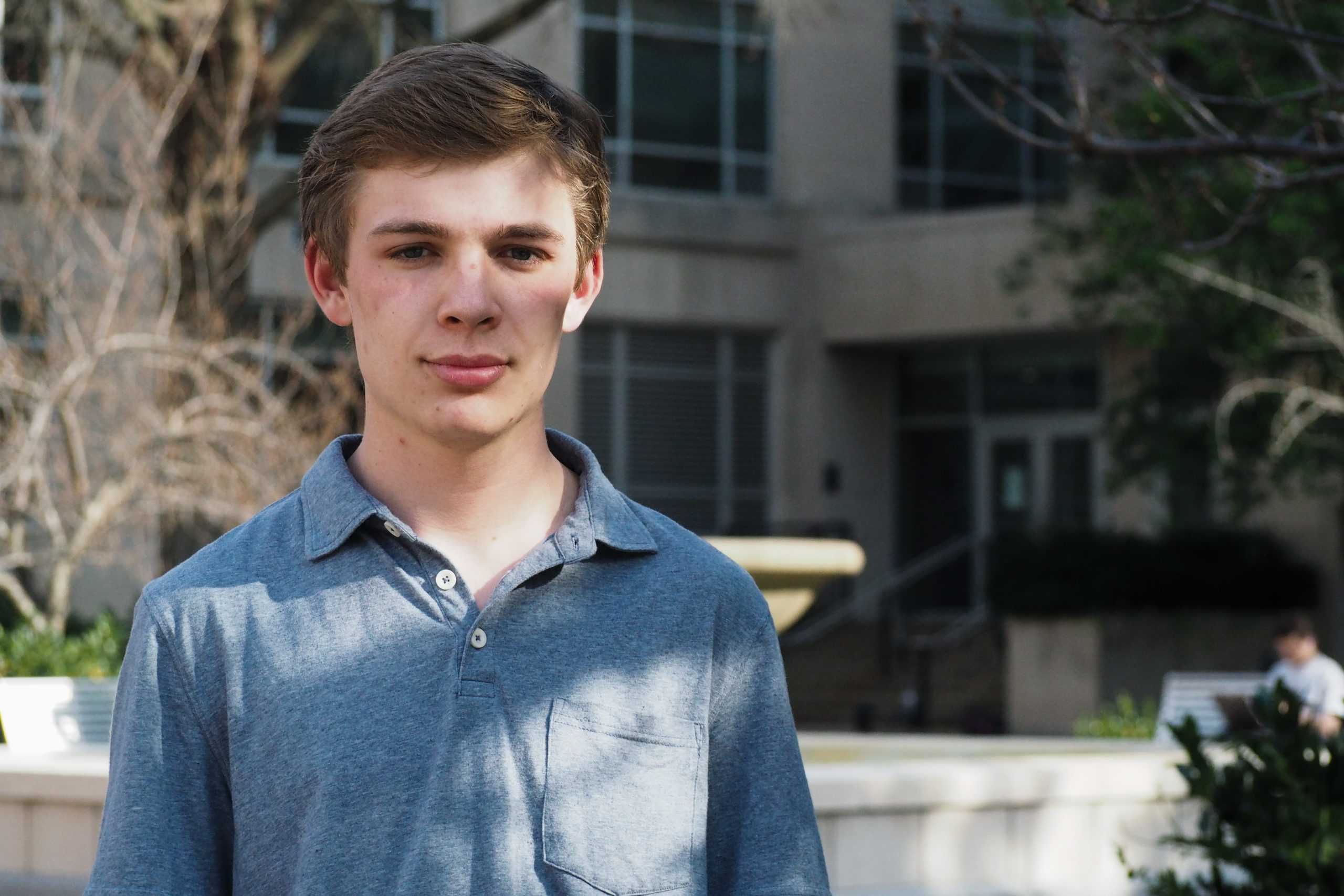
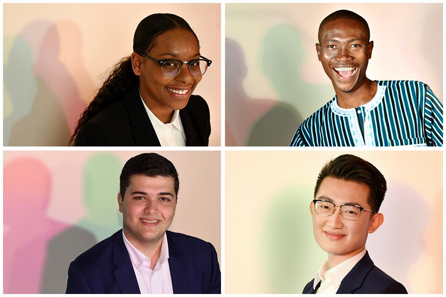
Christian Zidouemba
Senior
Zidouemba plans to work to ensure that GW’s new unlimited dining plan will offer international food options in its three all-you-can-eat dining halls.
Read Full Bio
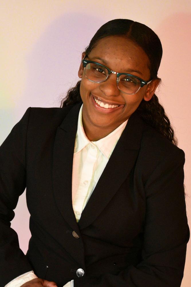
Dasia Bandy
Sophomore
Bandy was the first to run for SA president with a platform to ramp up inclusion initiatives and increase accessibility of technology and health resource.
Read Full Bio
Candidates for Vice President
There are two candidates running for executive vice president this year.

Alfredo Granados
Sophomore
Granados said he will work with the senate’s finance committee to advocate for a more equitable distribution of funds to student organizations.
Read Full Bio
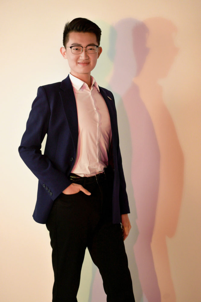
Yan Xu
Sophomore
Xu said securing funding for student organizations has pushed him to continue his advocacy in the vice president role.
Read Full Bio
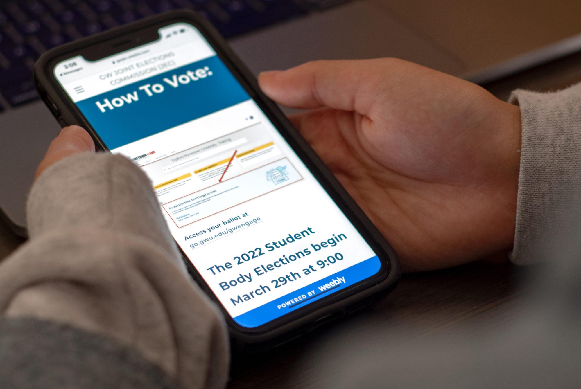
Here’s what you need to know before SA election day
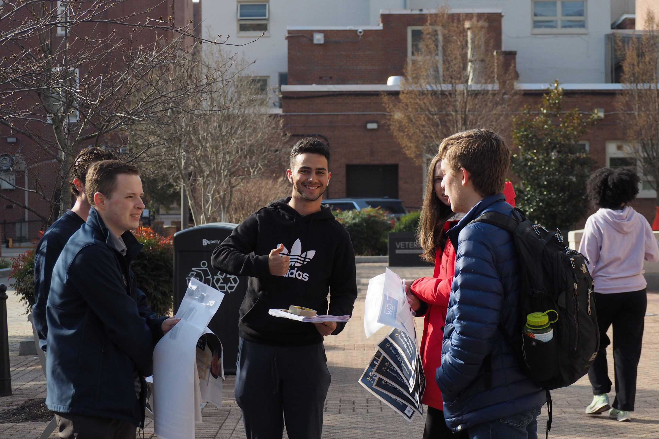
This year’s campaign season – the first one held in-person since 2019 – was marked by a record-low number of candidates and sparse campaigning efforts.
By Erika Filter and Tara Suter
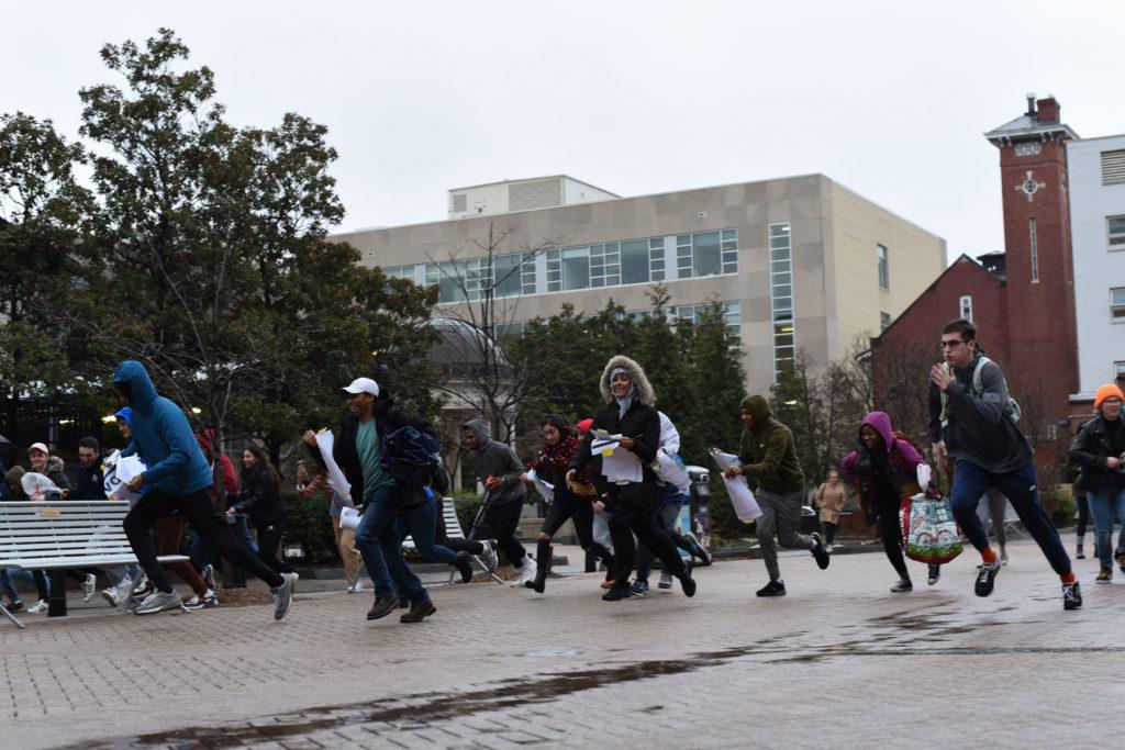
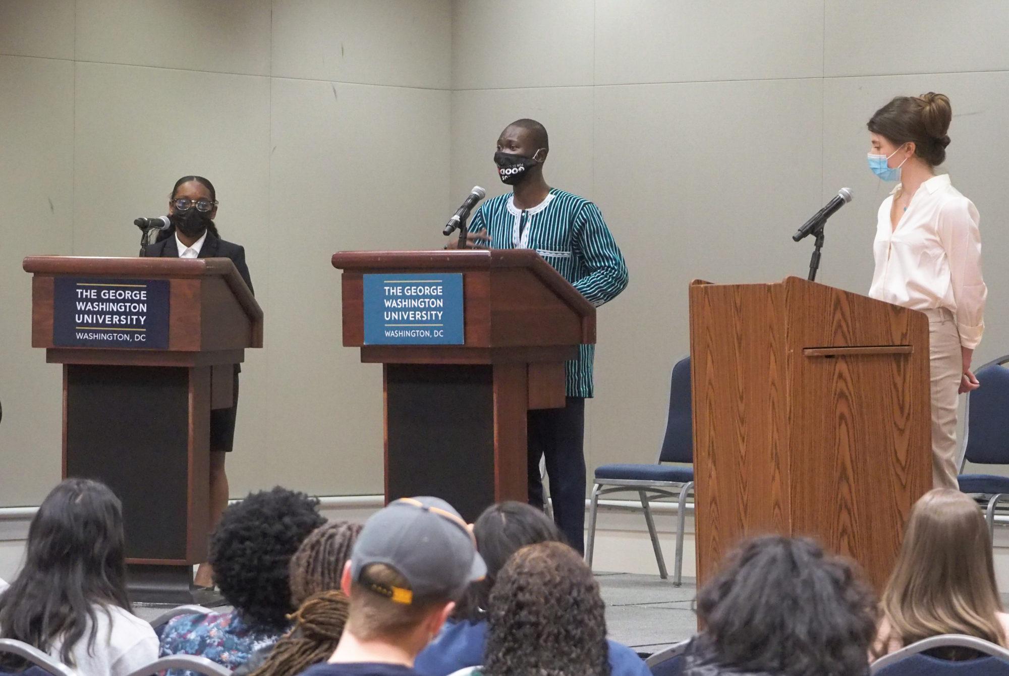
Photo essay: This year’s low-profile SA campaign
Just two candidates showed up to the start of this year’s SA postering day, a kickoff event that used to be a literal race between campaigns.
By Grace Hromin
JEC worked to ramp up messaging, support in-person campaigning during election season
JEC chair Trip Johnson said he expects more than 5,000 students to vote inthe SA’s first in-person election season in three years.
By Henry Huvos
SA campaign teams strategize for first fully in-person campaign in three years
Several candidates broke from SA election season tradition, opting to run without a campaign staff to help rally votes in a quiet election.
By Ianne Salvosa and Nikki Ghaemi
Fact check: Assessing candidates’ policy ideas
Many of the candidates hope to expand the role of the SA, but a number of those plans are sparse on details for how they plan to achieve them.
By Isha Trivedi and Jared Gans
Getting to the Bottom of It: What you need to know about the 2022 Student Association elections
Host Sejal Govindarao speaks with student government editor Lauren Sforza on what to know for the upcoming Student Association elections.
By Sejal Govindarao
Hatchet Editorial Board Endorsements
The Hatchet’s editorial board – a group of opinion writers and staff members on Hatchet staff who are not affiliated with the news section – interviewed all presidential and executive vice president candidates about their platforms in March. Here’s who they decided to endorse for each position.
Read “Why the Editorial Board makes SA endorsements”
For President
Dasia Bandy
One candidate brings a perfect fusion of passion and policy to the table. Students should vote for Dasia Bandy for SA president this year.
Read the endorsement
For Vice President
Alfredo Granados
Granados exhibited a unique passion for advocating for students whose voices need to be heard, combined with the experience needed to be effective.
Read Opinion Piece