Krishna Rajpara | Photographer
{“@context”:”http:\/\/schema.org”,”@type”:”WebSite”,”url”:”https:\/\/www.gwhatchet.com”,”name”:”The GW Hatchet”}
@import url(“https://use.typekit.net/kco7duy.css”);
@media only screen and (min-width: 650px) {
blockquote.right {
width: 40%;
margin-top: 0px;
margin-bottom: 10px;
margin-left: 30px;
margin-right: 0px;
}
}
@media only screen and (max-width: 650px) {
blockquote.right {
margin-top: -10px;
margin-bottom: 10px;
margin-left: 15px;
}
}
blockquote.right {
border-left: 4px solid #043c5b;
color: #043c5b;
font-family: bureau-grot, sans-serif;
font-weight: bold;
padding-left: 15px;
float: right;
font-style: italic;
}
blockquote > p {
padding: 0;
margin: 0;
}
@media only screen and (min-width: 650px) {
blockquote.left {
width: 40%;
margin-top: 5px;
margin-bottom: 10px;
margin-left: 15px;
margin-right: 30px;
}
}
@media only screen and (max-width: 650px) {
blockquote.left {
margin-top: -5px;
margin-bottom: 15px;
margin-left: 15px;
margin-right: 30px;
}
}
blockquote.left {
border-left: 4px solid #043c5b;
color: #043c5b;
font-family: bureau-grot, sans-serif;
font-weight: bold;
padding-left: 15px;
float: left;
font-style: italic;
}
blockquote > p {
padding: 0;
margin: 0;
}
aside {
background-color: rgb(227, 227, 227);
top: 0px;
float: right;
padding: 10px 15px 0px 15px;
width: 100%;
margin: 0px 0px 15px 0px;
color: #043c5b;
font-family: bureau-grot, Georgia, Cambria, Times New Roman, serif;
border-top: 4px solid #043c5b;
font-size: 20px;
line-height: 1em;
font-weight: bold;
}
.related:before {
content: “Related: “;
color: rgb(99, 113, 122);
font-family: bureau-grot, Georgia, Cambria, Times New Roman, serif;
}
.aside {
font-family: sans-serif;
font-size: 16px;
color: rgb(99, 113, 122);
line-height: 1.2em;
font-weight: 100;
}
.aside2 {
font-family: bureau-grot, Georgia, Cambria, Times New Roman, serif;
font-size: 16px;
color: #043c5b;
font-weight: 100;
}
aside > p {
margin: 0px 0px 10px 0px;
}
@font-face {
font-family: ‘junegill’;
src: url(‘https://github.com/AaronKovacs/Hatchet-2021-Orientation-Guide/blob/master/junegull.ttf?raw=true’) format(‘truetype’);
}
html, body {
background-color: #FFF;
}
@import url(“https://fonts.googleapis.com/css?family=Source+Sans+Pro:400,700”);
.basketball-guide-2017-container {
max-width: 1200px;
text-align: center;
font-family: “bureau-grot”, “Cambria”, “Georgia”, serif;
margin: 1rem auto
}
.basketball-guide-2017-container * {
box-sizing: border-box
}
.basketball-guide-2017-container a:link {
text-decoration: none
}
.basketball-guide-2017-container h1 {
font-size: 2rem;
font-family: “bureau-grot”, “Segoe UI”, “Helvetica Neue”, “Helvetica”, sans-serif;
text-transform: uppercase;
background-color: #eb6123;
color: white;
padding: 0.5rem 0;
margin: 0.5rem 0
}
h2 {
font-size: 2rem;
font-family: “bureau-grot”, “Segoe UI”, “Helvetica Neue”, “Helvetica”, sans-serif;
text-transform: uppercase;
color: black;
padding: 0.5rem 0;
margin: 0.5rem 0
}
.basketball-guide-2017-container header.guide-header img {
width: 99%;
max-height: 450px;
object-fit: cover;
object-position: center top;
}
.basketball-guide-2017-container header.guide-header .cover-story {
max-width: 900px;
margin: 0 auto;
color: black
}
.basketball-guide-2017-container header.guide-header .cover-story h2.big-headline {
font-size: 24pt;
margin: 0.1rem 0 0.1rem 0;
font-family: “junegill”, “Segoe UI”, “Helvetica Neue”, “Helvetica”, sans-serif;
text-transform: uppercase;
color: #eb6123
}
.basketball-guide-2017-container header.guide-header .cover-story p.big-subheadline {
font-size: 18pt;
margin: -0.25rem 0 0rem 0;
font-family: “bureau-grot”, “Segoe UI”, “Helvetica Neue”, “Helvetica”, sans-serif;
color: #FFF;
}
.basketball-guide-2017-container header.guide-header .cover-story p.big-excerpt {
margin-top: 0.0rem;
font-size: 14pt;
color: #FFF;
}
@media screen and (max-width: 500px) {
.basketball-guide-2017-container header.guide-header .cover-story h2.big-headline {
font-size: 2rem;
line-height: 2rem
}
.basketball-guide-2017-container header.guide-header .cover-story p.big-subheadline {
font-size: 1.5rem
}
.basketball-guide-2017-container header.guide-header .cover-story p.big-excerpt,
.basketball-guide-2017-container header.guide-header .cover-story p.read-button span {
font-size: 1rem
}
}
.basketball-guide-2017-container section.guide-section {
margin-bottom: 2rem
}
.basketball-guide-2017-container section.guide-section header h3 {
font-size: 2rem;
font-family: “bureau-grot”, “Segoe UI”, “Helvetica Neue”, “Helvetica”, sans-serif;
text-transform: uppercase;
background-color: #eb6123;
color: white;
padding: 0.5rem 0;
margin: 0.5rem 0.5rem;
}
.basketball-guide-2017-container section.guide-section section.row {
display: flex;
flex-direction: row;
flex-wrap: wrap
}
.basketball-guide-2017-container .story-box {
flex-grow: 1;
height: 400px;
display: block;
overflow: hidden;
position: relative;
flex-shrink: 0;
flex-basis: 0;
min-width: 300px
}
@media screen and (max-width: 500px) {
.basketball-guide-2017-container .story-box {
min-width: calc(100% – 1rem)
}
}
.basketball-guide-2017-container .story-box img {
width: 100%;
height: 100%;
object-fit: cover;
object-position: center bottom;
}
.mobile-cover {
display: none;
}
@media screen and (max-width: 1100px) {
.guide-header {
display: none;
}
.mobile-cover {
display: block;
}
}
div.caption h4 {
width: 100%;
position: absolute;
bottom: 0;
color: white;
background-color: #ffd700;
padding: 0.25rem 0.5rem;
font-size: 1.5rem;
text-align: right;
max-width: 75%;
position: absolute;
right: 0;
bottom: 0;
text-align: left;
display: none;
bottom: 0;
}
.basketball-guide-2017-container .story-box div.blurb {
width: 100%;
position: absolute;
bottom: 0;
color: black;
}
.basketball-guide-2017-container .story-box div.blurb h4,
.basketball-guide-2017-container .story-box div.blurb p.description {
background-color: #ffd700;
padding: 0.25rem 0.5rem
}
.basketball-guide-2017-container .story-box div.blurb h4 {
font-size: 1.5rem;
margin: 2rem 0;
text-align: right;
max-width: 75%;
position: absolute;
right: 0;
bottom: 0
}
.basketball-guide-2017-container .story-box div.blurb p.description {
text-align: left;
display: none;
max-width: 75%
}
.basketball-guide-2017-container p.read-button span {
background-color: #eb6123;
color: white;
text-transform: uppercase;
display: inline-block;
padding: 0.5rem 1rem;
font-family: “bureau-grot”, “Segoe UI”, “Helvetica Neue”, “Helvetica”, sans-serif;
font-weight: bold;
font-size: 1.25rem
}
body.ios header {
display: none
}
body.ios .basketball-guide-2017-container header {
display: block
}
body.ios article.post {
padding-left: 0;
padding-right: 0
}
@font-face {
font-family: ‘FEAFS’;
src: url(‘https://aaronkovacs.github.io/Hatchet-2019-Halloween-Landing-Page/FEASFBRG.TTF’) format(‘truetype’);
}
.modal {
width: 30%;
height: 80%;
margin-top: 4%;
margin-right: 32px;
background-color: #000;
text-align: center;
float: right;
padding: 16px 16px 32px 16px;
}
.overlay {
position: absolute;
bottom: 0;
background: rgb(0, 0, 0);
background: rgba(0, 0, 0, 0.5); /* Black see-through */
color: #f1f1f1;
width: 100%;
/*height: 100%;*/
transition: .5s ease;
opacity:0;
color: white;
font-size: 20px;
text-align: center;
}
.blurb {
transition: .5s ease;
}
.story-box:hover .overlay {
opacity: 1;
}
.story-box:hover .blurb:not(:hover) {
opacity: 0;
}
.cover-header {
display: block;
}
.header-title {
text-transform: proper;
color: white;
padding: 0.5rem 0;
margin: 0;
font-size: 30pt;
font-weight: bold;
font-family: “junegill”, “Cambria”, “Georgia”, serif;
margin-top: -0.4em;
color: #000;
}
.header-subtitle {
text-transform: uppercase;
color: white;
padding: 0.5rem 0;
padding-top: 0.5em;
margin: 0;
font-size: 15pt;
font-weight: 600;
font-family: “junegill”, “Cambria”, “Georgia”, serif;
color: #000;
}
.red-bar {
background: #0057b7;
height: 8px;
max-width: 600px;
margin-left: auto;
margin-right: auto;
}
.story-box {
margin: 0.0rem 0.0rem;
border-style: solid;
border-width: 5px;
border-color: #E6CD6C;
}
.guide-section {
width: 600px;
margin-left: auto;
margin-right: auto;
}
@media screen and (max-width: 700px) {
.guide-section {
width: 95%;
}
.red-bar {
width: 95%;
}
}
* {
box-sizing: border-box;
}
/* The actual timeline (the vertical ruler) */
.timeline {
position: relative;
max-width: 1200px;
margin: 0 auto;
}
/* The actual timeline (the vertical ruler) */
.timeline::after {
content: ”;
position: absolute;
width: 9px;
background-color: #ffd700;
top: 0;
bottom: 0;
left: 00%;
margin-left: -3px;
}
/* Container around content */
.container {
padding-left: 40px;
position: relative;
background-color: inherit;
width: 100%;
}
/* The circles on the timeline */
.container::after {
content: ”;
position: absolute;
width: 25px;
height: 25px;
right: -17px;
background-color: #0057b7;
border: 4px solid #E6CD6C;
top: 15px;
border-radius: 50%;
z-index: 1;
}
/* Place the container to the left */
.left {
left: 0;
}
/* Place the container to the right */
.right {
left: 00%;
}
/* Add arrows to the left container (pointing right) */
.left::before {
content: ” “;
height: 0;
position: absolute;
top: 22px;
width: 0;
z-index: 1;
right: 30px;
border: medium solid #E6CD6C;
border-width: 10px 0 10px 10px;
border-color: transparent transparent transparent #E6CD6C;
}
/* Add arrows to the right container (pointing left) */
.right::before {
content: ” “;
height: 0;
position: absolute;
top: 22px;
width: 0;
z-index: 1;
left: 30px;
border: medium solid #E6CD6C;
border-width: 10px 10px 10px 0;
border-color: transparent #E6CD6C transparent transparent;
}
/* Fix the circle for containers on the right side */
.right::after {
left: -16px;
}
/* The actual content */
.content {
background-color: #ffd700;
position: relative;
border-radius: 6px;
}
/* Media queries – Responsive timeline on screens less than 600px wide */
@media screen and (max-width: 600px) {
/* Place the timelime to the left */
.timeline::after {
left: 10px;
}
/* Full-width containers */
.container {
width: 100%;
padding-left: 30px;
padding-right: 0px;
}
/* Make sure that all arrows are pointing leftwards */
.container::before {
left: -1000px;
border: medium solid transparent;
border-width: 10px 10px 10px 0;
border-color: transparent #1F1D85 transparent transparent;
}
/* Make sure all circles are at the same spot */
.left::after, .right::after {
left: -5px;
}
/* Make all right containers behave like the left ones */
.right {
left: 0%;
}
h4 {
font-family: “junegill”, “Georgia”, “Cambria”, “Times New Roman”, serif;
}
.nonblurb {
font-family: “junegill”, “Georgia”, “Cambria”, “Times New Roman”, serif;
font-weight: 700;
font-size: 1.5rem;
}
@media screen and (max-width: 1100px) {
}
}
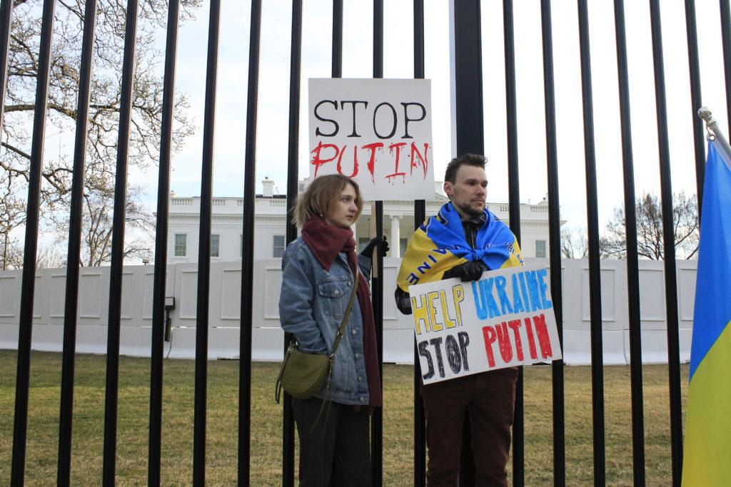
Sights of Ukrainian Solidarity
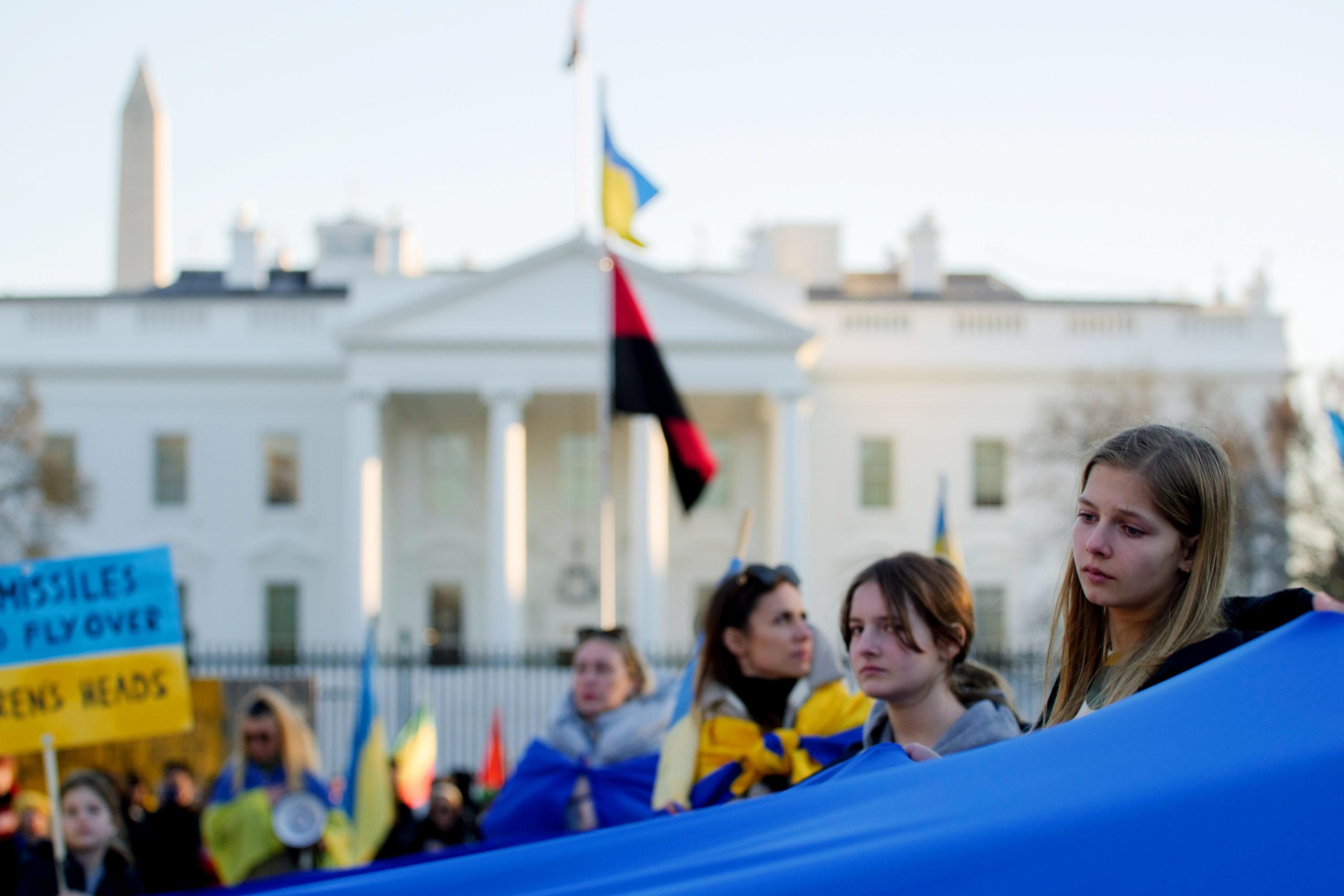
Photo essay: Protesters gather in D.C. to show solidarity with Ukraine
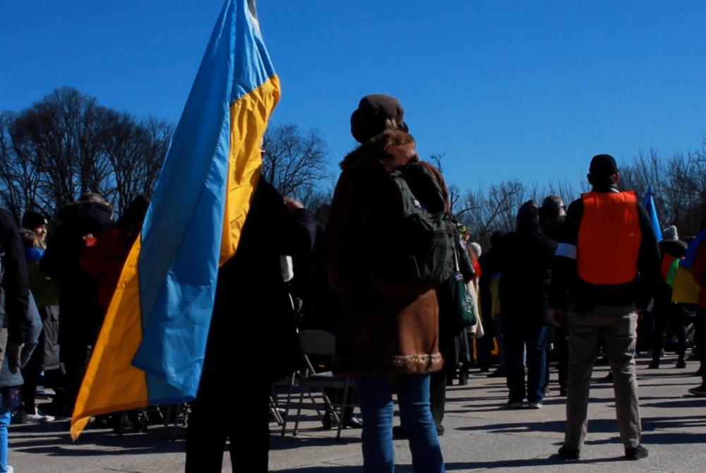
Video: Protestors gather at Lincoln Memorial over Ukraine-Russia conflict

How to support Ukraine during Russia’s invasion