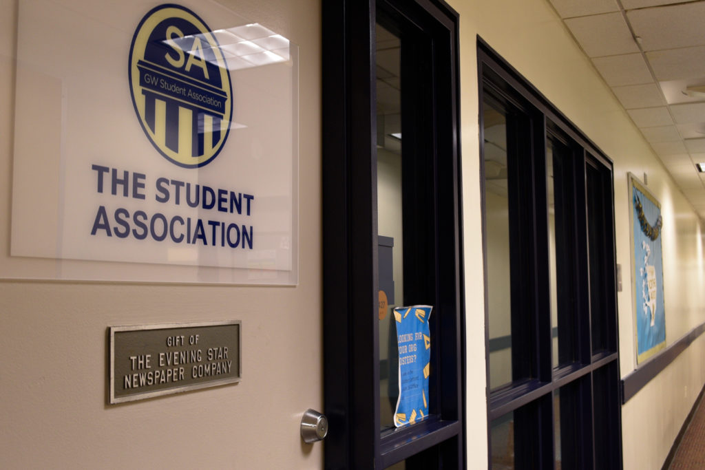
Danielle Towers | Staff Photographer
The Student Association's organization space, in March 2021.
{“@context”:”http:\/\/schema.org”,”@type”:”WebSite”,”url”:”https:\/\/www.gwhatchet.com”,”name”:”The GW Hatchet”}
@import url(“https://use.typekit.net/kco7duy.css”);
@media only screen and (min-width: 650px) {
blockquote.right {
width: 40%;
margin-top: 0px;
margin-bottom: 10px;
margin-left: 30px;
margin-right: 0px;
}
}
@media only screen and (max-width: 650px) {
blockquote.right {
margin-top: -10px;
margin-bottom: 10px;
margin-left: 15px;
}
}
blockquote.right {
border-left: 4px solid #043c5b;
color: #043c5b;
font-family: bureau-grot, sans-serif;
font-weight: bold;
padding-left: 15px;
float: right;
font-style: italic;
}
blockquote > p {
padding: 0;
margin: 0;
}
@media only screen and (min-width: 650px) {
blockquote.left {
width: 40%;
margin-top: 5px;
margin-bottom: 10px;
margin-left: 15px;
margin-right: 30px;
}
}
@media only screen and (max-width: 650px) {
blockquote.left {
margin-top: -5px;
margin-bottom: 15px;
margin-left: 15px;
margin-right: 30px;
}
}
blockquote.left {
border-left: 4px solid #043c5b;
color: #043c5b;
font-family: bureau-grot, sans-serif;
font-weight: bold;
padding-left: 15px;
float: left;
font-style: italic;
}
blockquote > p {
padding: 0;
margin: 0;
}
aside {
background-color: rgb(227, 227, 227);
top: 0px;
float: right;
padding: 10px 15px 0px 15px;
width: 100%;
margin: 0px 0px 15px 0px;
color: #043c5b;
font-family: bureau-grot, Georgia, Cambria, Times New Roman, serif;
border-top: 4px solid #043c5b;
font-size: 20px;
line-height: 1em;
font-weight: bold;
}
.related:before {
content: “Related: “;
color: rgb(99, 113, 122);
font-family: bureau-grot, Georgia, Cambria, Times New Roman, serif;
}
.aside {
font-family: sans-serif;
font-size: 16px;
color: rgb(99, 113, 122);
line-height: 1.2em;
font-weight: 100;
}
.aside2 {
font-family: bureau-grot, Georgia, Cambria, Times New Roman, serif;
font-size: 16px;
color: #043c5b;
font-weight: 100;
}
aside > p {
margin: 0px 0px 10px 0px;
}
@font-face {
font-family: “CircularStd”;
src: url(“https://github.com/AaronKovacs/Hatchet-2021-SA/blob/master/fonts/LEMONMILK-Bold.otf?raw=true”) format(“opentype”);
font-weight: 900;
font-style: normal;
}
@font-face {
font-family: “CircularStd”;
src: url(“https://github.com/AaronKovacs/Hatchet-2021-SA/blob/master/fonts/LEMONMILK-Bold.otf?raw=true”) format(“opentype”);
font-weight: bold;
font-style: normal;
}
@font-face {
font-family: “CircularStd”;
src: url(“https://github.com/AaronKovacs/Hatchet-2021-SA/blob/master/fonts/CircularStd-Book.otf?raw=true”) format(“opentype”);
font-weight: 100;
font-style: normal;
}
@font-face {
font-family: “CircularStd”;
src: url(“https://github.com/AaronKovacs/Hatchet-2021-SA/blob/master/fonts/LEMONMILK-Medium.otf?raw=true”) format(“opentype”);
font-weight: 400;
font-style: normal;
}
html, body {
background-color: transparent;
}
@import url(“https://fonts.googleapis.com/css?family=Source+Sans+Pro:400,700”);
.basketball-guide-2017-container {
max-width: 1200px;
text-align: center;
font-family: “bureau-grot”, “Cambria”, “Georgia”, serif;
margin: 1rem auto
}
.basketball-guide-2017-container * {
box-sizing: border-box
}
.basketball-guide-2017-container a:link {
text-decoration: none
}
.basketball-guide-2017-container h1 {
font-size: 2rem;
font-family: “bureau-grot”, “Segoe UI”, “Helvetica Neue”, “Helvetica”, sans-serif;
text-transform: uppercase;
background-color: #eb6123;
color: white;
padding: 0.5rem 0;
margin: 0.5rem 0
}
h2 {
font-size: 2rem;
font-family: “bureau-grot”, “Segoe UI”, “Helvetica Neue”, “Helvetica”, sans-serif;
text-transform: uppercase;
color: black;
padding: 0.5rem 0;
margin: 0.5rem 0
}
.basketball-guide-2017-container header.guide-header img {
width: 99%;
max-height: 450px;
object-fit: cover;
object-position: center top;
}
.basketball-guide-2017-container header.guide-header .cover-story {
max-width: 900px;
margin: 0 auto;
color: black
}
.basketball-guide-2017-container header.guide-header .cover-story h2.big-headline {
font-size: 24pt;
margin: 0.1rem 0 0.1rem 0;
font-family: “bureau-grot”, “Segoe UI”, “Helvetica Neue”, “Helvetica”, sans-serif;
text-transform: uppercase;
color: #eb6123
}
.basketball-guide-2017-container header.guide-header .cover-story p.big-subheadline {
font-size: 18pt;
margin: -0.25rem 0 0rem 0;
font-family: “bureau-grot”, “Segoe UI”, “Helvetica Neue”, “Helvetica”, sans-serif;
color: #FFF;
}
.basketball-guide-2017-container header.guide-header .cover-story p.big-excerpt {
margin-top: 0.0rem;
font-size: 14pt;
color: #FFF;
}
@media screen and (max-width: 500px) {
.basketball-guide-2017-container header.guide-header .cover-story h2.big-headline {
font-size: 2rem;
line-height: 2rem
}
.basketball-guide-2017-container header.guide-header .cover-story p.big-subheadline {
font-size: 1.5rem
}
.basketball-guide-2017-container header.guide-header .cover-story p.big-excerpt,
.basketball-guide-2017-container header.guide-header .cover-story p.read-button span {
font-size: 1rem
}
}
.basketball-guide-2017-container section.guide-section {
margin-bottom: 2rem
}
.basketball-guide-2017-container section.guide-section header h3 {
font-size: 2rem;
font-family: “bureau-grot”, “Segoe UI”, “Helvetica Neue”, “Helvetica”, sans-serif;
text-transform: uppercase;
background-color: #eb6123;
color: white;
padding: 0.5rem 0;
margin: 0.5rem 0.5rem;
}
.basketball-guide-2017-container section.guide-section section.row {
display: flex;
flex-direction: row;
flex-wrap: wrap
}
.basketball-guide-2017-container .story-box {
flex-grow: 1;
height: 400px;
display: block;
overflow: hidden;
position: relative;
flex-shrink: 0;
flex-basis: 0;
min-width: 300px
}
@media screen and (max-width: 500px) {
.basketball-guide-2017-container .story-box {
min-width: calc(100% – 1rem)
}
}
.basketball-guide-2017-container .story-box img {
width: 100%;
height: 100%;
object-fit: cover;
object-position: center bottom;
}
.mobile-cover {
display: none;
}
@media screen and (max-width: 1100px) {
.guide-header {
display: none;
}
.mobile-cover {
display: block;
}
}
div.caption h4 {
width: 100%;
position: absolute;
bottom: 0;
color: white;
background-color: #eb6123;
padding: 0.25rem 0.5rem;
font-size: 1.5rem;
text-align: right;
max-width: 75%;
position: absolute;
right: 0;
bottom: 0;
text-align: left;
display: none;
bottom: 0;
}
.basketball-guide-2017-container .story-box div.blurb {
width: 100%;
position: absolute;
bottom: 0;
color: white
}
.basketball-guide-2017-container .story-box div.blurb h4,
.basketball-guide-2017-container .story-box div.blurb p.description {
background-color: #1b3d25;
padding: 0.25rem 0.5rem
}
.basketball-guide-2017-container .story-box div.blurb h4 {
font-size: 1.5rem;
margin: 2rem 0;
text-align: right;
max-width: 75%;
position: absolute;
right: 0;
bottom: 0
}
.basketball-guide-2017-container .story-box div.blurb p.description {
text-align: left;
display: none;
max-width: 75%
}
.basketball-guide-2017-container p.read-button span {
background-color: #eb6123;
color: white;
text-transform: uppercase;
display: inline-block;
padding: 0.5rem 1rem;
font-family: “bureau-grot”, “Segoe UI”, “Helvetica Neue”, “Helvetica”, sans-serif;
font-weight: bold;
font-size: 1.25rem
}
body.ios header {
display: none
}
body.ios .basketball-guide-2017-container header {
display: block
}
body.ios article.post {
padding-left: 0;
padding-right: 0
}
@font-face {
font-family: ‘FEAFS’;
src: url(‘https://aaronkovacs.github.io/Hatchet-2019-Halloween-Landing-Page/FEASFBRG.TTF’) format(‘truetype’);
}
.modal {
width: 30%;
height: 80%;
margin-top: 4%;
margin-right: 32px;
background-color: #000;
text-align: center;
float: right;
padding: 16px 16px 32px 16px;
}
.overlay {
position: absolute;
bottom: 0;
background: rgb(0, 0, 0);
background: rgba(0, 0, 0, 0.5); /* Black see-through */
color: #f1f1f1;
width: 100%;
/*height: 100%;*/
transition: .5s ease;
opacity:0;
color: white;
font-size: 20px;
text-align: center;
}
.blurb {
transition: .5s ease;
}
.story-box:hover .overlay {
opacity: 1;
}
.story-box:hover .blurb:not(:hover) {
opacity: 0;
}
.cover-header {
display: block;
}
.header-title {
text-transform: uppercase;
color: white;
padding: 0.5rem 0;
margin: 0;
font-size: 30pt;
font-weight: bold;
font-family: “bureau-grot”, “Cambria”, “Georgia”, serif;
margin-top: -0.4em;
color: #000;
}
.header-subtitle {
text-transform: uppercase;
color: white;
padding: 0.5rem 0;
padding-top: 0.5em;
margin: 0;
font-size: 15pt;
font-weight: 600;
font-family: “bureau-grot”, “Cambria”, “Georgia”, serif;
color: #000;
}
.red-bar {
background: #1b3d25;
height: 8px;
max-width: 600px;
margin-left: auto;
margin-right: auto;
}
.story-box {
margin: 0.0rem 0.0rem;
border-style: solid;
border-width: 5px;
border-color: black;
}
.guide-section {
width: 800px;
margin-left: auto;
margin-right: auto;
}
@media screen and (max-width: 700px) {
.guide-section {
width: 95%;
}
.red-bar {
width: 95%;
}
}
.item-container {
width: 100%;
overflow: hidden;
background-color: #ABEDFF;
padding-bottom: 1em;
margin-bottom: 2em;
border-radius: 16px;
}
.item-left {
width: 100%;
height: 100%;
}
.item-right {
width: 100%;
}
.item-image {
width: auto;
height: 100%;
object-fit: cover;
overflow: hidden;
}
.item-quote {
color: black;
margin-top: 1.5em;
padding-left: 16px;
padding-right: 16px;
font-size: 12pt;
}
.guide-header-title {
font-family: ‘CircularStd’;
font-size: 30pt;
font-weight: 900;
margin: 0;
}
.guide-header-subtitle {
font-family: ‘CircularStd’;
font-size: 25pt;
font-weight: 900;
margin: 0;
}
.guide-header-body {
font-family: ‘CircularStd’;
font-size: 16pt;
font-weight: 100;
margin: 0;
margin-top: 0.5em;
}
@media only screen and (max-width: 800px) {
.guide-header-title {
font-size: 30pt;
}
.guide-header-subtitle {
font-size: 25pt;
}
.guide-header-body {
font-size: 14pt;
}
}
.guide-header-read-more {
font-family: ‘CircularStd’;
font-size: 16pt;
font-weight: 300;
margin: 0;
padding-bottom: 0.1em;
background-color: #5E15FF;
padding-left: 15px;
padding-right: 15px;
padding-top: 10px;
padding-bottom: 10px;
color: white;
display: inline-block;
width: auto;
margin-top: 1em;
border-radius: 8px;
transition-property: opacity;
transition-duration: 0.5s;
transition-timing-function: linear;
transition-delay: 0s;
}
.guide-header-read-more:hover {
opacity: 0.5;
}
.guide-section-header {
text-align: left;
}
.guide-section-header-title {
font-family: ‘CircularStd’;
font-size: 25pt;
font-weight: 900;
margin: 0;
padding-bottom: 0.1em;
}
.guide-section-header-subtitle {
font-family: ‘CircularStd’;
font-size: 16pt;
font-weight: 300;
margin: 0;
padding-bottom: 0.5em;
margin-bottom: 0.5em;
}
@media only screen and (max-width: 450px) {
.guide-section-header-title {
font-size: 20pt;
}
.guide-section-header-subtitle {
font-size: 10pt;
}
}
.guide-section-header-divider {
height: 10px;
background-color: black;
width: 100%;
margin-bottom: 1em;
box-shadow: 0 4px 8px 0 rgba(0, 0, 0, 0.2), 0 6px 20px 0 rgba(0, 0, 0, 0.19);
}
.carousel-container {
width: 100vw;
padding-left: calc((100% – 800px) / 2);
left: 0;
position: absolute;
padding-top: 1em;
padding-bottom: 1em;
margin-bottom: 1em;
overflow-x: scroll;
display: flex;
-ms-overflow-style: none; /* Internet Explorer 10+ */
scrollbar-width: none;
}
.carousel-card {
margin-right: 1.5em;
margin-bottom: 2em;
display: inline-block;
width: 100%;
height: 300px;
border-radius: 16px;
overflow: hidden;
background-color: #ABEDFF;
box-shadow: 0 4px 8px 0 rgba(82, 142, 255, 0.2), 0 6px 20px 0 rgba(82, 142, 255, 0.19);
}
.carousel-content {
text-align: left;
margin-right: 1em;
}
.carousel-image {
width: 300px;
height: 100%;
object-fit: cover;
float: left;
margin-right: 1em;
}
.carousel-card-header {
background-color: #5E15FF;
width: 100%;
margin-bottom: 1.5em;
color: white;
font-family: ‘CircularStd’;
font-size: 20pt;
font-weight: 900;
text-align: left;
padding-top: 0.25em;
padding-bottom: 0.25em;
}
.carousel-card-title {
font-family: ‘CircularStd’;
font-size: 25pt;
font-weight: 900;
margin: 0;
padding-bottom: 0.1em;
}
.carousel-card-title-smaller {
font-size: 22pt;
}
.carousel-card-subtitle {
font-family: ‘CircularStd’;
font-size: 12pt;
font-weight: 300;
margin: 0;
padding-bottom: 0.1em;
border-radius: 4px;
background-color: #5E15FF;
padding: 5px;
color: white;
display: inline-block;
width: auto;
margin-bottom: 1em;
}
.carousel-card-body {
font-family: ‘CircularStd’;
font-size: 12pt;
font-weight: 100;
margin: 0;
padding-bottom: 0.5em;
}
.carousel-card-body-smaller {
font-size: 10pt;
}
.carousel-card-link {
font-family: ‘CircularStd’;
font-size: 12pt;
font-weight: 400;
margin: 0;
margin-top: auto;
color: #5E15FF;
}
.carousel-width-spacer {
display: inline-block;
min-width: 600px;
}
.carousel-height-spacer {
margin-bottom: 750px;
}
.carousel-vp-spacer {
margin-top: 350px;
}
@media only screen and (max-width: 800px) {
.carousel-card-header {
font-size: 18pt;
}
.carousel-container {
padding-left: 0.75em;
}
.carousel-card {
min-width: 400px;
}
.carousel-card-title {
font-size: 18pt;
}
.carousel-card-title-smaller {
font-size: 18pt;
}
.carousel-card-subtitle {
font-size: 10pt;
}
.carousel-card-body {
font-size: 10pt;
}
.carousel-card-body-smaller {
font-size: 10pt;
}
.carousel-card-link {
font-size: 10pt;
}
.carousel-width-spacer {
min-width: 100px;
}
}
@media only screen and (max-width: 450px) {
.carousel-card-header {
margin-bottom: 0.5em;
}
.carousel-image {
width: 150px;
}
.carousel-card {
min-width: 350px;
height: 250px;
}
.carousel-height-spacer {
margin-bottom: 610px;
}
.carousel-vp-spacer {
margin-top: 280px;
}
}
@media only screen and (max-width: 380px) {
.carousel-card-header {
font-size: 14pt;
}
.carousel-card-title {
font-size: 14pt;
}
.carousel-card-title-smaller {
font-size: 14pt;
}
.carousel-card-header {
margin-bottom: 0.5em;
}
.carousel-image {
width: 130px;
}
.carousel-card {
min-width: 315px;
height: 220px;
}
.carousel-height-spacer {
margin-bottom: 550px;
}
.carousel-vp-spacer {
margin-top: 250px;
}
}
@media only screen and (max-width: 325px) {
.carousel-card-header {
font-size: 12pt;
}
.carousel-card-title {
font-size: 12pt;
}
.carousel-card-title-smaller {
font-size: 12pt;
}
.carousel-card-subtitle {
font-size: 8pt;
}
.carousel-card-body {
font-size: 7pt;
}
.carousel-card-body-smaller {
font-size: 7pt;
}
.carousel-card-link {
font-size: 7pt;
}
.carousel-card-header {
margin-bottom: 0.5em;
}
.carousel-image {
width: 120px;
}
.carousel-card {
min-width: 270px;
height: 200px;
}
.carousel-height-spacer {
margin-bottom: 490px;
}
.carousel-vp-spacer {
margin-top: 220px;
}
}
.guide-news-card {
width: 100%;
height: 200px;
margin-bottom: 1em;
}
.guide-news-content {
text-align: left;
margin-right: 1em;
height: 200px;
}
.guide-news-image {
width: 200px;
height: 100%;
object-fit: cover;
float: left;
margin-right: 1em;
background-color: black;
}
@media only screen and (max-width: 800px) {
.guide-news-image {
float: none;
width: 100%;
margin-top: 1em;
margin-bottom: 0.5em;
}
.guide-news-card {
height: auto;
}
}
.guide-news-card-header {
background-color: black;
width: 100%;
margin-bottom: 1em;
color: white;
font-family: ‘CircularStd’;
font-size: 20pt;
font-weight: 900;
text-align: left;
padding-top: 0.25em;
padding-bottom: 0.25em;
}
.guide-news-card-title {
font-family: ‘CircularStd’;
font-size: 20pt;
font-weight: 900;
margin: 0;
padding-bottom: 0.1em;
}
@media only screen and (max-width: 800px) {
.guide-news-card-title {
font-size: 20pt;
}
.guide-news-content {
height: auto;
}
}
@media only screen and (max-width: 450px) {
.guide-news-card-title {
font-size: 16pt;
}
}
.guide-news-card-subtitle {
font-family: ‘CircularStd’;
font-size: 12pt;
font-weight: 300;
margin: 0;
padding-bottom: 0.1em;
color: black;
width: auto;
margin-bottom: 1em;
display: inline-block;
margin-left: 0.5em;
}
.guide-news-card-subtitle-block {
font-family: ‘CircularStd’;
font-size: 12pt;
font-weight: 300;
margin: 0;
background-color: #5E15FF;
border-radius: 4px;
padding: 5px;
color: white;
display: inline-block;
width: auto;
}
.guide-news-card-body {
font-family: ‘CircularStd’;
font-size: 12pt;
font-weight: 100;
margin: 0;
padding-bottom: 0.5em;
}
.endorsements-container {
background-color: #ABEDFF;
border-radius: 16px;
width: 100%;
margin-bottom: 1em;
padding-top: 0.25em;
padding-bottom: 0.25em;
box-shadow: 0 4px 8px 0 rgba(95, 158, 255, 0.2), 0 6px 20px 0 rgba(95, 158, 255, 0.19);
}
.endorsements-card-left {
margin-top: 2em;
margin-bottom: 2em;
margin-left: 2em;
margin-right: 1em;
width: calc(100% / 2 – 3em);
border-radius: 16px;
overflow: hidden;
background-color: white;
display: inline-block;
}
.endorsements-card-right {
float: right;
margin-top: 2em;
border-radius: 16px;
overflow: hidden;
margin-bottom: 2em;
margin-left: 1em;
margin-right: 2em;
width: calc(100% / 2 – 3em);
background-color: white;
}
.endorsements-guide-op-card {
background-color: white;
padding: 1em;
margin: 2em;
margin-top: 0;
}
@media only screen and (max-width: 800px) {
.endorsements-card-left {
float: none;
width: calc(100% – 2em);
margin-left: 1em;
margin-right: 1em;
margin-top: 1em;
margin-bottom: 1em;
}
.endorsements-card-right {
float: none;
width: calc(100% – 2em);
margin-left: 1em;
margin-right: 1em;
margin-top: 0em;
margin-bottom: 1em;
}
.endorsements-guide-op-card {
margin: 1em;
}
}
.endorsements-card-content {
padding: 1em;
}
.endorsements-image {
width: 100%;
height: 300px;
object-fit: cover;
}
.endorsements-title {
font-family: ‘CircularStd’;
font-size: 20pt;
font-weight: 900;
margin: 0;
padding-bottom: 0.1em;
}
.endorsements-subtitle {
font-family: ‘CircularStd’;
font-size: 12pt;
font-weight: 300;
border-radius: 4px;
margin: 0;
padding-bottom: 0.1em;
background-color: #5E15FF;
padding: 5px;
color: white;
display: inline-block;
width: auto;
margin-bottom: 0.5em;
}
.endorsements-body {
font-family: ‘CircularStd’;
font-size: 12pt;
font-weight: 100;
margin: 0;
padding-bottom: 0.5em;
}
.endorsements-link {
font-family: ‘CircularStd’;
font-size: 12pt;
font-weight: 100;
margin: 0;
margin-top: auto;
color: #5E15FF;
}
.endorsements-op-title {
font-size: 20pt;
}
@media only screen and (max-width: 450px) {
.endorsements-title {
font-size: 18pt;
}
.endorsements-op-title {
font-size: 16pt;
}
}
.guide-header-background {
position: absolute;
top: 0;
left: 0;
width: 100vw;
background: rgb(219,209,251);
background: linear-gradient(0deg, rgba(219,209,251,1) 0%, rgba(94,21,255,1) 100%);
height: 600px;
z-index: -1;
}
.guide-header-image {
background-color: clear;
z-index: 5;
width: 100%;
height: 500px;
object-fit: contain;
}
.guide-header-image-mobile {
display: none;
width: 100%;
height: 450px;
padding-bottom: 4em;
object-fit: contain;
}
a {
color: black;
}
::-webkit-scrollbar {
width: 0px; /* Remove scrollbar space */
background: transparent; /* Optional: just make scrollbar invisible */
}
logo-slider {
–image-height: 250px;
–image-width: 350px;
border: none;
padding: 20px;
overflow: hidden;
max-width: 100%;
width: 100%;
margin: 0 auto;
position: relative;
display: flex;
}
logo-slider div {
display: flex;
position: relative;
animation: marquee 25s linear infinite;
justify-content: space-around;
}
logo-slider img {
display: block;
min-width: var(–image-width);
height: var(–image-height);
margin: 0 1vw;
border-radius: 8px;
overflow: hidden;
}
logo-slider:after {
content: “”;
position: absolute;
width: 100%;
height: 100%;
left: 0;
top: 0;
background: rgb(219,209,251);
background: linear-gradient(0deg, rgba(219,209,251,1) 0%, rgba(94,21,255,1) 100%);
background: transparent;
}
@media (max-width: 900px) {
logo-slider {
–image-size: 50px;
–image-size: min(max(50px, 10vw), 100px);
}
}
@keyframes marquee {
0% {
transform: translateX(0%);
}
100% {
transform: translateX(-100%);
}
}
body {
background-color: rgba(94,21, 255, 0.2);
}
.pres-he {
object-position: 10% 10%;
}
.pres-cw {
object-position: 15% 10%;
}
.pres-ca {
object-position: 0% 10%;
}
.pres-bh {
object-position: 15% 10%;
}
.pres-kc {
}
.issue-link {
width: fit-content;
margin-left: auto;
margin-right: auto;
}
@media only screen and (max-width: 450px) {
.pres-he {
object-position: 25% 10%;
}
.pres-cw {
object-position: 30% 10%;
}
.pres-ca {
object-position: 15% 10%;
}
.pres-bh {
object-position: 25% 10%;
}
.pres-kc {
object-position: 35% 10%;
}
}


Guide to 2021 SA Elections
Candidates running for the Student Association’s top positions say rebuilding trust is their top priority if elected to lead the body.
Read the Cover Story
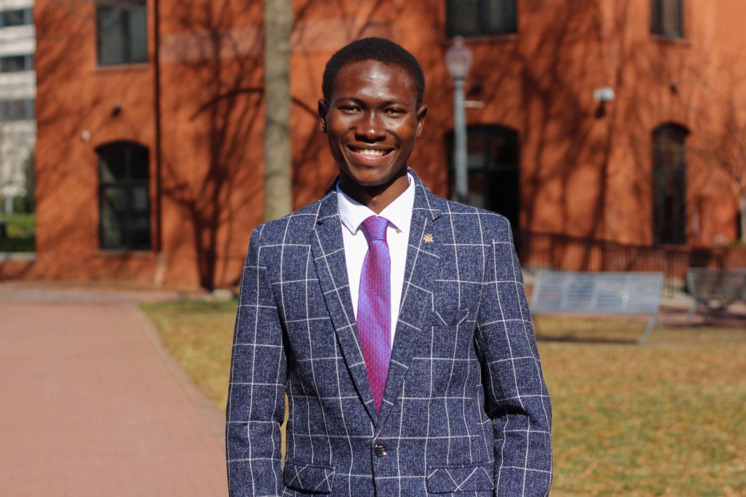
There are four candidates running for SA’s top spot this year.
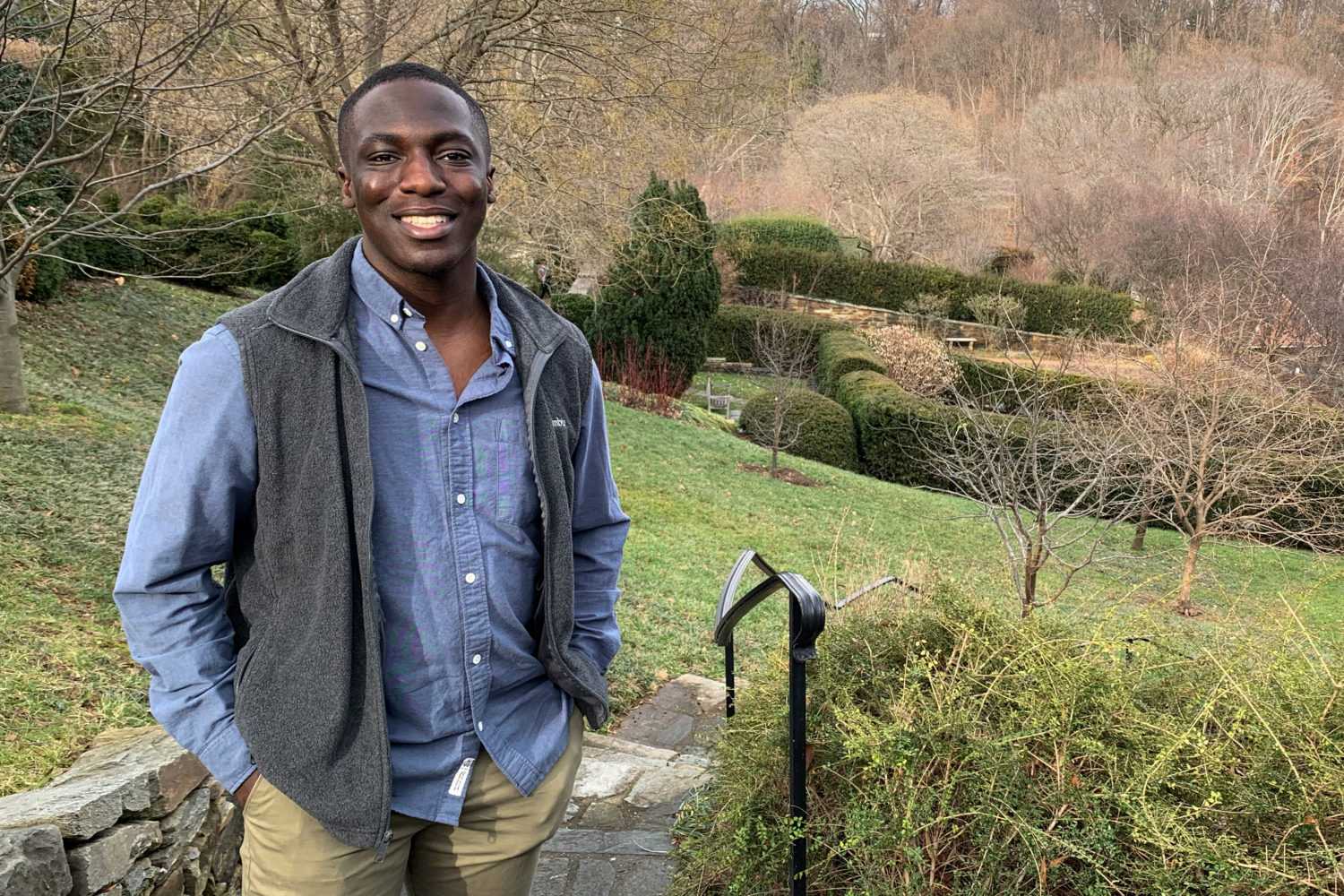
Junior
Zidouemba said his friendly disposition will help him build relationships with students on campus.
Read Full Bio
Junior
Junior Hannah Edwards, the former Student Association vice president for diversity and inclusion, is vying for SA president.
Read Full Bio
Junior
Aborisade said students needs a “progressive” student leader who can bring students together after three semesters away from campus.
Read Full Bio
Junior
Hill said he recognizes that at times the SA seems to be working against the student body, but the body’s “roots and intentions” are to support students.
Read Full Bio
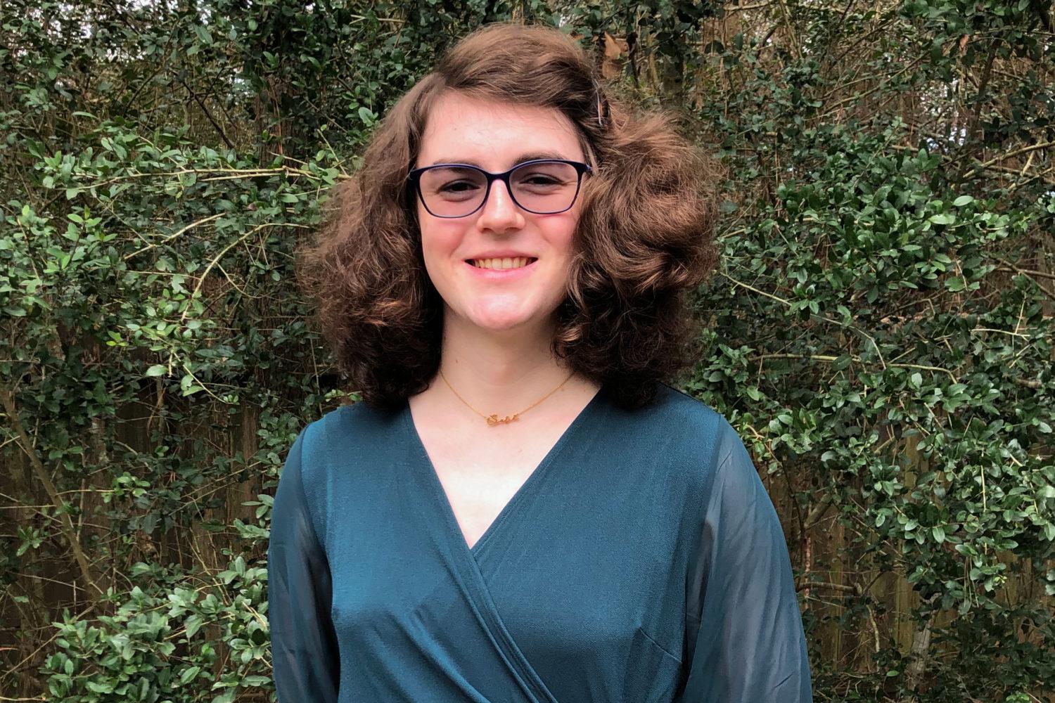
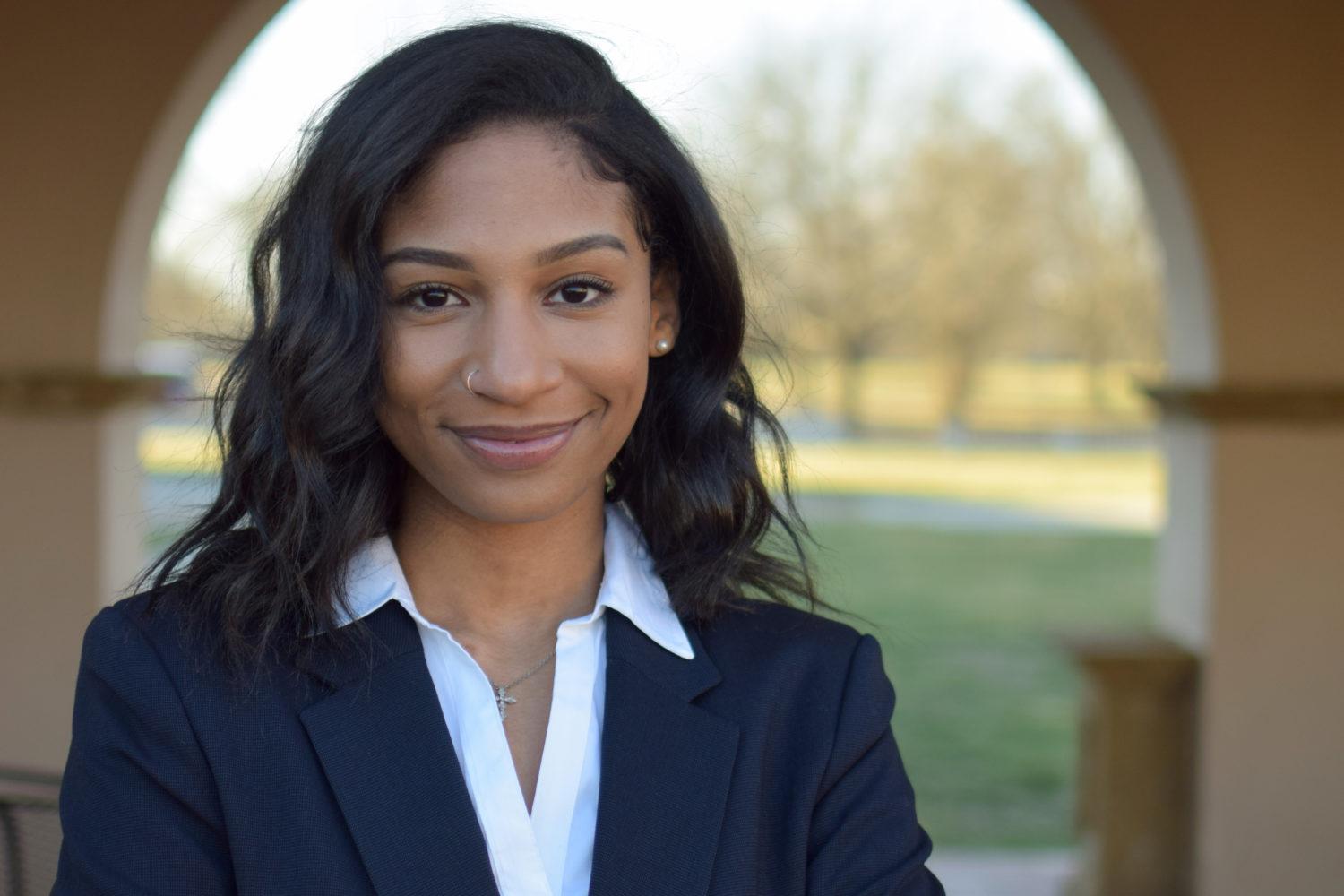
There are two candidates running for vice president this year.
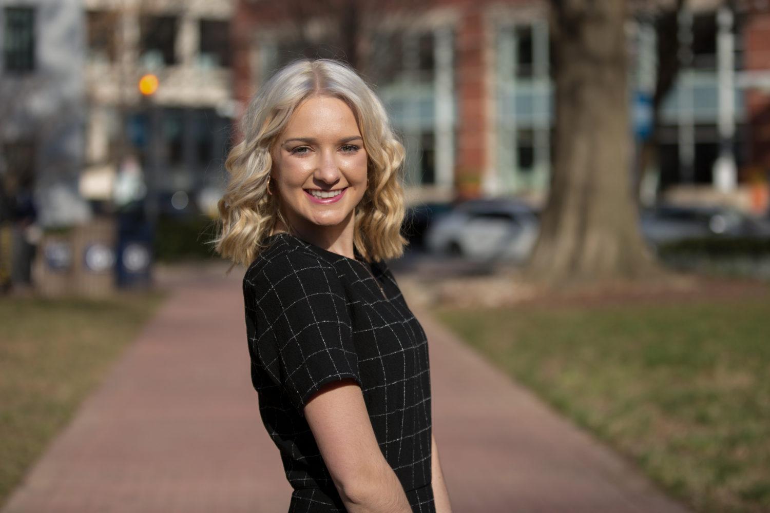
Sophomore
Carpenter said the SA needs to be approachable to build a better relationship with the student body.
Read Full Bio
Junior
Packer said she is the best choice for vice president because she knows what it’s like to be on the “outside” of the SA.
Read Full Bio
Top SA executive candidates have vowed to achieve many objectives if elected to office, but not all of their proposed initiatives are centered around fact.
By Lauren Sforza

The editorial board urges students to vote yes on both referenda this year.
By Andrew Sugrue
SA elections this year will be unlike previous years, with an entirely virtual elections season and the expanded use of ranked-choice voting.
By Brennan Fiske
The Hatchet’s editorial board – a group of opinion writers and staff members on Hatchet staff who are not affiliated with the news section – interviewed all presidential and executive vice president candidates about their platforms in March. Here’s who they decided to endorse for each position.
For President
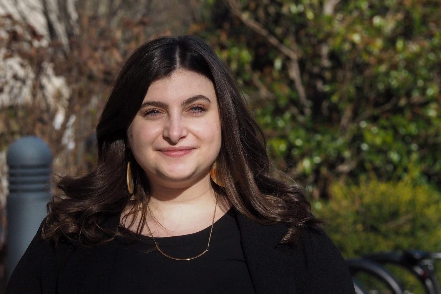
Hannah Edwards
The editorial board felt that Edwards has the experience, passion and detailed plans needed to run the SA successfully.
Read Opinion Piece
For Vice President
Kate Carpenter
It is a close call, but we believe Carpenter’s experience and specific policy plans make her the best candidate for vice president.
Read Opinion Piece
Learn about how candidates navigating online campaigning.