
Kate Carpenter | Staff Photographer
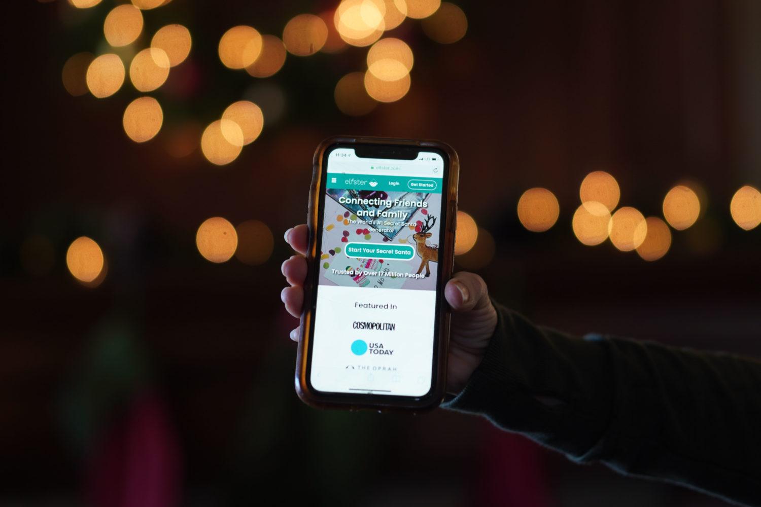
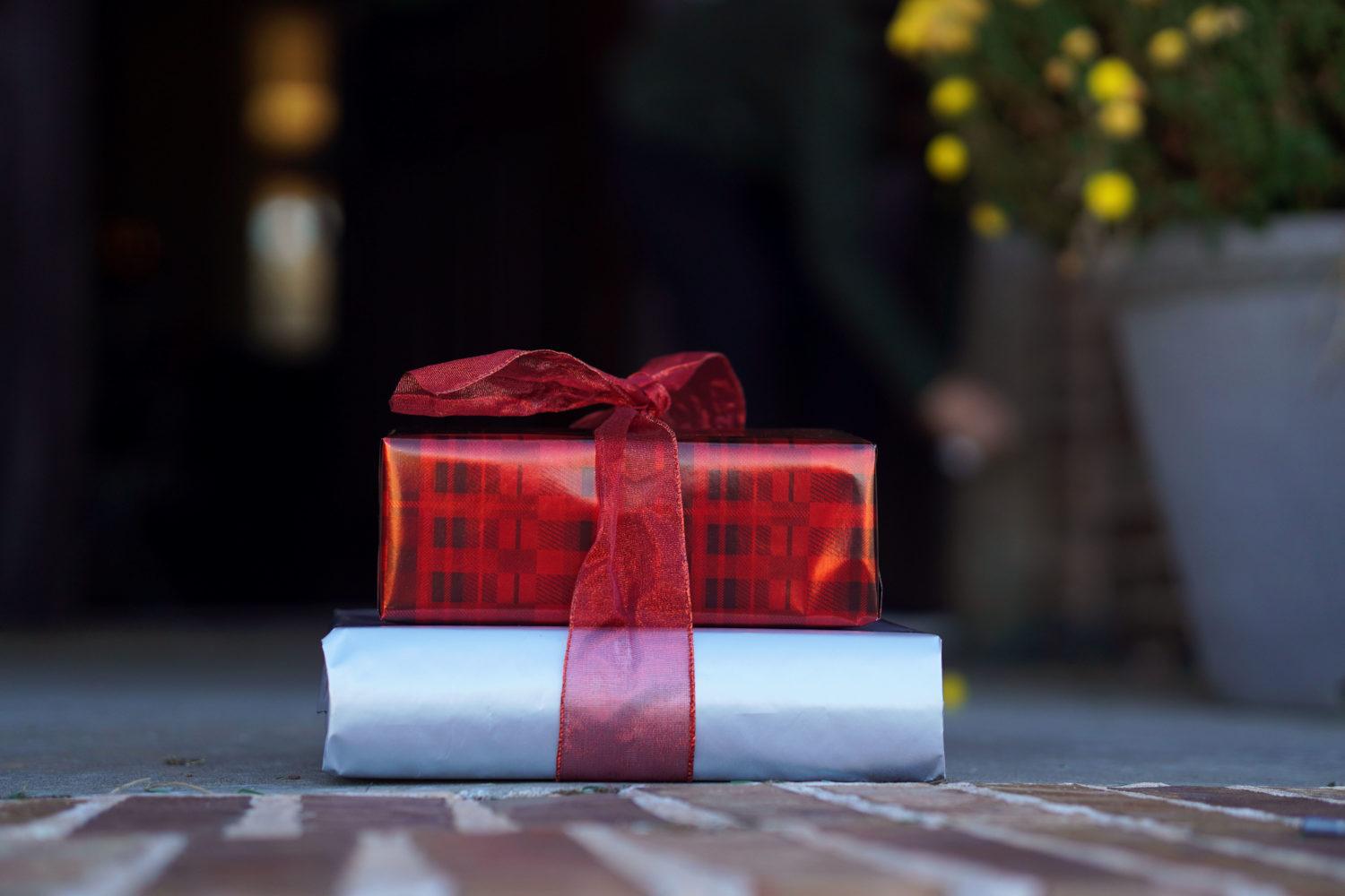
COVID-19 can live on surfaces for hours or even days, so consider a contactless gift option to keep your loved ones safe.
{“@context”:”http:\/\/schema.org”,”@type”:”WebSite”,”url”:”https:\/\/www.gwhatchet.com”,”name”:”The GW Hatchet”}
@media only screen and (min-width: 650px) {
blockquote.right {
width: 40%;
margin-top: 0px;
margin-bottom: 10px;
margin-left: 30px;
margin-right: 0px;
}
}
@media only screen and (max-width: 650px) {
blockquote.right {
margin-top: -10px;
margin-bottom: 10px;
margin-left: 15px;
}
}
blockquote.right {
border-left: 4px solid #043c5b;
color: #043c5b;
font-family: Source Sans Pro, sans-serif;
font-weight: bold;
padding-left: 15px;
float: right;
font-style: italic;
}
blockquote > p {
padding: 0;
margin: 0;
}
@media only screen and (min-width: 650px) {
blockquote.left {
width: 40%;
margin-top: 5px;
margin-bottom: 10px;
margin-left: 15px;
margin-right: 30px;
}
}
@media only screen and (max-width: 650px) {
blockquote.left {
margin-top: -5px;
margin-bottom: 15px;
margin-left: 15px;
margin-right: 30px;
}
}
blockquote.left {
border-left: 4px solid #043c5b;
color: #043c5b;
font-family: Source Sans Pro, sans-serif;
font-weight: bold;
padding-left: 15px;
float: left;
font-style: italic;
}
blockquote > p {
padding: 0;
margin: 0;
}
aside {
background-color: rgb(227, 227, 227);
top: 0px;
float: right;
padding: 10px 15px 0px 15px;
width: 100%;
margin: 0px 0px 15px 0px;
color: #043c5b;
font-family: Source Serif Pro, Georgia, Cambria, Times New Roman, serif;
border-top: 4px solid #043c5b;
font-size: 20px;
line-height: 1em;
font-weight: bold;
}
.related:before {
content: “Related: “;
color: rgb(99, 113, 122);
font-family: Source Serif Pro, Georgia, Cambria, Times New Roman, serif;
}
.aside {
font-family: sans-serif;
font-size: 16px;
color: rgb(99, 113, 122);
line-height: 1.2em;
font-weight: 100;
}
.aside2 {
font-family: Source Serif Pro, Georgia, Cambria, Times New Roman, serif;
font-size: 16px;
color: #043c5b;
font-weight: 100;
}
aside > p {
margin: 0px 0px 10px 0px;
}
html {
margin-top: 0px !important;
}
@font-face {
font-family: ‘Bodoni’;
src: url(‘https://github.com/AaronKovacs/Hatchet-2020-Holiday-Guide/blob/master/Bodoni.otf’) format(‘opentype’);
}
.winter-is-coming, .snow {
z-index: 100;
pointer-events: none;
}
.winter-is-coming {
overflow: hidden;
position: absolute;
top: 0;
height: 100%;
width: 100%;
max-width: 100%;
}
.snow {
position: absolute;
top: 0;
right: 0;
bottom: 0;
left: 0;
z-index: -1;
scale: 0.5;
-webkit-animation: falling linear infinite both;
animation: falling linear infinite both;
-webkit-transform: translate3D(0, -100%, 0);
transform: translate3D(0, -100%, 0);
}
.snow–near {
-webkit-animation-duration: 10s;
animation-duration: 10s;
background-image: url(“https://dl6rt3mwcjzxg.cloudfront.net/assets/snow/snow-large-075d267ecbc42e3564c8ed43516dd557.png”);
background-size: contain;
}
.snow–near + .snow–alt {
-webkit-animation-delay: 5s;
animation-delay: 5s;
}
.snow–mid {
-webkit-animation-duration: 20s;
animation-duration: 20s;
background-image: url(“https://dl6rt3mwcjzxg.cloudfront.net/assets/snow/snow-medium-0b8a5e0732315b68e1f54185be7a1ad9.png”);
background-size: contain;
}
.snow–mid + .snow–alt {
-webkit-animation-delay: 10s;
animation-delay: 10s;
}
.snow–far {
-webkit-animation-duration: 30s;
animation-duration: 30s;
background-image: url(“https://dl6rt3mwcjzxg.cloudfront.net/assets/snow/snow-small-1ecd03b1fce08c24e064ff8c0a72c519.png”);
background-size: contain;
}
.snow–far + .snow–alt {
-webkit-animation-delay: 15s;
animation-delay: 15s;
}
@-webkit-keyframes falling {
0% {
-webkit-transform: translate3D(-7.5%, -100%, 0);
transform: translate3D(-7.5%, -100%, 0);
}
100% {
-webkit-transform: translate3D(7.5%, 100%, 0);
transform: translate3D(7.5%, 100%, 0);
}
}
@keyframes falling {
0% {
-webkit-transform: translate3D(-7.5%, -100%, 0);
transform: translate3D(-7.5%, -100%, 0);
}
100% {
-webkit-transform: translate3D(7.5%, 100%, 0);
transform: translate3D(7.5%, 100%, 0);
}
}
@import url(“https://fonts.googleapis.com/css?family=Source+Sans+Pro:400,700”);
.basketball-guide-2017-container {
text-align: left;
font-family: “Source Serif Pro”, “Cambria”, “Georgia”, serif;
margin: 1rem auto
}
.basketball-guide-2017-container * {
box-sizing: border-box
}
.basketball-guide-2017-container a:link {
text-decoration: none
}
.basketball-guide-2017-container header.guide-header img {
width: 100%;
max-height: 550px;
object-fit: cover;
}
.basketball-guide-2017-container header.guide-header .cover-story {
max-width: 900px;
margin: 0 auto;
color: black
}
.basketball-guide-2017-container header.guide-header .cover-story h2.big-headline {
font-size: 3rem;
margin: 0.75rem 0 0.75rem 0;
font-family: “Source Sans Pro”, “Segoe UI”, “Helvetica Neue”, “Helvetica”, sans-serif;
text-transform: uppercase;
line-height: 3rem;
color: #0F703C
}
.basketball-guide-2017-container header.guide-header .cover-story p.big-subheadline {
font-size: 1.5rem;
margin: -0.25rem 0 1rem 0;
font-family: “Source Sans Pro”, “Segoe UI”, “Helvetica Neue”, “Helvetica”, sans-serif
}
.basketball-guide-2017-container header.guide-header .cover-story p.big-excerpt {
margin-top: 0.5rem;
font-size: 1.1rem
}
@media screen and (max-width: 500px) {
.basketball-guide-2017-container header.guide-header .cover-story h2.big-headline {
font-size: 2rem;
line-height: 2rem
}
.basketball-guide-2017-container header.guide-header .cover-story p.big-subheadline {
font-size: 1.5rem
}
.basketball-guide-2017-container header.guide-header .cover-story p.big-excerpt,
.basketball-guide-2017-container header.guide-header .cover-story p.read-button span {
font-size: 1rem
}
}
.basketball-guide-2017-container header.guide-header:hover .cover-story h2.big-headline {
color: black
}
.basketball-guide-2017-container section.guide-section {
margin-bottom: 0rem
}
.basketball-guide-2017-container section.guide-section header h3 {
font-size: 2rem;
font-family: “Source Sans Pro”, “Segoe UI”, “Helvetica Neue”, “Helvetica”, sans-serif;
text-transform: uppercase;
/*background-color: #0F703C;*/
color: white;
padding: 0.5rem 0;
margin: 0.5rem 0
}
.basketball-guide-2017-container section.guide-section section.row {
display: flex;
flex-direction: row;
flex-wrap: wrap;
}
.shadow {
-webkit-box-shadow: 0px 0px 26px -2px rgba(0,0,0,0.54);
-moz-box-shadow: 0px 0px 26px -2px rgba(0,0,0,0.54);
box-shadow: 0px 0px 26px -2px rgba(0,0,0,0.54);
}
.basketball-guide-2017-container .story-box {
-webkit-box-shadow: 0px 0px 26px -2px rgba(0,0,0,0.54);
-moz-box-shadow: 0px 0px 26px -2px rgba(0,0,0,0.54);
box-shadow: 0px 0px 26px -2px rgba(0,0,0,0.54);
flex-grow: 1;
height: 500px;
/*height: 600px;
/*height: 100%;*/
/*background-color: white;*/
display: block;
/*border: 5px solid #0F703C;*/
margin: 0;
height: 100%;
overflow: hidden;
position: relative;
flex-shrink: 0;
flex-basis: 0;
min-width: 45%
}
.basketball-guide-2017-container .story-box img {
width: 100%;
height: 252px;
/*background-color: white;*/
object-fit: cover;
object-position: center top
}
.basketball-guide-2017-container .story-box div.blurb {
width: 100%;
position: absolute;
bottom: 0;
color: white
}
.basketball-guide-2017-container .story-box div.blurb h4,
.basketball-guide-2017-container .story-box div.blurb p.description {
background-color: #0F703C;
padding: 0.25rem 0.5rem
}
.basketball-guide-2017-container .story-box div.blurb h4 {
font-size: 1.5rem;
margin: 2rem 0;
text-align: right;
max-width: 75%;
position: absolute;
right: 0;
bottom: 0
}
.basketball-guide-2017-container .story-box div.blurb p.description {
text-align: left;
display: none;
max-width: 75%
}
.basketball-guide-2017-container p.read-button span {
background-color: #0F703C;
color: white;
text-transform: uppercase;
display: inline-block;
padding: 0.5rem 1rem;
font-family: “Source Sans Pro”, “Segoe UI”, “Helvetica Neue”, “Helvetica”, sans-serif;
font-weight: bold;
font-size: 1.25rem
}
body.ios header {
display: none
}
body.ios .basketball-guide-2017-container header {
display: block
}
body.ios article.post {
padding-left: 0;
padding-right: 0
}
html {
height: 100%;
overflow: hidden;
}
html {
background-color: white;
}
body {
color: white;
margin: 0;
padding: 0;
-webkit-perspective: 1px;
perspective: 1px;
-webkit-transform-style: preserve-3d;
transform-style: preserve-3d;
height: 100%;
overflow-y: scroll;
overflow-x: hidden;
}
figure {
box-sizing: border-box;
min-height: 40vw;
padding: 30vw 0 5vw;
margin-left: -0.0em;
position: relative;
-webkit-transform-style: inherit;
transform-style: inherit;
width: 100vw;
background-blend-mode: darken;
transition: 3s;
}
figure,
figure:before {
background: 50% 50% / cover;
}
figure::before {
bottom: 0;
content: “”;
left: 0;
position: absolute;
right: 0;
top: 0;
display: block;
background-color: white;
/*./ArmellTransfer_OA-2000×1340.gif*/
/*https://www.gwhatchet.com/wp-content/uploads/2018/11/LandingPage_GS-2000×1340.jpg*/
background-image: url(https://www.gwhatchet.com/wp-content/uploads/2019/11/2019-fall-basketball-preview-image-1.jpg);
background-size: cover;
background-repeat: no-repeat;
background-origin: center;
background-clip: center;
background-attachment: fixed;
background-blend-mode: darken;
transition: 3s;
/*-webkit-transform-origin: center center 0;
-webkit-transform: translateZ(-1px) scale(2);
transform-origin: center center 0;
transform: translateZ(-1px) scale(2);*/
z-index: -1;
min-height: 50vh;
}
@media screen and (max-width: 600px) {
figure::before {
background-attachment: scroll;
}
}
figure * {
text-align: center;
margin: 0;
padding: 0.1em 0;
font-family: “Source Serif Pro”, “Georgia”, “Cambria”, “Times New Roman”, serif;
}
figure h2 {
font-size: 3rem;
margin: 0.75rem 0 0.75rem 0;
font-family: “Source Sans Pro”, “Segoe UI”, “Helvetica Neue”, “Helvetica”, sans-serif;
text-transform: uppercase;
line-height: 3rem;
color: #0F703C;
}
figure .big-subheadline {
font-family: “Source Sans Pro”, “Segoe UI”, “Helvetica Neue”, “Helvetica”, sans-serif;
}
main {
background-color: hsl(60, 10%, 10%);
line-height: 1.7;
max-width: 32em;
padding: 5% calc(50% – 16em) 35%;
position: relative;
z-index: 2;
}
.basketball-guide-2017-container:hover .read-container {
background-color: black;
}
.basketball-guide-2019-story-title {
font-size: 24pt;
font-weight: 600;
/*margin: 1rem 0 0.0rem 0;*/
width: 100%;
margin-top: auto;
margin-bottom: auto;
text-transform: none;
line-height: 1.2;
color: white;
/*margin-left: 1em;
margin-right: 1em;*/
font-family: “Roboto”, sans-serif;
}
.basketball-guide-2019-story-excerpt {
color: rgba(255, 255, 255, 0.7);
font-size: 14pt;
line-height: 1.15;
/*margin-left: 2em;
margin-right: 2em;*/
width: 100%;
/*margin-bottom: auto;*/
margin-top: auto;
font-family: “Rockwell”, “Source Serif Pro”, “Segoe UI”, “Helvetica Neue”, “Helvetica”, sans-serif;
}
.basketball-guide-2019-story-author {
color: rgba(255, 255, 255, 0.7);
font-size: 12pt;
line-height: 1.15;
margin-left: 2em;
margin-right: 2em;
margin-bottom: auto;
font-family: “Source Sans Pro”, “Segoe UI”, “Helvetica Neue”, “Helvetica”, sans-serif;
}
@media screen and (max-width: 600px) {
.basketball-guide-2019-story-title {
font-size: 22pt;
margin-left: 0.25em;
margin-right: 0.25em;
}
.basketball-guide-2019-story-excerpt {
font-size: 10pt;
margin-left: 0.25em;
margin-right: 0.25em;
}
.basketball-guide-2019-story-author {
font-size: 10pt;
margin-left: 1em;
margin-right: 1em;
}
}
@media screen and (max-width: 350px) {
.basketball-guide-2019-story-title {
font-size: 18pt;
margin-left: 0.25em;
margin-right: 0.25em;
}
.basketball-guide-2019-story-excerpt {
font-size: 10pt;
margin-left: 0.25em;
margin-right: 0.25em;
}
.basketball-guide-2019-story-author {
font-size: 10pt;
margin-left: 1em;
margin-right: 1em;
}
}
.basketball-guide-2019-button-subtitle {
font-family: “Source Sans Pro”, “Segoe UI”, “Helvetica Neue”, “Helvetica”, sans-serif;
font-size: 12pt;
color: white;
opacity: 0.7;
margin-top: 0;
font-weight: 700;
}
.read-button {
transition: .5s ease;
}
.hover-button {
transition: .5s ease;
width: calc(50% – 1.0rem);
}
.hover-button:hover {
opacity: 0.8;
}
.hover-button { cursor: pointer; }
a { cursor: pointer; }
.read-background {
transition: .5s ease;
width: 55%;
}
.read-background:hover {
background-color: black;
}
.backgroundBox {
transition: .5s ease;
/* padding-top: 1em; */
justify-content: space-between;
display: flex;
flex-direction: column;
width: 100%;
padding-left: 1rem;
padding-right: 1rem;
/* padding-bottom: 1rem; */
}
}
.story-box:hover div {
opacity: 0.8;
}
.basketball-guide-2017-container {
padding-bottom: 2em;
}
.disappearing-box {
display: block;
}
.centered-post {
max-width: 48.5%;
margin-left: auto;
margin-right: auto;
}
@media screen and (max-width: 600px) {
.centered-post {
max-width: 100%;
}
.hover-button {
width: calc(100% – 1.0rem);
margin-bottom: 0.25rem;
margin-top: 0.25rem;
}
.read-background {
width: 100%;
}
.basketball-guide-2017-container {
padding-bottom: 0em;
}
.disappearing-box {
display: none;
}
}
@media screen and (max-width: 350px) {
.big-headline {
font-size: 2.5rem;
}
}
.read-button:hover .read-background {
opacity: 0.8;
}
.header-title {
text-transform: uppercase;
background-color: #0F703C;
color: white;
padding: 0.5rem 0;
margin: 0;
font-size: 40pt;
font-weight: bold;
font-family: trade-gothic-next, sans-serif;
margin-top: -0.4em;
}
.header-subtitle {
text-transform: uppercase;
background-color: #0F703C;
color: white;
padding: 0.5rem 0;
padding-top: 0.9em;
margin: 0;
font-size: 20pt;
font-weight: bold;
font-family: trade-gothic-next, sans-serif;
color: #E5D28D;
}
.threeboxgallery {
width: 50%;
}
@media screen and (max-width: 900px) {
.threeboxgallery {
width: 100%;
}
}
.basketball-guide-2017-container .story-box {
min-width: calc(100% – 1.4rem);
}
.basketball-guide-2017-container .story-box {
height: auto;
}
.basketball-guide-2017-container .story-box img {
height: 400px;
}
@media screen and (min-width: 900px) {
.basketball-guide-2017-container .story-box {
min-width: 25%;
}
}
.basketball-guide-2017-container .story-box img {
height: 300px;
}
.basketball-guide-2017-container .story-box {
height: auto;
}
.tallBox {
width: 100%;
height: 60%;
}
.header-title-container {
margin-left: auto;
margin-right: auto;
margin-top: 20%;
width: 50%;
background-color: white;
padding: 1em;
padding-left: 2em;
padding-right: 2em;
text-align: center;
box-shadow: 10px 10px 0px #0F703C;
}
.header-subtitle-text {
color: #000;
font-size: 20pt;
font-weight: 1000;
margin-top: 0.5em;
}
.header-title-text {
color: #000;
font-size: 45pt;
font-family: grafolita-script, sans-serif;
font-weight: 700;
font-style: normal;
}
.header-paragraph {
font-family: “Source Sans Pro”, “Segoe UI”, “Helvetica Neue”, “Helvetica”, sans-serif;
font-size: 16pt;
margin-top: 0.5em;
color: black;
}
.section-header-title {
color: #FFF;
font-size: 25pt;
text-transform: none;
text-align: center;
margin-top: 2em;
box-shadow: 10px 10px 0px #92C99D;
background-color: #0F703C;
padding: 1em;
font-family: “Source Sans Pro”, “Segoe UI”, “Helvetica Neue”, “Helvetica”, sans-serif;
}
.guide-section-first {
margin-top: calc(100vh + 6em);
}
.guide-header-image-container {
width: 100%;
height: 700px;
}
.guide-header-image {
width: auto;
height: inherit;
margin-left: auto;
margin-right: auto;
}
@media only screen and (max-width: 1200px) {
.header-title-container {
width: 80%;
}
}
@media only screen and (max-width: 800px) {
.guide-header-image {
width: 100%;
height: auto;
margin-top: auto;
margin-left: auto;
margin-right: auto;
}
.guide-header-image-container {
width: 100%;
height: calc(100vw * 0.6495);
}
.header-title-container {
width: calc(100% – 2em);
}
.header-subtitle-text {
font-size: 15pt;
}
.header-title-text {
font-size: 30pt;
}
.header-paragraph {
font: 12pt;
}
.section-header-title {
font-size: 15pt;
}
.guide-section-first {
margin-top: calc(400px + 7em);
}
}
.story-box {
transition: all .2s ease-in-out;
background-color: white;
}
.story-box:hover {
transform: scale(1.05);
}
.card-box {
background-color: white;
padding-top: 1.2em;
padding-bottom: 1.2em;
}
.card-story-title {
color: #000;
font-size: 16pt;
}
.card-story-subtitle {
font-size: 12pt;
font-weight: 100;
margin-top: 0.5em;
color: #000;This appears in the August 24, 2020 issue…
}
.wrapper {
position: absolute;
top: 0;
left: 0;
width: 100%;
height: 150%;
min-height: 100vh;
z-index: -1;
margin-top: calc(100vh);
}
footer .social-links {
border-top: 1px solid #000;
border-bottom: 1px solid #000;
}
footer p.copyright {
border-top: 1px solid #000;
color: #000;
}
footer .footer-widgets ul.widgets li.widget_nav_menu li a {
color: #000;
}
.issue-link {
color: black;
margin-left: 37%;
}
.issue-link a {
color: black;
}
.background-top {
background-color: white;
position: absolute;
top: 0;
left: 0;
width: 100%;
opacity: 1.0;
}
.story-box {
height: 100%;
margin: 0;
}
@media screen and (max-width: 900px) {
.basketball-guide-2017-container .story-box {
margin-bottom: 2.5em;
}
}
footer .footer-widgets ul.widgets li.widget h2.widgettitle {
color: black;
}
.guide-header-blurb {
color: black;
text-align: center;
background-color: white;
padding: 2em;
font-family: “Source Sans Pro”, “Segoe UI”, “Helvetica Neue”, “Helvetica”, sans-serif;
font-size: 16pt;
line-height: 1.3;
}
.card-box {
width: 100%;
padding: 1em;
background-color: white;
display: flex;
flex-direction: row;
align-items: center;
margin-bottom: 1em;
max-width: 1100px;
margin-left: auto;
margin-right: auto;
}
.card-content {
padding: 1em;
}
.card-content-title {
font-family: Bodoni;
font-size: 20pt;
font-weight: 800;
color: black;
margin: 0;
}
.card-content-subtitle {
font-family: sorts-mill-goudy, serif;
font-size: 14pt;
color: black;
font-weight: 400;
margin: 0;
margin-top: 0.5em;
}
.card-content-read-button {
font-family: Bodoni;
font-size: 14pt;
color: #034c3c;
font-weight: 800;
text-decoration: underline;
margin: 0;
margin-top: 0.5em;
}
.card-box img {
width: 200px;
height: 200px;
object-fit: cover;
}
.sec-header {
padding-left: 0em;
color: black;
font-size: 26pt;
font-weight: 800;
padding-top:0.0em;
margin: 0;
background-color: transparent;
width: 100%;
font-family: Source Serif Pro;
text-transform: none;
max-width: 1100px;
margin-left: auto;
margin-right: auto;
}
.blurb-container {
background-color: white;
width: 100%;
height: 100%;
margin-top: 0;
}
@media only screen and (min-width: 1100px) {
.blurb-container {
margin-top: -2em;
}
}
@media only screen and (max-width: 1113px) {
.sec-header {
padding-left: 0.5em;
}
.card-box {
flex-direction: column;
}
.card-content {
padding-left: 0;
padding-right: 0;
}
.card-box img {
width: 100%;
height: 200px;
object-fit: cover;
}
}
.podcast-img {
width: 400px;
object-fit: contain;
}
.guide-sec-img {
width: 300px;
margin-left: auto;
margin-right: auto;
object-fit: contain;
}
@media only screen and (max-width: 600px) {
.guide-sec-img {
width: 90%;
}
}
@media only screen and (max-width: 800px) {
.podcast-img {
width: 100%;
padding: 1em;
}
.card-box {
flex-direction: column;
justify-content: center;
}
.card-box img {
width: 100%;
height: 300px;
object-fit: cover;
}
}
@media only screen and (max-width: 600px) {
.podcast-img {
width: 100%;
padding: 1em;
}
}
.background-snow {
background-color: #e33f40;
height: 800px;
}
@media only screen and (max-width: 1500px) {
.background-snow {
height: 600px;
}
}
@media only screen and (max-width: 1100px) {
.background-snow {
height: 500px;
}
}
@media only screen and (max-width: 700px) {
.background-snow {
height: 400px;
}
}
.guide-header-image {
width: 400px;
height: 100px;
object-fit: contain;
}
@media only screen and (max-width: 800px) {
.guide-header-image {
width: 90%;
}
}
@media only screen and (max-width: 600px) {
.card-box {
padding: 0.5em;
}
.card-content {
padding: 0;
padding-top: 1em;
padding-bottom: 1em;
}
}
footer {
margin-top: 320em;
}
@media only screen and (max-width: 1600px) {
footer {
margin-top: 320em;
}
}
@media only screen and (max-width: 1366px) {
footer {
margin-top: 310em;
}
}
@media only screen and (max-width: 1266px) {
footer {
margin-top: 300em;
}
}
@media only screen and (max-width: 1100px) {
footer {
margin-top: 360em;
}
}
@media only screen and (max-width: 800px) {
footer {
margin-top: 420em;
}
}
@media only screen and (max-width: 600px) {
footer {
margin-top: 440em;
}
}


About the guideThe world needs a little joy this winter. No matter where you are this holiday season, read up on how to enjoy a safe and happy break in The Hatchet’s 2020 Holiday Guide.


Q&A: Physician offers advice on safely celebrating the holidays during pandemic
Gerald Keusch, an infectious disease specialist from the BU School of Medicine, fielded The Hatchet’s questions about safely celebrating the holidays.
Read Story
Games to play during your virtual holiday work party
The annual company holiday party is an excuse to get a bit tipsy. The same expectations apply to a Zoom work party.
Read Story
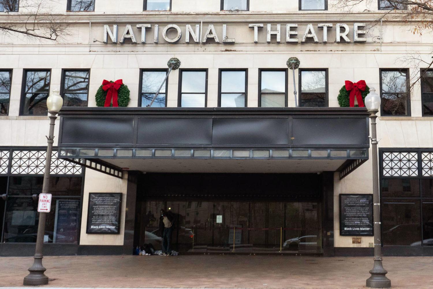
Where to watch signature holiday events online
There’s a bucketload of long-standing holiday events to look forward to each year, but this year they’re shifting online.
Read Story
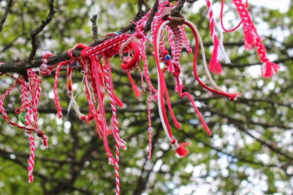
Students share cultural traditions from around the world
The students said practicing these customs help them embrace their cultural identity and connect more closely to their families.
Read Story


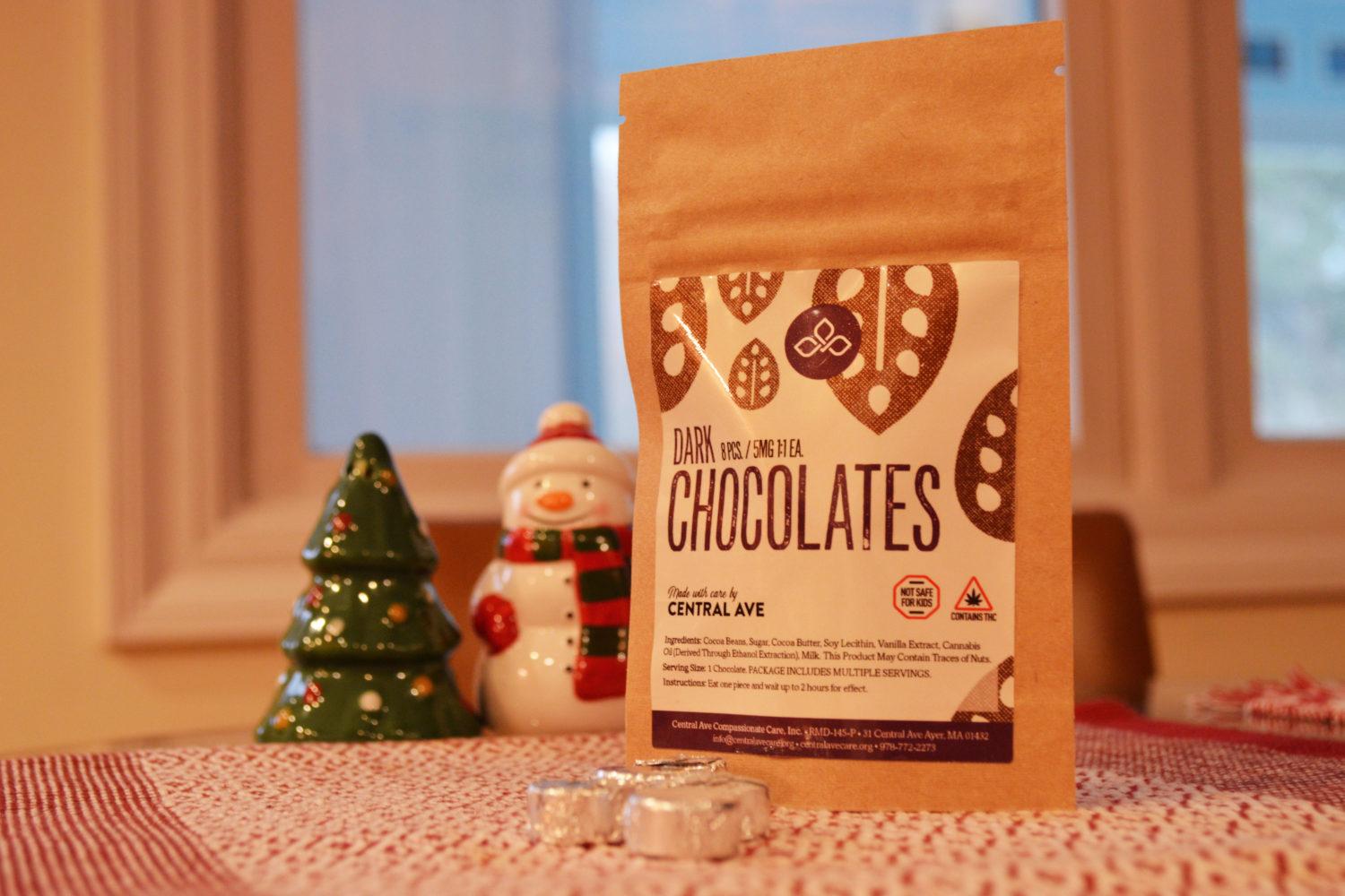
High for the holidays: Cannabis-infused winter treats
Cannabis-infused holiday treats are a relaxing way to celebrate the season, but maybe stick with classic sugar cookies for Santa.
Read Story
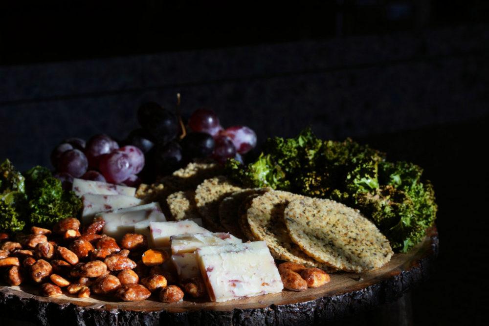
Sweet, savory and salty holiday-themed appetizers
You may be celebrating the holidays with less people than usual this year, but that’s not an excuse to slack on the appetizers.
Read Story
D.C. restaurants offering holiday take-out specials
If you’re in D.C. for the holidays and want to forgo cooking, a few restaurants around the District have you covered.
Read Story


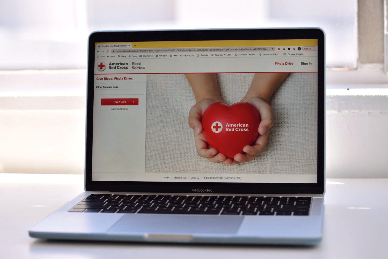
How to help D.C., national charities withstand the pandemic
From COVID-19 relief organizations to food drives, there’s no shortage of places to give this year.
Read Story
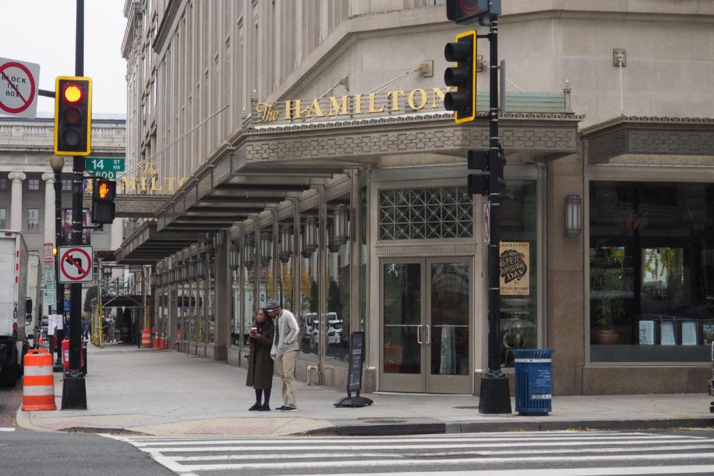
Shopping small: Independent businesses to support this holiday season
If you could buy a gift from anywhere this year, it should be from the boutique in your hometown or the coffee shop outside your apartment.
Read Story
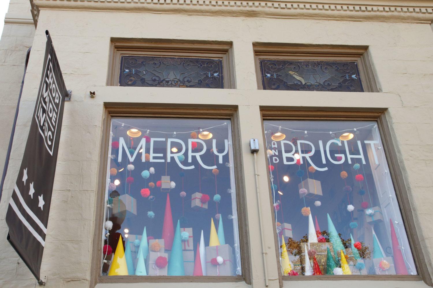
Presents without wrapping paper: Your guide to shopping for contactless gifts
Try sending one of these virtual or low-contact gifts to minimize risk of spreading COVID-19 this holiday season.
Read Story
