File Photo by Sabrina Godin | Staff Photographer
{“@context”:”http:\/\/schema.org”,”@type”:”WebSite”,”url”:”https:\/\/www.gwhatchet.com”,”name”:”The GW Hatchet”}
@import url(“https://use.typekit.net/kco7duy.css”);
@media only screen and (min-width: 650px) {
blockquote.right {
width: 40%;
margin-top: 0px;
margin-bottom: 10px;
margin-left: 30px;
margin-right: 0px;
}
}
@media only screen and (max-width: 650px) {
blockquote.right {
margin-top: -10px;
margin-bottom: 10px;
margin-left: 15px;
}
}
blockquote.right {
border-left: 4px solid #043c5b;
color: #043c5b;
font-family: bureau-grot, sans-serif;
font-weight: bold;
padding-left: 15px;
float: right;
font-style: italic;
}
blockquote > p {
padding: 0;
margin: 0;
}
@media only screen and (min-width: 650px) {
blockquote.left {
width: 40%;
margin-top: 5px;
margin-bottom: 10px;
margin-left: 15px;
margin-right: 30px;
}
}
@media only screen and (max-width: 650px) {
blockquote.left {
margin-top: -5px;
margin-bottom: 15px;
margin-left: 15px;
margin-right: 30px;
}
}
blockquote.left {
border-left: 4px solid #043c5b;
color: #043c5b;
font-family: bureau-grot, sans-serif;
font-weight: bold;
padding-left: 15px;
float: left;
font-style: italic;
}
blockquote > p {
padding: 0;
margin: 0;
}
aside {
background-color: rgb(227, 227, 227);
top: 0px;
float: right;
padding: 10px 15px 0px 15px;
width: 100%;
margin: 0px 0px 15px 0px;
color: #043c5b;
font-family: bureau-grot, Georgia, Cambria, Times New Roman, serif;
border-top: 4px solid #043c5b;
font-size: 20px;
line-height: 1em;
font-weight: bold;
}
.related:before {
content: “Related: “;
color: rgb(99, 113, 122);
font-family: bureau-grot, Georgia, Cambria, Times New Roman, serif;
}
.aside {
font-family: sans-serif;
font-size: 16px;
color: rgb(99, 113, 122);
line-height: 1.2em;
font-weight: 100;
}
.aside2 {
font-family: bureau-grot, Georgia, Cambria, Times New Roman, serif;
font-size: 16px;
color: #043c5b;
font-weight: 100;
}
aside > p {
margin: 0px 0px 10px 0px;
}
@font-face {
font-family: “CircularStd”;
src: url(“https://github.com/AaronKovacs/Hatchet-2020-SA/blob/master/fonts/CircularStd-Black.otf?raw=true”) format(“opentype”);
font-weight: 900;
font-style: normal;
}
@font-face {
font-family: “CircularStd”;
src: url(“https://github.com/AaronKovacs/Hatchet-2020-SA/blob/master/fonts/CircularStd-Bold.otf?raw=true”) format(“opentype”);
font-weight: bold;
font-style: normal;
}
@font-face {
font-family: “CircularStd”;
src: url(“https://github.com/AaronKovacs/Hatchet-2020-SA/blob/master/fonts/CircularStd-Book.otf?raw=true”) format(“opentype”);
font-weight: 100;
font-style: normal;
}
@font-face {
font-family: “CircularStd”;
src: url(“https://github.com/AaronKovacs/Hatchet-2020-SA/blob/master/fonts/CircularStd-Medium.otf?raw=true”) format(“opentype”);
font-weight: 400;
font-style: normal;
}
html, body {
background-color: transparent;
}
@import url(“https://fonts.googleapis.com/css?family=Source+Sans+Pro:400,700”);
.basketball-guide-2017-container {
max-width: 1200px;
text-align: center;
font-family: “bureau-grot”, “Cambria”, “Georgia”, serif;
margin: 1rem auto
}
.basketball-guide-2017-container * {
box-sizing: border-box
}
.basketball-guide-2017-container a:link {
text-decoration: none
}
.basketball-guide-2017-container h1 {
font-size: 2rem;
font-family: “bureau-grot”, “Segoe UI”, “Helvetica Neue”, “Helvetica”, sans-serif;
text-transform: uppercase;
background-color: #eb6123;
color: white;
padding: 0.5rem 0;
margin: 0.5rem 0
}
h2 {
font-size: 2rem;
font-family: “bureau-grot”, “Segoe UI”, “Helvetica Neue”, “Helvetica”, sans-serif;
text-transform: uppercase;
color: black;
padding: 0.5rem 0;
margin: 0.5rem 0
}
.basketball-guide-2017-container header.guide-header img {
width: 99%;
max-height: 450px;
object-fit: cover;
object-position: center top;
}
.basketball-guide-2017-container header.guide-header .cover-story {
max-width: 900px;
margin: 0 auto;
color: black
}
.basketball-guide-2017-container header.guide-header .cover-story h2.big-headline {
font-size: 24pt;
margin: 0.1rem 0 0.1rem 0;
font-family: “bureau-grot”, “Segoe UI”, “Helvetica Neue”, “Helvetica”, sans-serif;
text-transform: uppercase;
color: #eb6123
}
.basketball-guide-2017-container header.guide-header .cover-story p.big-subheadline {
font-size: 18pt;
margin: -0.25rem 0 0rem 0;
font-family: “bureau-grot”, “Segoe UI”, “Helvetica Neue”, “Helvetica”, sans-serif;
color: #FFF;
}
.basketball-guide-2017-container header.guide-header .cover-story p.big-excerpt {
margin-top: 0.0rem;
font-size: 14pt;
color: #FFF;
}
@media screen and (max-width: 500px) {
.basketball-guide-2017-container header.guide-header .cover-story h2.big-headline {
font-size: 2rem;
line-height: 2rem
}
.basketball-guide-2017-container header.guide-header .cover-story p.big-subheadline {
font-size: 1.5rem
}
.basketball-guide-2017-container header.guide-header .cover-story p.big-excerpt,
.basketball-guide-2017-container header.guide-header .cover-story p.read-button span {
font-size: 1rem
}
}
.basketball-guide-2017-container section.guide-section {
margin-bottom: 2rem
}
.basketball-guide-2017-container section.guide-section header h3 {
font-size: 2rem;
font-family: “bureau-grot”, “Segoe UI”, “Helvetica Neue”, “Helvetica”, sans-serif;
text-transform: uppercase;
background-color: #eb6123;
color: white;
padding: 0.5rem 0;
margin: 0.5rem 0.5rem;
}
.basketball-guide-2017-container section.guide-section section.row {
display: flex;
flex-direction: row;
flex-wrap: wrap
}
.basketball-guide-2017-container .story-box {
flex-grow: 1;
height: 400px;
display: block;
overflow: hidden;
position: relative;
flex-shrink: 0;
flex-basis: 0;
min-width: 300px
}
@media screen and (max-width: 500px) {
.basketball-guide-2017-container .story-box {
min-width: calc(100% – 1rem)
}
}
.basketball-guide-2017-container .story-box img {
width: 100%;
height: 100%;
object-fit: cover;
object-position: center bottom;
}
.mobile-cover {
display: none;
}
@media screen and (max-width: 1100px) {
.guide-header {
display: none;
}
.mobile-cover {
display: block;
}
}
div.caption h4 {
width: 100%;
position: absolute;
bottom: 0;
color: white;
background-color: #eb6123;
padding: 0.25rem 0.5rem;
font-size: 1.5rem;
text-align: right;
max-width: 75%;
position: absolute;
right: 0;
bottom: 0;
text-align: left;
display: none;
bottom: 0;
}
.basketball-guide-2017-container .story-box div.blurb {
width: 100%;
position: absolute;
bottom: 0;
color: white
}
.basketball-guide-2017-container .story-box div.blurb h4,
.basketball-guide-2017-container .story-box div.blurb p.description {
background-color: #1b3d25;
padding: 0.25rem 0.5rem
}
.basketball-guide-2017-container .story-box div.blurb h4 {
font-size: 1.5rem;
margin: 2rem 0;
text-align: right;
max-width: 75%;
position: absolute;
right: 0;
bottom: 0
}
.basketball-guide-2017-container .story-box div.blurb p.description {
text-align: left;
display: none;
max-width: 75%
}
.basketball-guide-2017-container p.read-button span {
background-color: #eb6123;
color: white;
text-transform: uppercase;
display: inline-block;
padding: 0.5rem 1rem;
font-family: “bureau-grot”, “Segoe UI”, “Helvetica Neue”, “Helvetica”, sans-serif;
font-weight: bold;
font-size: 1.25rem
}
body.ios header {
display: none
}
body.ios .basketball-guide-2017-container header {
display: block
}
body.ios article.post {
padding-left: 0;
padding-right: 0
}
@font-face {
font-family: ‘FEAFS’;
src: url(‘https://aaronkovacs.github.io/Hatchet-2019-Halloween-Landing-Page/FEASFBRG.TTF’) format(‘truetype’);
}
.modal {
width: 30%;
height: 80%;
margin-top: 4%;
margin-right: 32px;
background-color: #000;
text-align: center;
float: right;
padding: 16px 16px 32px 16px;
}
.overlay {
position: absolute;
bottom: 0;
background: rgb(0, 0, 0);
background: rgba(0, 0, 0, 0.5); /* Black see-through */
color: #f1f1f1;
width: 100%;
/*height: 100%;*/
transition: .5s ease;
opacity:0;
color: white;
font-size: 20px;
text-align: center;
}
.blurb {
transition: .5s ease;
}
.story-box:hover .overlay {
opacity: 1;
}
.story-box:hover .blurb:not(:hover) {
opacity: 0;
}
.cover-header {
display: block;
}
.header-title {
text-transform: uppercase;
color: white;
padding: 0.5rem 0;
margin: 0;
font-size: 30pt;
font-weight: bold;
font-family: “bureau-grot”, “Cambria”, “Georgia”, serif;
margin-top: -0.4em;
color: #000;
}
.header-subtitle {
text-transform: uppercase;
color: white;
padding: 0.5rem 0;
padding-top: 0.5em;
margin: 0;
font-size: 15pt;
font-weight: 600;
font-family: “bureau-grot”, “Cambria”, “Georgia”, serif;
color: #000;
}
.red-bar {
background: #1b3d25;
height: 8px;
max-width: 600px;
margin-left: auto;
margin-right: auto;
}
.story-box {
margin: 0.0rem 0.0rem;
border-style: solid;
border-width: 5px;
border-color: black;
}
.guide-section {
width: 800px;
margin-left: auto;
margin-right: auto;
}
@media screen and (max-width: 700px) {
.guide-section {
width: 95%;
}
.red-bar {
width: 95%;
}
}
.item-container {
width: 100%;
overflow: hidden;
background-color: white;
padding-bottom: 1em;
margin-bottom: 2em;
border-bottom: 10px solid #000;
}
.item-left {
width: 100%;
height: 100%;
}
.item-right {
width: 100%;
}
.item-image {
width: auto;
height: 100%;
object-fit: cover;
overflow: hidden;
}
.item-quote {
color: black;
margin-top: 1.5em;
padding-left: 16px;
padding-right: 16px;
font-size: 12pt;
}
.guide-header-title {
font-family: ‘CircularStd’;
font-size: 40pt;
font-weight: 900;
margin: 0;
}
.guide-header-subtitle {
font-family: ‘CircularStd’;
font-size: 25pt;
font-weight: 900;
margin: 0;
}
.guide-header-body {
font-family: ‘CircularStd’;
font-size: 16pt;
font-weight: 100;
margin: 0;
margin-top: 0.5em;
}
@media only screen and (max-width: 800px) {
.guide-header-title {
font-size: 30pt;
}
.guide-header-subtitle {
font-size: 25pt;
}
.guide-header-body {
font-size: 14pt;
}
}
.guide-header-read-more {
font-family: ‘CircularStd’;
font-size: 16pt;
font-weight: 300;
margin: 0;
padding-bottom: 0.1em;
background-color: black;
padding-left: 15px;
padding-right: 15px;
padding-top: 10px;
padding-bottom: 10px;
color: white;
display: inline-block;
width: auto;
margin-top: 1em;
transition-property: opacity;
transition-duration: 0.5s;
transition-timing-function: linear;
transition-delay: 0s;
}
.guide-header-read-more:hover {
opacity: 0.5;
}
.guide-section-header {
text-align: left;
}
.guide-section-header-title {
font-family: ‘CircularStd’;
font-size: 25pt;
font-weight: 900;
margin: 0;
padding-bottom: 0.1em;
}
.guide-section-header-subtitle {
font-family: ‘CircularStd’;
font-size: 16pt;
font-weight: 300;
margin: 0;
padding-bottom: 0.5em;
margin-bottom: 0.5em;
}
@media only screen and (max-width: 450px) {
.guide-section-header-title {
font-size: 20pt;
}
.guide-section-header-subtitle {
font-size: 10pt;
}
}
.guide-section-header-divider {
height: 10px;
background-color: black;
width: 100%;
margin-bottom: 1em;
box-shadow: 0 4px 8px 0 rgba(0, 0, 0, 0.2), 0 6px 20px 0 rgba(0, 0, 0, 0.19);
}
.carousel-container {
width: 100vw;
padding-left: calc((100% – 800px) / 2);
left: 0;
position: absolute;
padding-top: 1em;
padding-bottom: 1em;
margin-bottom: 1em;
overflow-x: scroll;
display: flex;
-ms-overflow-style: none; /* Internet Explorer 10+ */
scrollbar-width: none;
}
.carousel-card {
margin-right: 1.5em;
min-width: 500px;
display: inline-block;
width: 500px;
height: 300px;
box-shadow: 0 4px 8px 0 rgba(0, 0, 0, 0.2), 0 6px 20px 0 rgba(0, 0, 0, 0.19);
}
.carousel-content {
text-align: left;
margin-right: 1em;
}
.carousel-image {
width: 200px;
height: 100%;
object-fit: cover;
float: left;
margin-right: 1em;
}
.carousel-card-header {
background-color: black;
width: 100%;
margin-bottom: 1em;
color: white;
font-family: ‘CircularStd’;
font-size: 20pt;
font-weight: 900;
text-align: left;
padding-top: 0.25em;
padding-bottom: 0.25em;
}
.carousel-card-title {
font-family: ‘CircularStd’;
font-size: 25pt;
font-weight: 900;
margin: 0;
padding-bottom: 0.1em;
}
.carousel-card-title-smaller {
font-size: 22pt;
}
.carousel-card-subtitle {
font-family: ‘CircularStd’;
font-size: 12pt;
font-weight: 300;
margin: 0;
padding-bottom: 0.1em;
background-color: black;
padding: 5px;
color: white;
display: inline-block;
width: auto;
margin-bottom: 1em;
}
.carousel-card-body {
font-family: ‘CircularStd’;
font-size: 12pt;
font-weight: 100;
margin: 0;
padding-bottom: 0.5em;
}
.carousel-card-body-smaller {
font-size: 10pt;
}
.carousel-card-link {
font-family: ‘CircularStd’;
font-size: 12pt;
font-weight: 100;
margin: 0;
margin-top: auto;
color: #56A3FF;
}
.carousel-width-spacer {
display: inline-block;
min-width: 600px;
}
.carousel-height-spacer {
margin-bottom: 750px;
}
.carousel-vp-spacer {
margin-top: 350px;
}
@media only screen and (max-width: 800px) {
.carousel-card-header {
font-size: 18pt;
}
.carousel-container {
padding-left: 0.75em;
}
.carousel-card {
min-width: 400px;
}
.carousel-card-title {
font-size: 18pt;
}
.carousel-card-title-smaller {
font-size: 18pt;
}
.carousel-card-subtitle {
font-size: 10pt;
}
.carousel-card-body {
font-size: 10pt;
}
.carousel-card-body-smaller {
font-size: 10pt;
}
.carousel-card-link {
font-size: 10pt;
}
.carousel-width-spacer {
min-width: 100px;
}
}
@media only screen and (max-width: 450px) {
.carousel-card-header {
margin-bottom: 0.5em;
}
.carousel-image {
width: 150px;
}
.carousel-card {
min-width: 350px;
height: 250px;
}
.carousel-height-spacer {
margin-bottom: 610px;
}
.carousel-vp-spacer {
margin-top: 280px;
}
}
@media only screen and (max-width: 380px) {
.carousel-card-header {
font-size: 14pt;
}
.carousel-card-title {
font-size: 14pt;
}
.carousel-card-title-smaller {
font-size: 14pt;
}
.carousel-card-header {
margin-bottom: 0.5em;
}
.carousel-image {
width: 130px;
}
.carousel-card {
min-width: 315px;
height: 220px;
}
.carousel-height-spacer {
margin-bottom: 550px;
}
.carousel-vp-spacer {
margin-top: 250px;
}
}
@media only screen and (max-width: 325px) {
.carousel-card-header {
font-size: 12pt;
}
.carousel-card-title {
font-size: 12pt;
}
.carousel-card-title-smaller {
font-size: 12pt;
}
.carousel-card-subtitle {
font-size: 8pt;
}
.carousel-card-body {
font-size: 7pt;
}
.carousel-card-body-smaller {
font-size: 7pt;
}
.carousel-card-link {
font-size: 7pt;
}
.carousel-card-header {
margin-bottom: 0.5em;
}
.carousel-image {
width: 120px;
}
.carousel-card {
min-width: 270px;
height: 200px;
}
.carousel-height-spacer {
margin-bottom: 490px;
}
.carousel-vp-spacer {
margin-top: 220px;
}
}
.guide-news-card {
width: 100%;
height: 200px;
margin-bottom: 1em;
}
.guide-news-content {
text-align: left;
margin-right: 1em;
height: 200px;
}
.guide-news-image {
width: 200px;
height: 200px;
object-fit: cover;
float: left;
margin-right: 1em;
background-color: black;
}
@media only screen and (max-width: 800px) {
.guide-news-image {
float: none;
width: 100%;
margin-top: 1em;
margin-bottom: 0.5em;
}
.guide-news-card {
height: auto;
}
}
.guide-news-card-header {
background-color: black;
width: 100%;
margin-bottom: 1em;
color: white;
font-family: ‘CircularStd’;
font-size: 20pt;
font-weight: 900;
text-align: left;
padding-top: 0.25em;
padding-bottom: 0.25em;
}
.guide-news-card-title {
font-family: ‘CircularStd’;
font-size: 25pt;
font-weight: 900;
margin: 0;
padding-bottom: 0.1em;
}
@media only screen and (max-width: 800px) {
.guide-news-card-title {
font-size: 20pt;
}
.guide-news-content {
height: auto;
}
}
@media only screen and (max-width: 450px) {
.guide-news-card-title {
font-size: 16pt;
}
}
.guide-news-card-subtitle {
font-family: ‘CircularStd’;
font-size: 12pt;
font-weight: 300;
margin: 0;
padding-bottom: 0.1em;
color: black;
width: auto;
margin-bottom: 1em;
display: inline-block;
margin-left: 0.5em;
}
.guide-news-card-subtitle-block {
font-family: ‘CircularStd’;
font-size: 12pt;
font-weight: 300;
margin: 0;
background-color: black;
padding: 5px;
color: white;
display: inline-block;
width: auto;
}
.guide-news-card-body {
font-family: ‘CircularStd’;
font-size: 12pt;
font-weight: 100;
margin: 0;
padding-bottom: 0.5em;
}
.endorsements-container {
background-color: black;
width: 100%;
margin-bottom: 1em;
padding-top: 0.25em;
padding-bottom: 0.25em;
box-shadow: 0 4px 8px 0 rgba(0, 0, 0, 0.2), 0 6px 20px 0 rgba(0, 0, 0, 0.19);
}
.endorsements-card-left {
margin-top: 2em;
margin-bottom: 2em;
margin-left: 2em;
margin-right: 1em;
width: calc(100% / 2 – 3em);
background-color: white;
display: inline-block;
}
.endorsements-card-right {
float: right;
margin-top: 2em;
margin-bottom: 2em;
margin-left: 1em;
margin-right: 2em;
width: calc(100% / 2 – 3em);
background-color: white;
}
.endorsements-guide-op-card {
background-color: white;
padding: 1em;
margin: 2em;
margin-top: 0;
}
@media only screen and (max-width: 800px) {
.endorsements-card-left {
float: none;
width: calc(100% – 2em);
margin-left: 1em;
margin-right: 1em;
margin-top: 1em;
margin-bottom: 1em;
}
.endorsements-card-right {
float: none;
width: calc(100% – 2em);
margin-left: 1em;
margin-right: 1em;
margin-top: 0em;
margin-bottom: 1em;
}
.endorsements-guide-op-card {
margin: 1em;
}
}
.endorsements-card-content {
padding: 1em;
}
.endorsements-image {
width: 100%;
height: 300px;
object-fit: cover;
}
.endorsements-title {
font-family: ‘CircularStd’;
font-size: 25pt;
font-weight: 900;
margin: 0;
padding-bottom: 0.1em;
}
.endorsements-subtitle {
font-family: ‘CircularStd’;
font-size: 12pt;
font-weight: 300;
margin: 0;
padding-bottom: 0.1em;
background-color: black;
padding: 5px;
color: white;
display: inline-block;
width: auto;
margin-bottom: 0.5em;
}
.endorsements-body {
font-family: ‘CircularStd’;
font-size: 12pt;
font-weight: 100;
margin: 0;
padding-bottom: 0.5em;
}
.endorsements-link {
font-family: ‘CircularStd’;
font-size: 12pt;
font-weight: 100;
margin: 0;
margin-top: auto;
color: #56A3FF;
}
.endorsements-op-title {
font-size: 20pt;
}
@media only screen and (max-width: 450px) {
.endorsements-title {
font-size: 18pt;
}
.endorsements-op-title {
font-size: 16pt;
}
}
.guide-header-background {
position: absolute;
top: 0;
left: 0;
width: 100vw;
background: rgb(38,38,38);
background: radial-gradient(circle, rgba(38,38,38,1) 0%, rgba(0,0,0,1) 100%);
height: 300px;
z-index: -1;
}
.guide-header-image {
background-color: clear;
z-index: 5;
width: 100%;
height: 400px;
object-fit: contain;
}
.guide-header-image-mobile {
display: none;
width: 100%;
height: 450px;
padding-bottom: 4em;
object-fit: contain;
}
@media only screen and (max-width: 600px) {
.guide-header-image {
display: none;
}
.guide-header-image-mobile {
display: block;
}
}
a {
color: black;
}
::-webkit-scrollbar {
width: 0px; /* Remove scrollbar space */
background: transparent; /* Optional: just make scrollbar invisible */
}


Guide to 2020 SA Elections
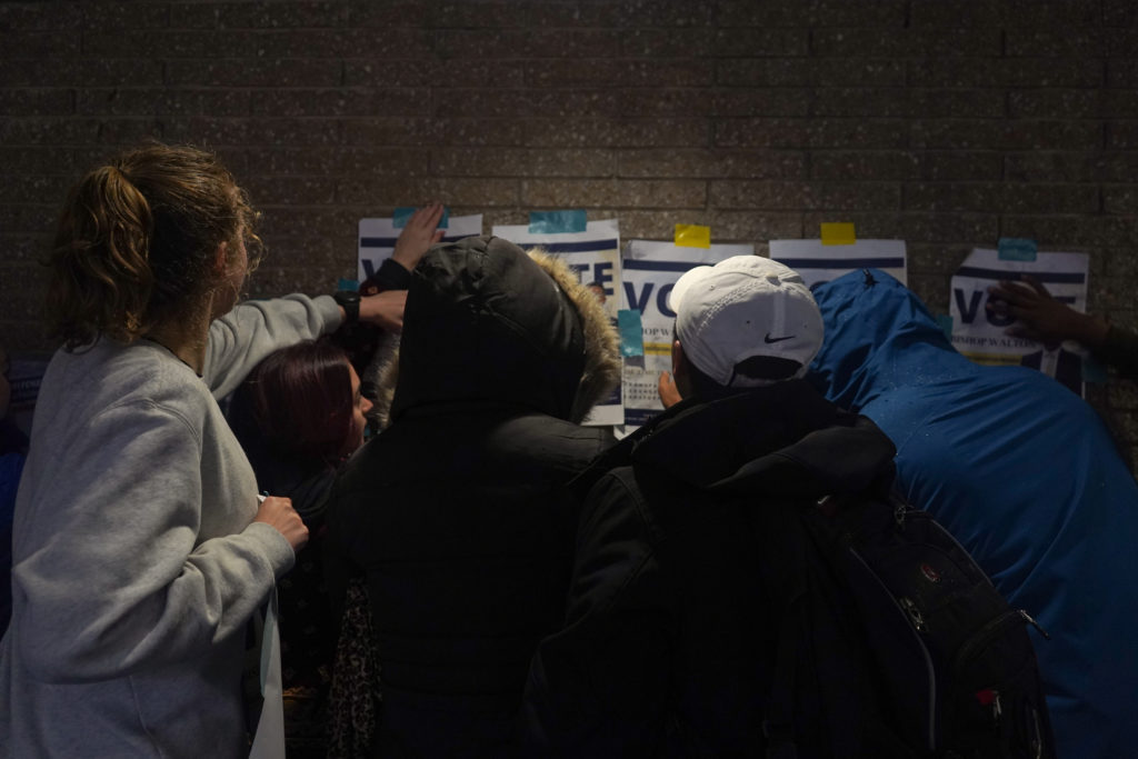
Student Association leaders said more candidates are running for top spots than in recent years as major issues like fossil fuel divestment gain traction.
Read the Cover Story
Eight candidates are running for the SA’s top two spots this year, six for president and two for executive vice president.
Previous
Next

Sophomore
Bishop Walton said he will work to decrease food insecurity and increase student diversity.
Read Full Bio
Sophomore
Christian Zidouemba said he would work to add more GWorld vendor options for students of different backgrounds.
Read Full Bio
Sophomore
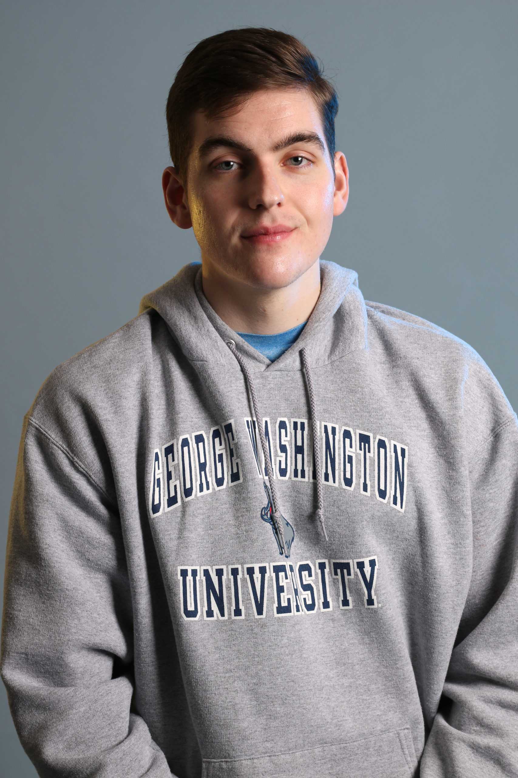
Drew Amstutz said working with administrators to resolve his own financial aid issues pushed him to run for the SA’s top post.
Read Full Bio
Junior
George Glass said his role as the “general” of George’s Army motivated him to run and boost school spirit.
Read Full Bio
Sophomore
Georgie Britcher said her “insider and outsider” perspective with the SA has prepared her to take on the job.
Read Full Bio

Junior
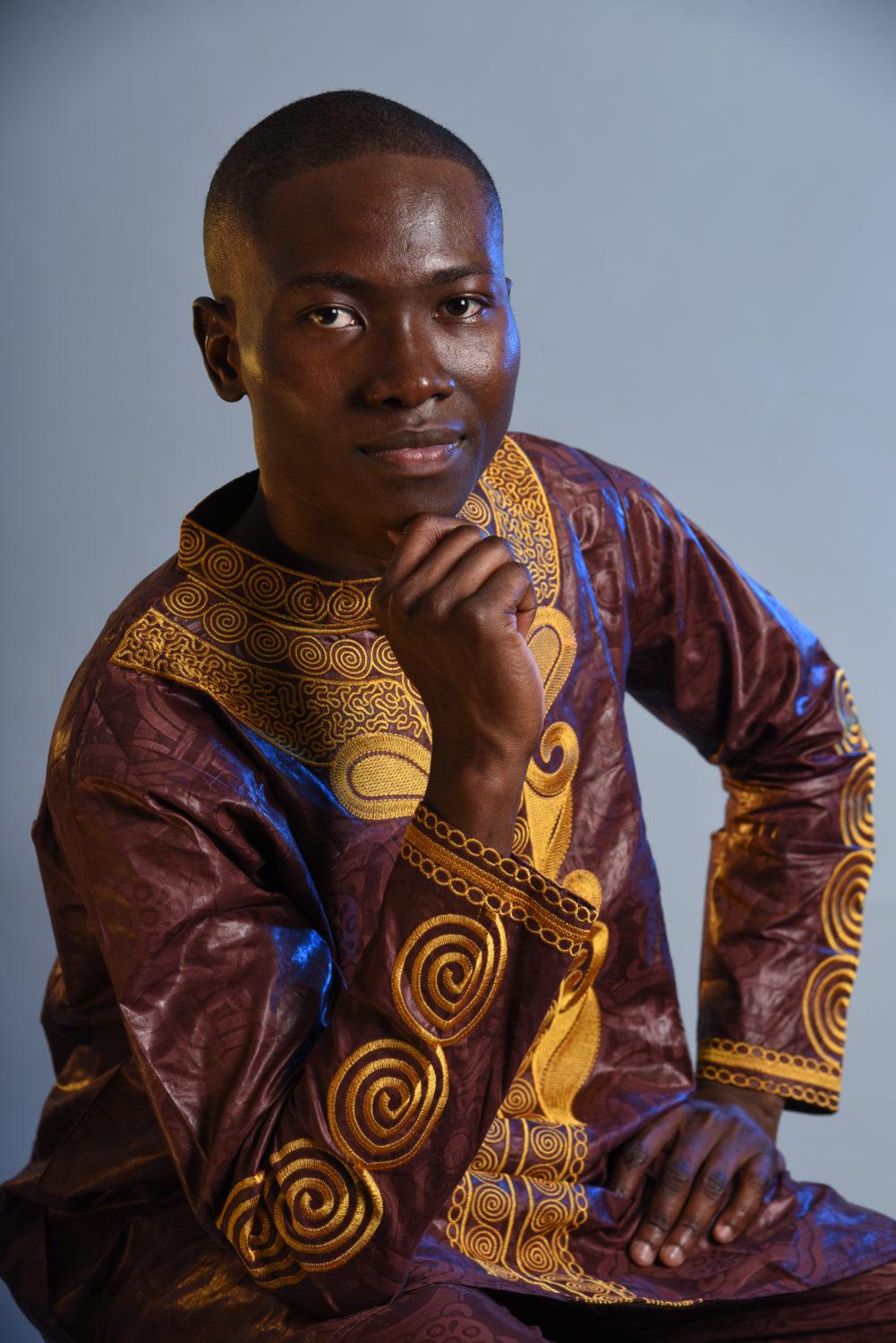
Howard Brookins said he will use the SA president position to call on officials to divest from the fossil fuel industry and address discrimination and harassment.
Read Full Bio
Freshman
Andy Liaupsin said his work supporting staff in his first year at GW pushed him to run for the position.
Read Full Bio

Sophomore
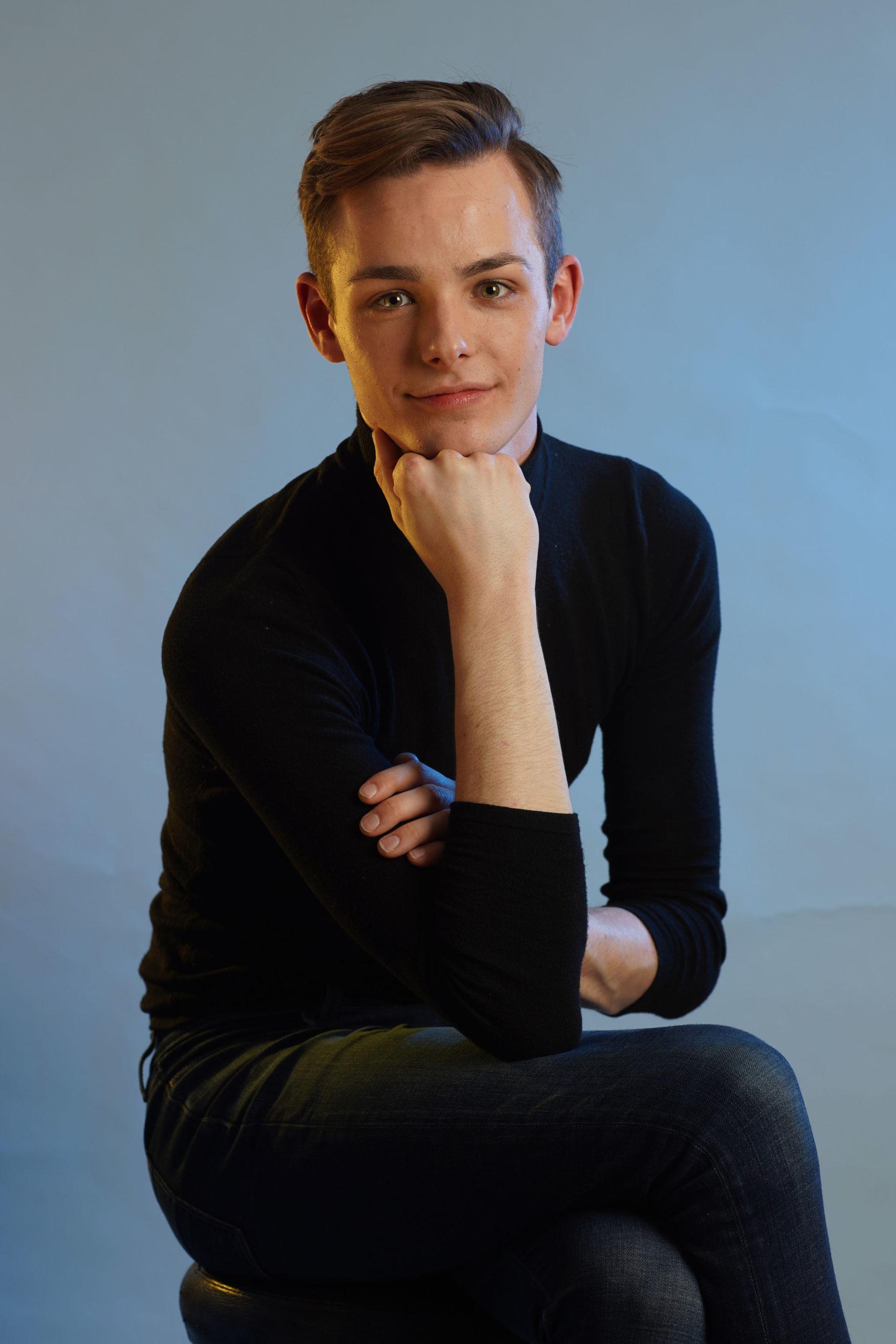
Brandon Hill said he would advocate for improved mental health resources if elected.
Read Full Bio
Learn the ins and outs of the election, from the new ranked-choice voting system to the accuracy of candidates’ platform points.
Initiatives calling on officials to divest from fossil fuels, restructure the financial aid office and address hateful rhetoric appear across platforms.
By Makena Roberts and Tiffany Garcia

Student Association elections are this week. Here are answers to everything you should know before you cast your ballot.
By Makena Roberts

The Hatchet looked through each candidate’s platform to identify inaccurate or misleading information and provide additional context.
By Parth Kotak and Makena Roberts

Approved referendums would press officials to allow the SA president voting power on the Board of Trustees and recognize graduate student workers as a union.
By Sarah Roach
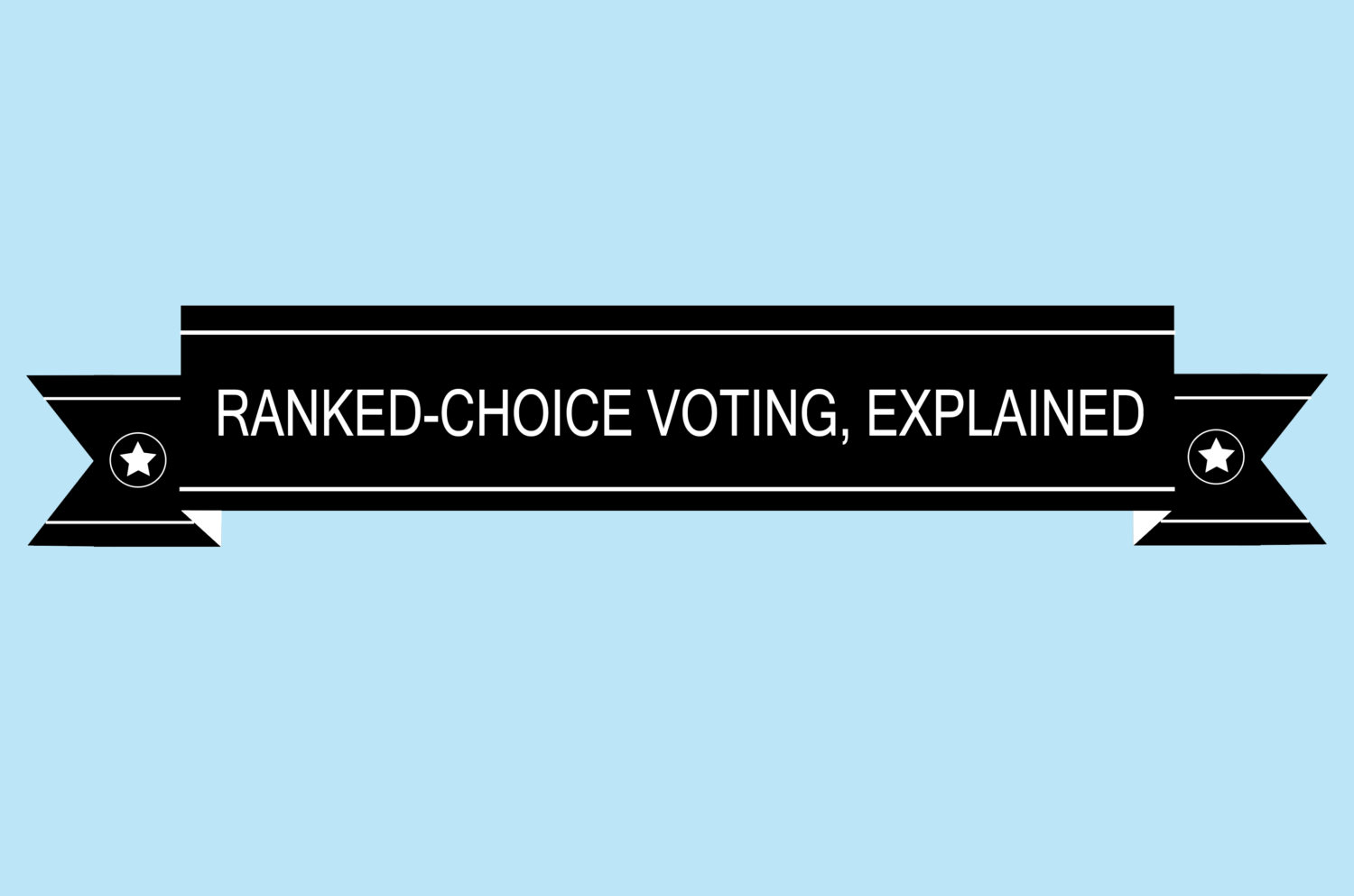
The Hatchet spoke with Kyle Piekarski, the chairman of the JEC, who broke down the ranked-choice voting process during this year’s SA elections.
By Makena Roberts
The Hatchet’s editorial board – a group of opinion writers and staff members on Hatchet staff who are not affiliated with the news section – interviewed all presidential and executive vice president candidates about their platforms in March. Here’s whom they decided to endorse for each position.

For President
Howard Brookins
Brookins has the experience needed to lead the organization, innovative solutions to recurrent problems and realistic plans to carry out his platform points.
Read the endorsement

For Executive VP
Brandon Hill
Hill has the experience and connections with the GW community to make him an effective executive vice president.
Read the endorsement
Students should support changes to the SA constitution, fossil fuel divestment, graduate student unionization and SA voting powers on the board.
By Editorial Board
var button = document.getElementById(‘slide’);
button.onclick = function () {
var container = document.getElementById(‘p-carousel’);
sideScroll(container,’right’,0.01,527,5);
};
var back = document.getElementById(‘slideback’);
back.onclick = function () {
var container = document.getElementById(‘p-carousel’);
sideScroll(container,’left’,0.01,527,5);
};
function sideScroll(element,direction,speed,distance,step){
scrollAmount = 0;
var slideTimer = setInterval(function(){
if(direction == ‘left’){
element.scrollLeft -= step;
} else {
element.scrollLeft += step;
}
scrollAmount += step;
if(scrollAmount >= distance){
window.clearInterval(slideTimer);
}
}, speed);
}